Identity
Rankin
John Rankin Waddell is a famous British portrait and fashion photography. He was born in 1966 in Glasgow. While studying a course in accounting, he realised it wasn't what he wanted to do for the rest of his life. He left the class and began to study photography at the London College of Communication. During his time there, he met Jefferson Hack. Together, they produced a magazine, which they named 'Dazed & Confused' and ran it. The monthly magazine became a cult reference. \they discovered young amateur photographers and displaying their work in different art categories such as fashion, design, photography and literature.
The Dazed & Confused magazine bought Rankin fame in the fashion and contemporary art world. In the photography course, he explored a wide variety of topics and atmosphere.
Rankin then started taking photographs for ad campaigns such as Boss, Nokia, Nike and Swatch, which were printed on covers of famous international magazines.
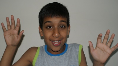
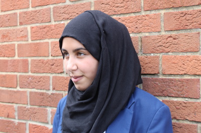
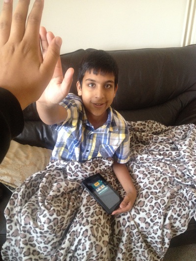
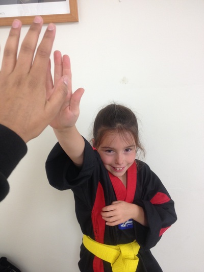
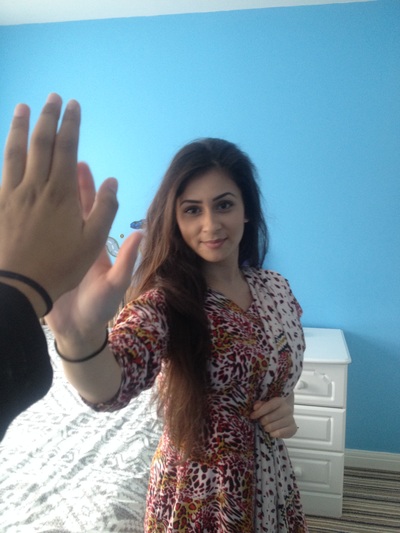
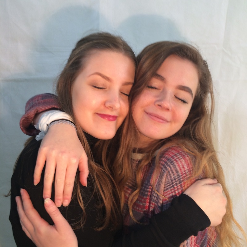
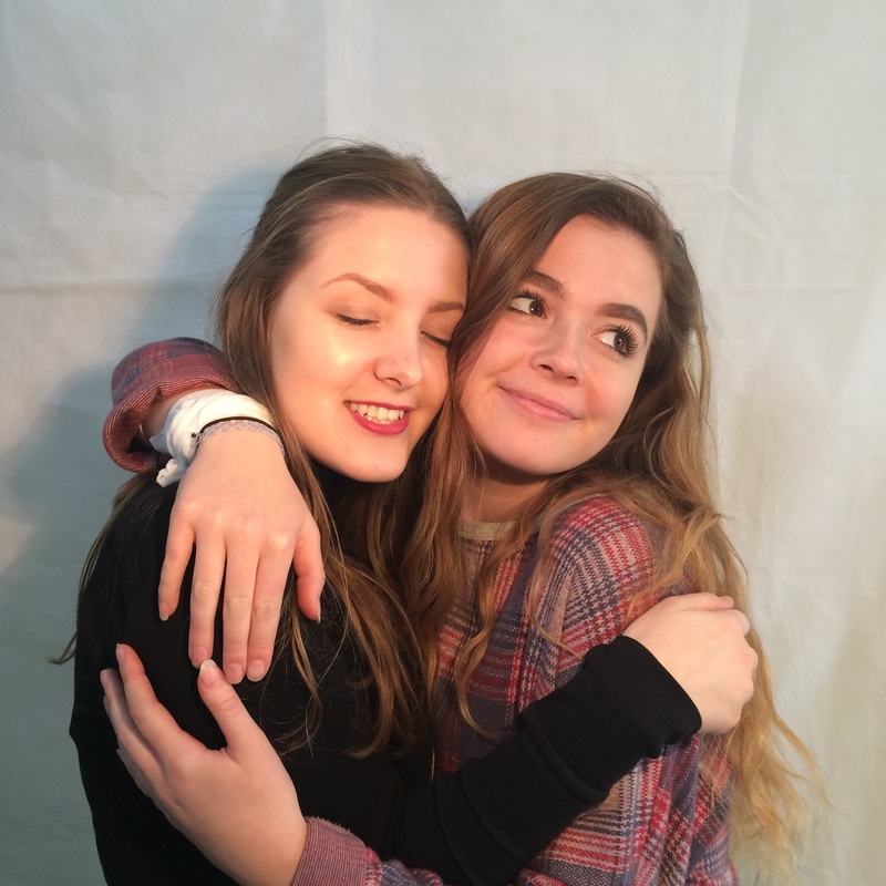
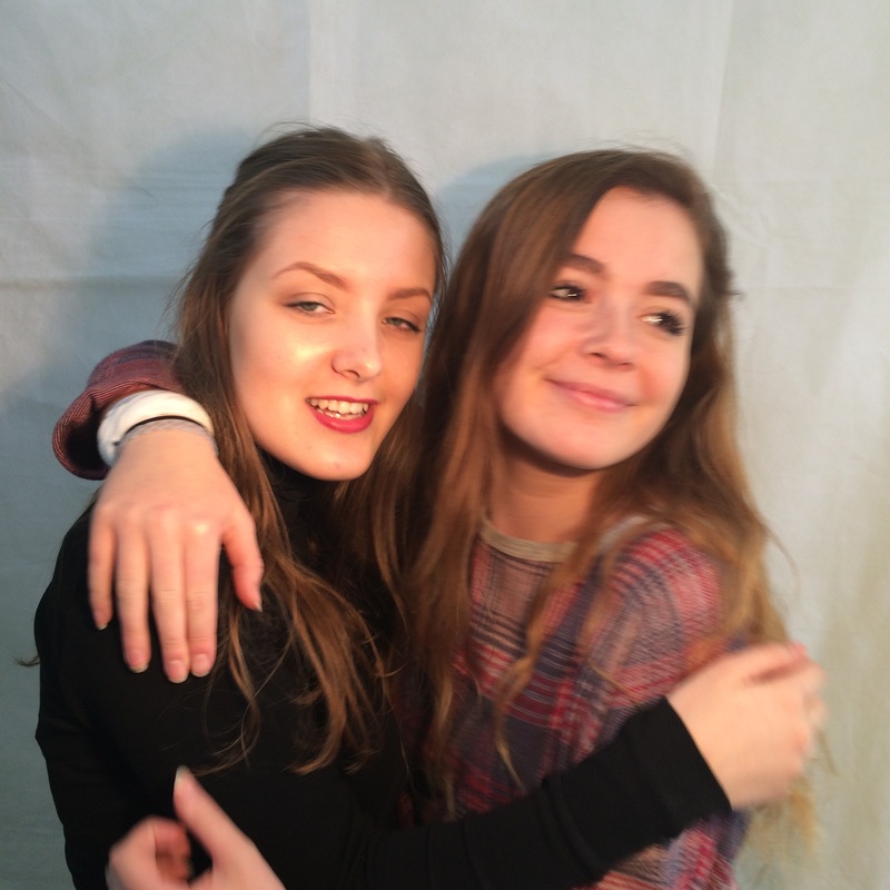
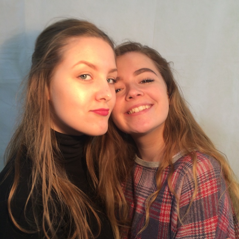
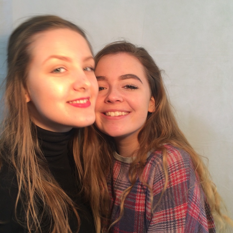
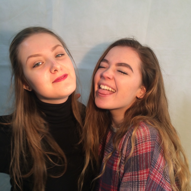
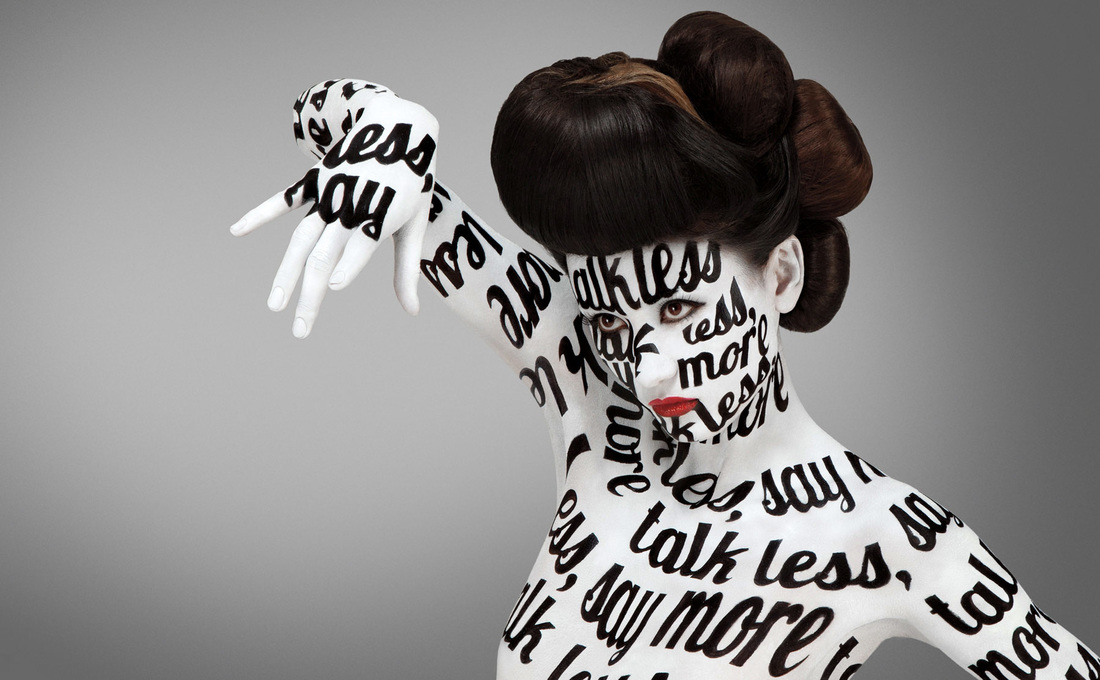
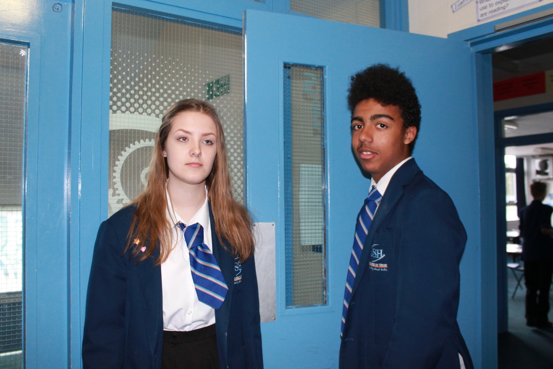
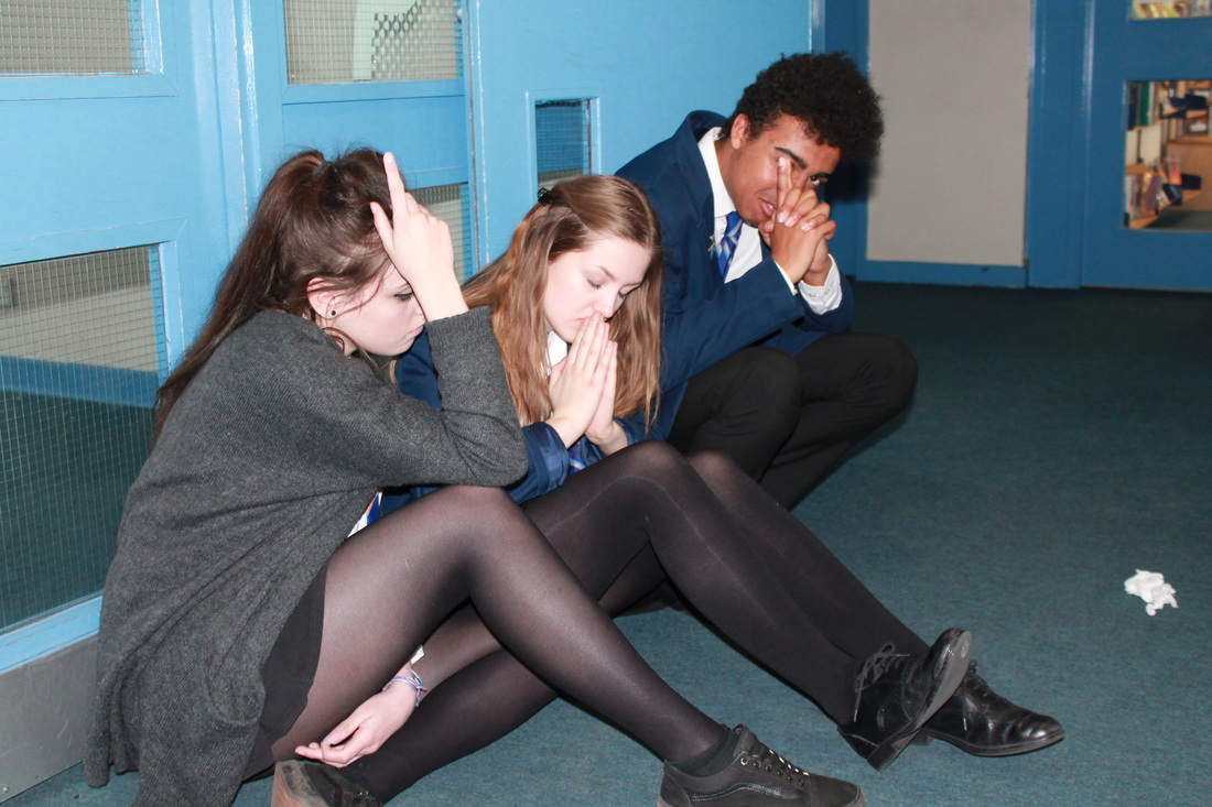
Rankin has taken portraits of many celebrities such Queen Elizabeth II, Kylie Minogue, Madonna, Leonardo DiCaprio, Miley Cyrus, Rita Ora, Adele and many more. Here are some of the photos:
The Dazed & Confused magazine bought Rankin fame in the fashion and contemporary art world. In the photography course, he explored a wide variety of topics and atmosphere.
Rankin then started taking photographs for ad campaigns such as Boss, Nokia, Nike and Swatch, which were printed on covers of famous international magazines.
Rankin has taken portraits of many celebrities such Queen Elizabeth II, Kylie Minogue, Madonna, Leonardo DiCaprio, Miley Cyrus, Rita Ora, Adele and many more. Here are some of the photos:

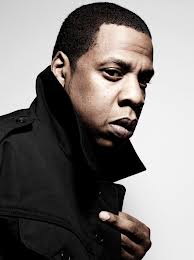
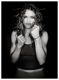

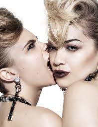
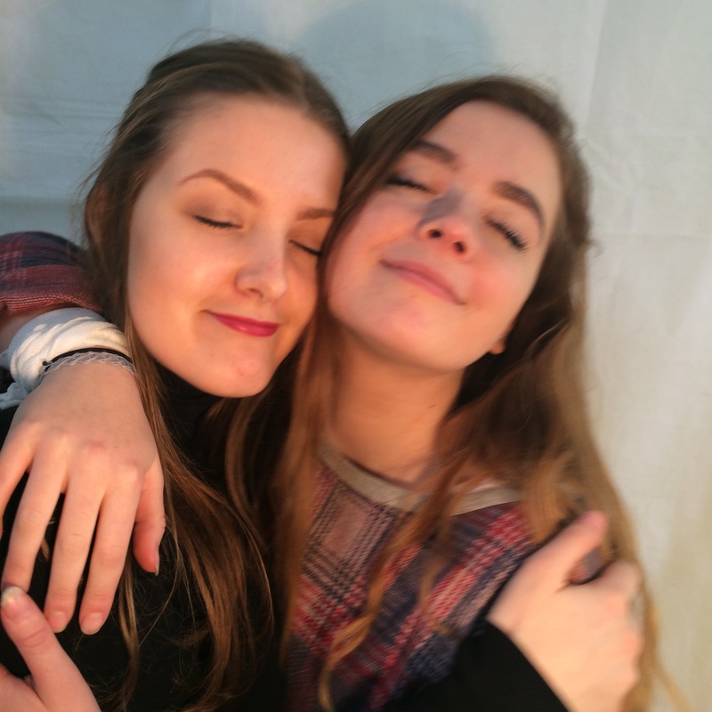
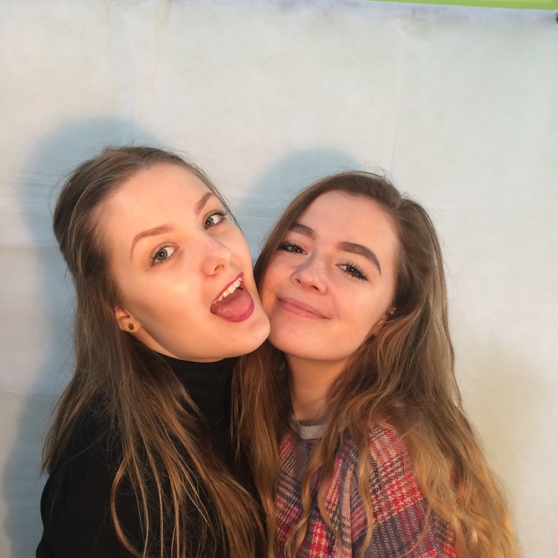
Photo Analysis

|
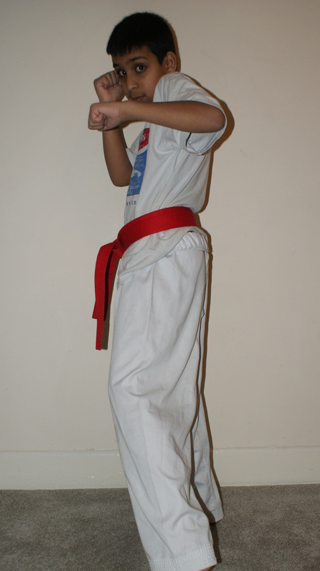
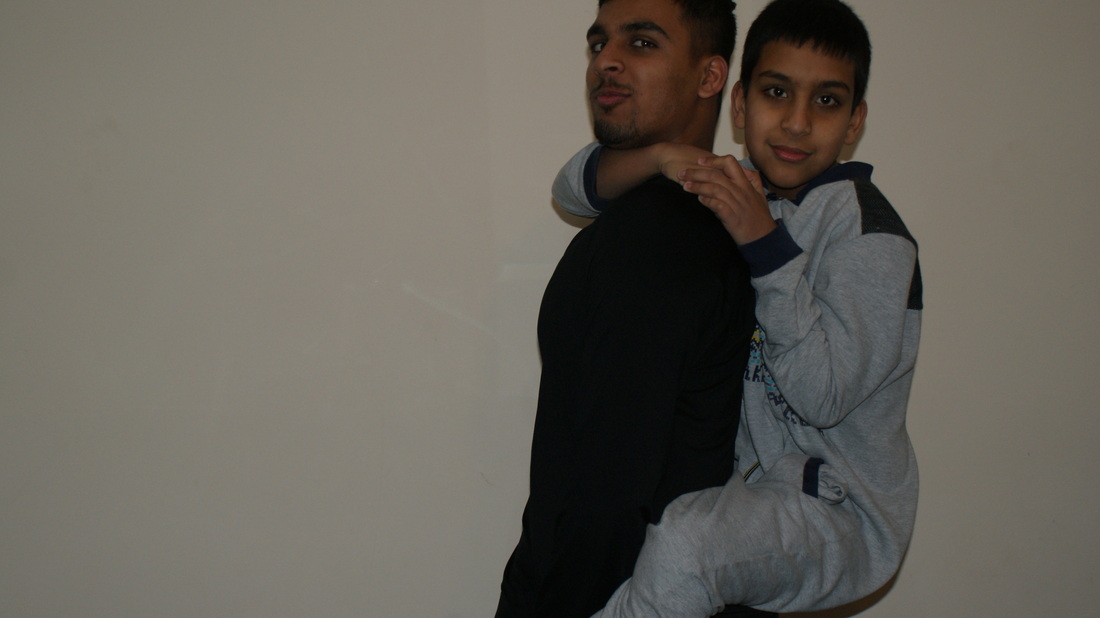
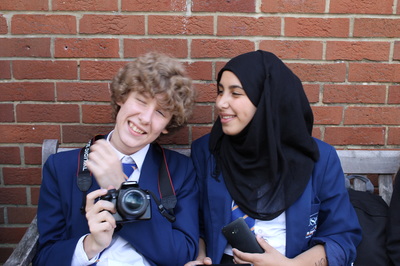
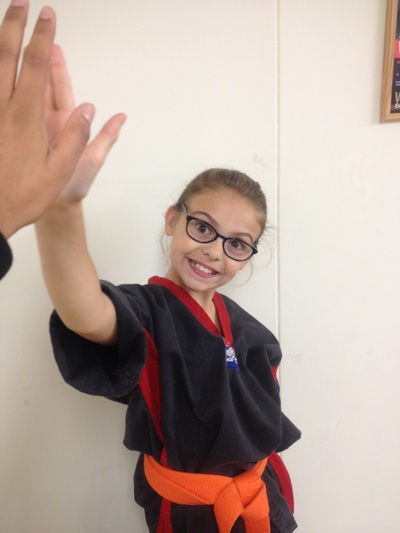
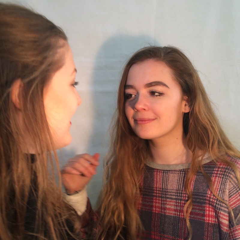
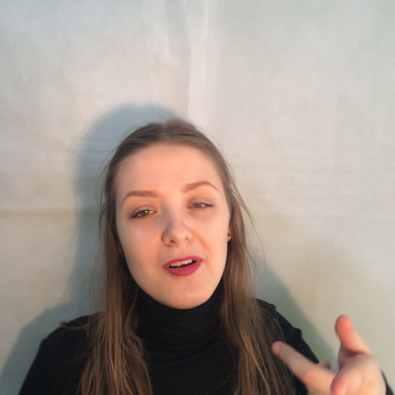
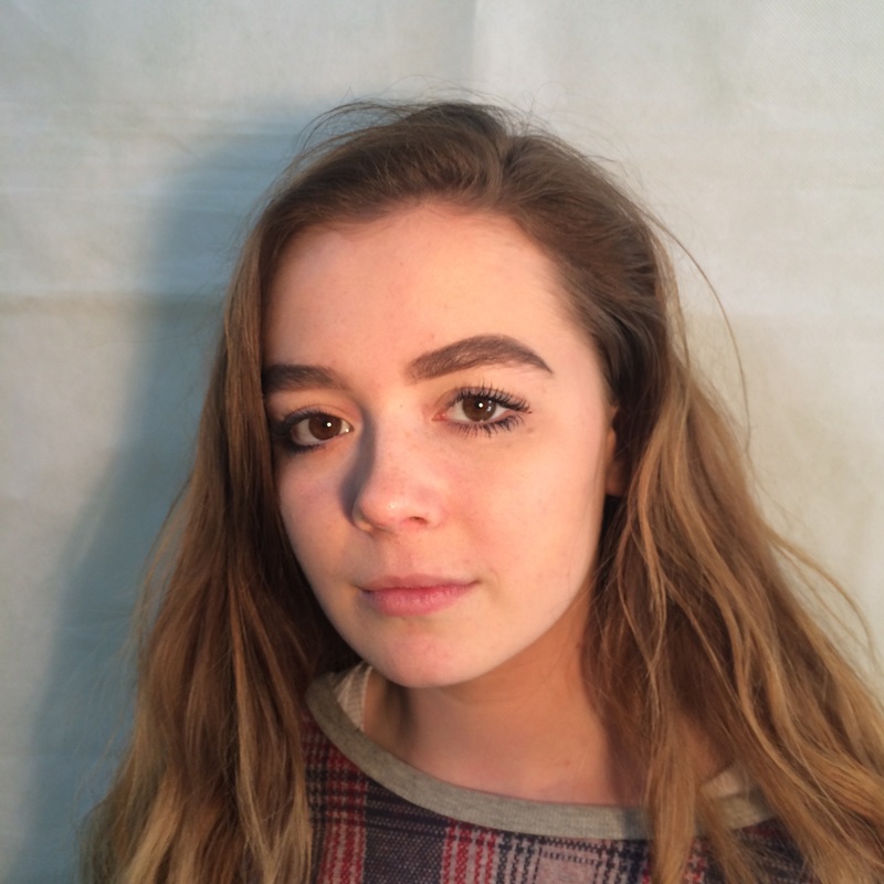
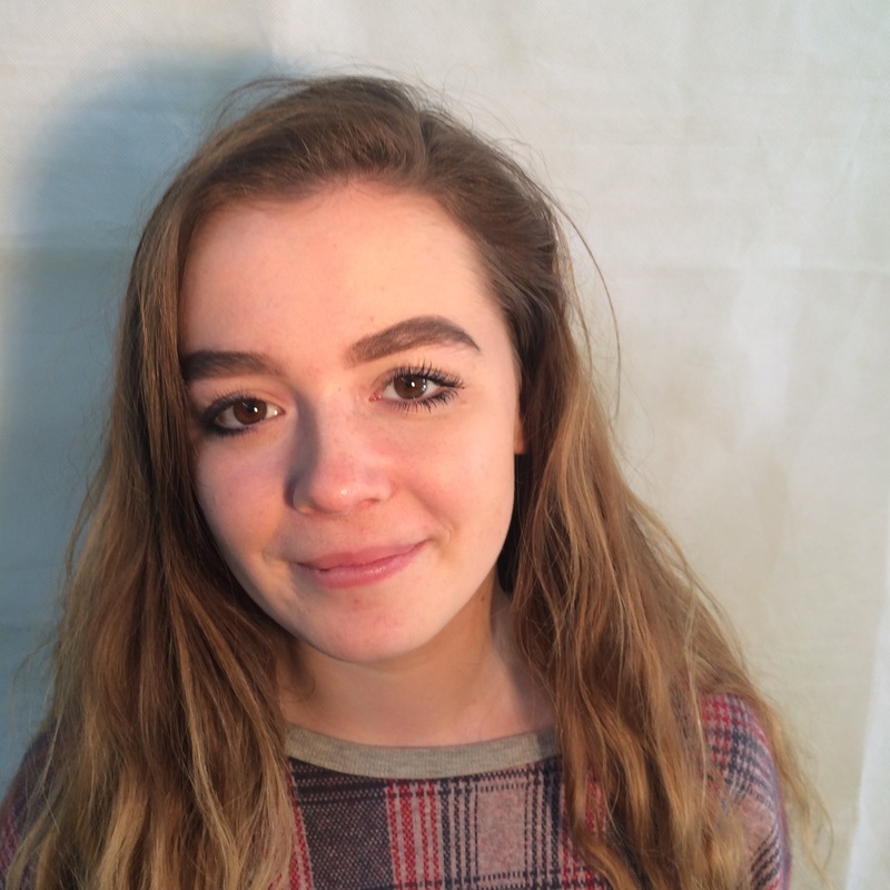
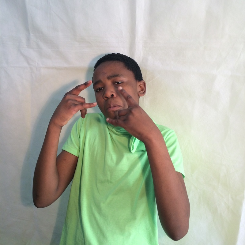
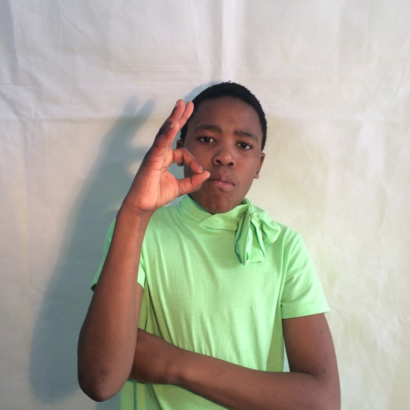
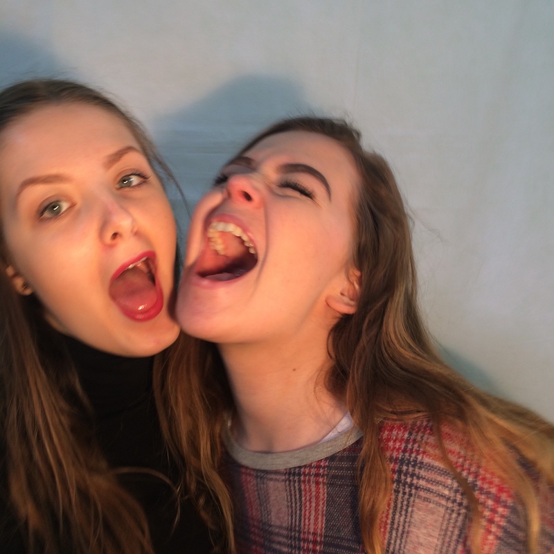
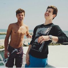
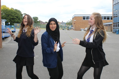
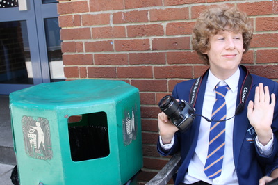
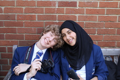
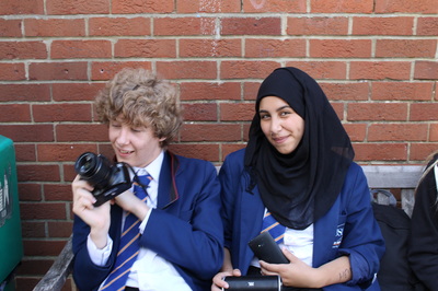
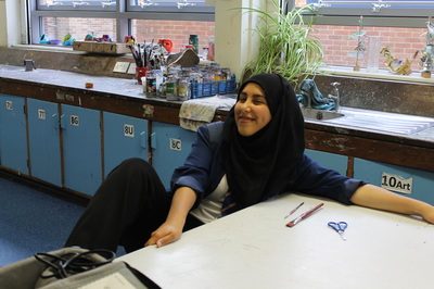
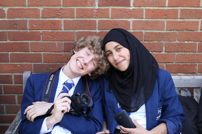
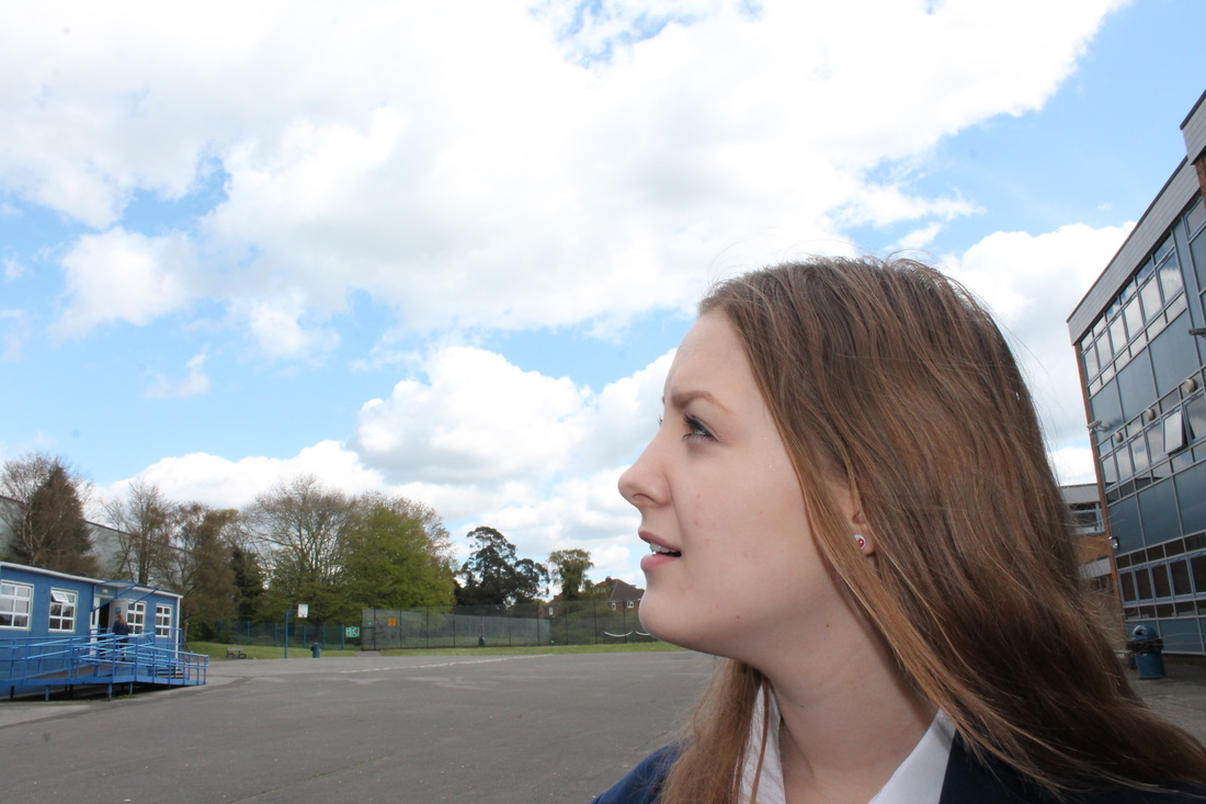
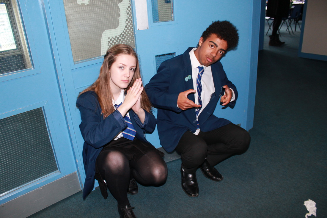
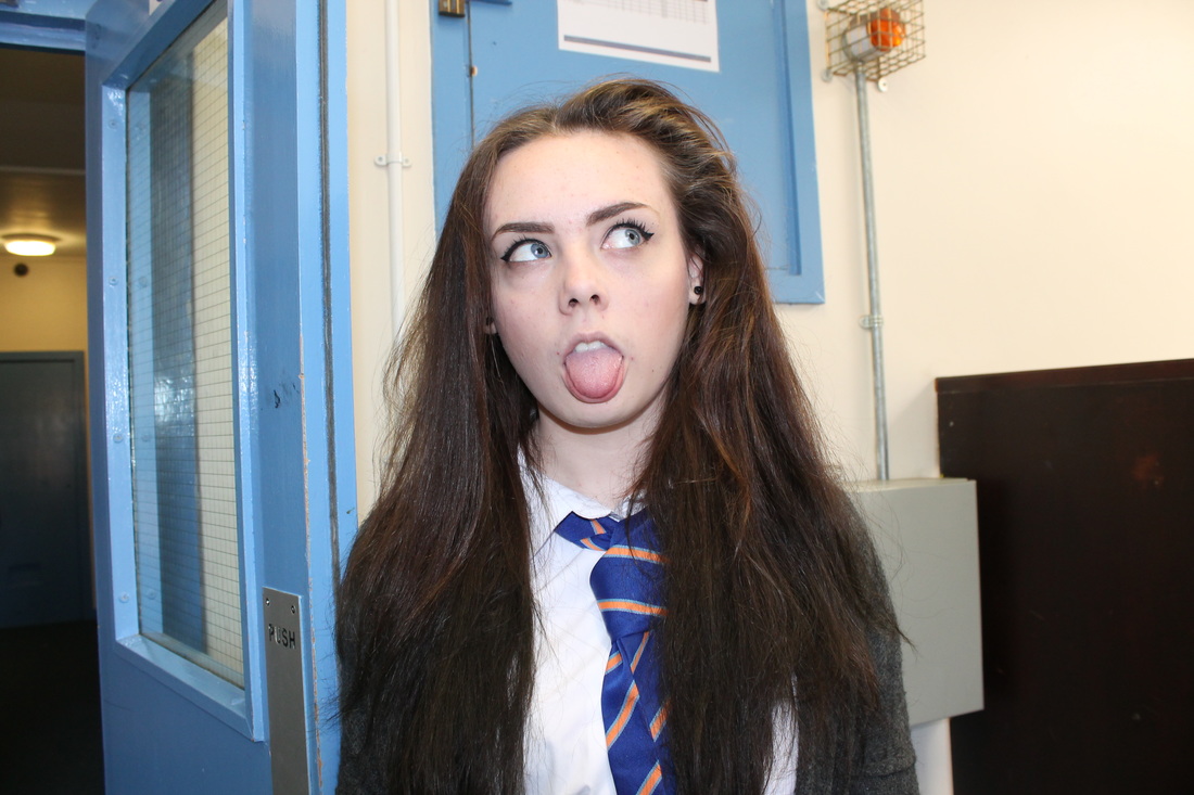
This is the photograph I have studied and it was created by Rankin. The theme of the photograph is portraiture. The purpose of the photograph is for art. The most important thing in the photograph that the photographer focuses on is their friendship. The photograph was taken in a studio, as you tell from the background. I think that the image is posed. Looking closely at the photograph I can see that the image has not been digitally manipulated, I can tell this because there are no major differences in other photographs.
Process The light in the photograph is artificial. The photographer has used a fast shutter speed so that they can (focus quickly on the subject and movement. Mood I was attracted to this photograph because I was intrigued by the girls’ relationship and how ‘wild’ they are. I would describe the mood of the photograph as joyful and crazy. The photographer has purposely set the mood of the photograph by putting the two together and let them do as they desire. The photographer has inspired me, I would like to produce similar photographs, I plan to get two people and let them do what they want. I think that the photographer is trying to deliver a message with this photograph, the message they deliver is friendship is important. My reason for thinking this is because they seem like they’re very close. |
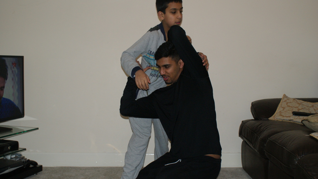
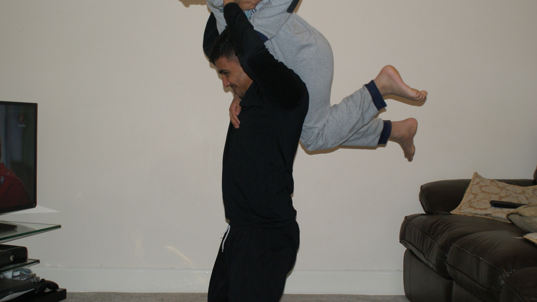
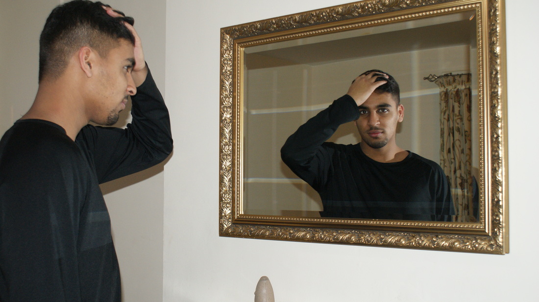
My Response To Rankin's Work


Akatre
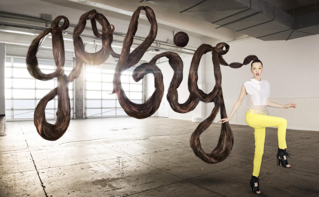
Akatre is a Graphic Design studio founded by Valentin Abad, Julien Dhivert and Sebastien Riveron. They produce images that are really visual appealing and creative. From typography to web, photography, art and multimedia, their work is well-known and admired by many.
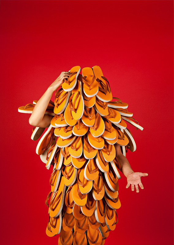
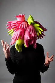
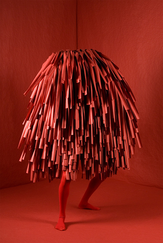
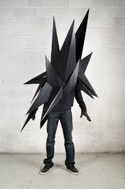
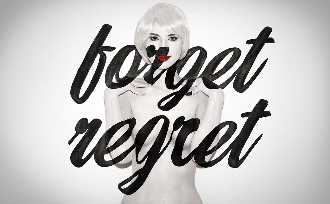
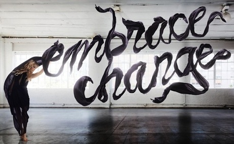
Here are some examples:
Here are some examples:
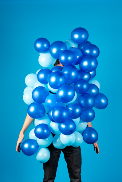
My Response to Akatre
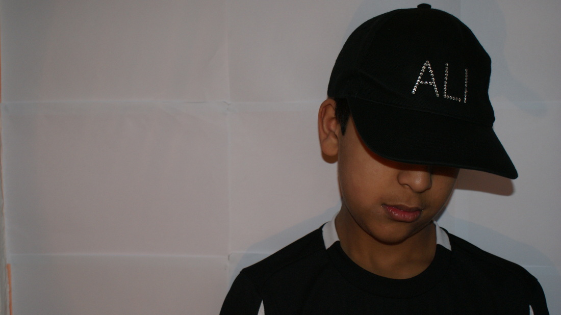
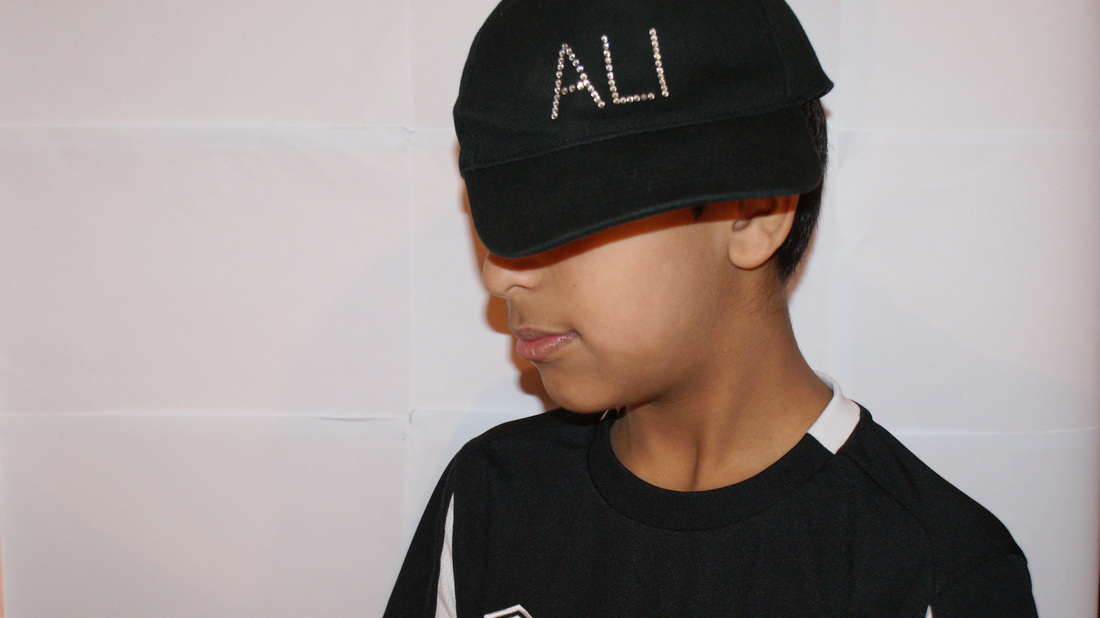
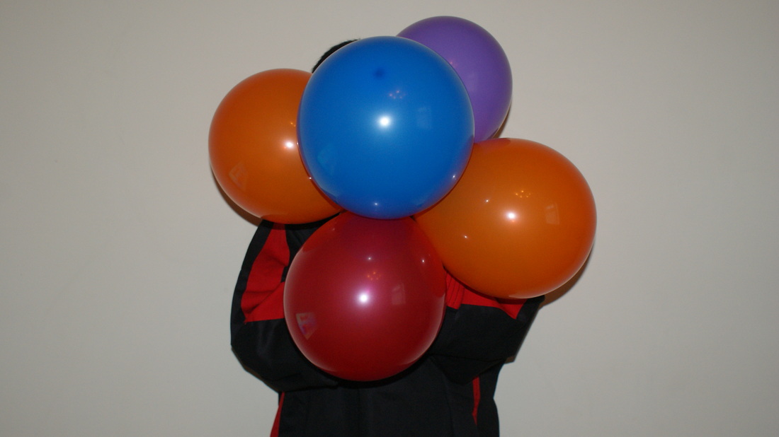
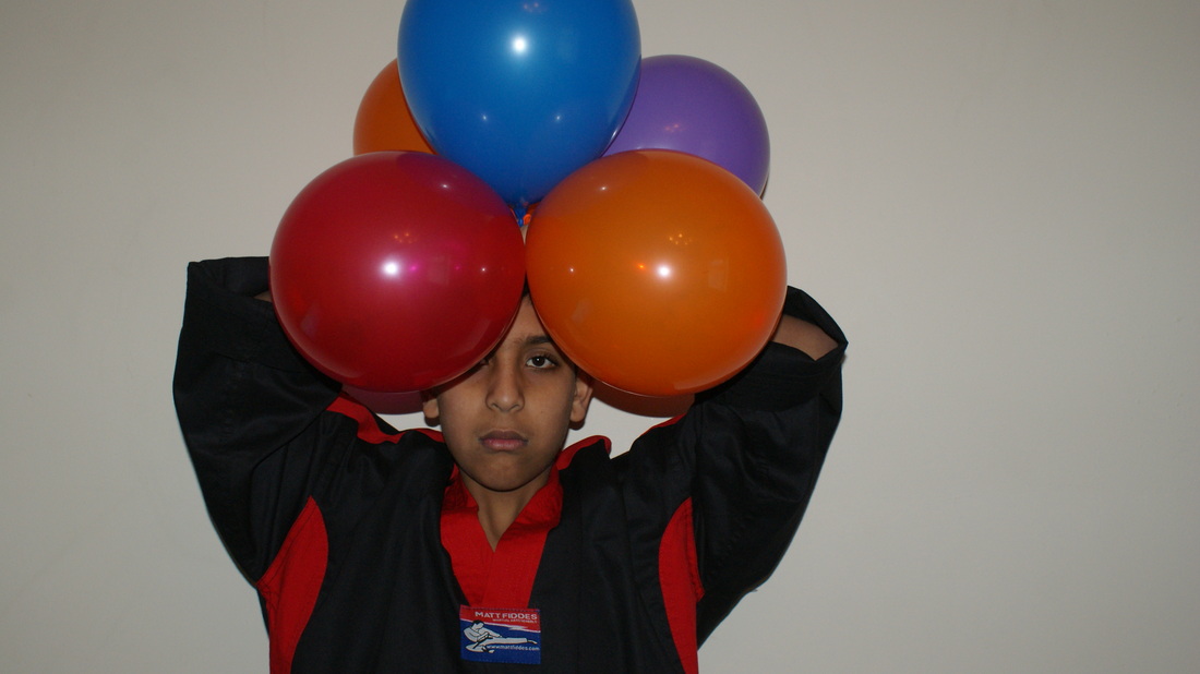
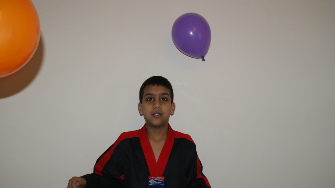
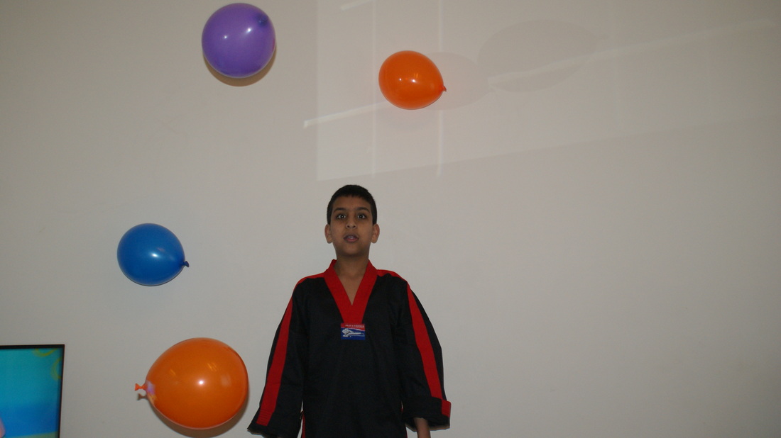
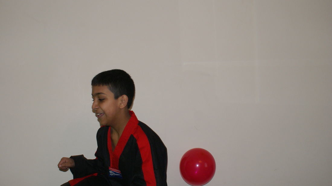
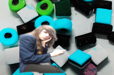
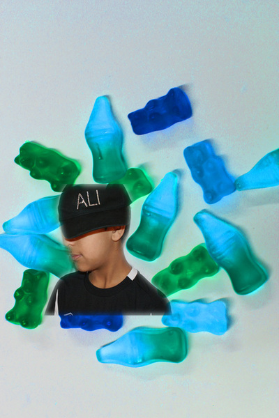
To create a mysterious effect, I used balloons and a cap to link my photos to what Akatre has produced.
Stefan Sagmeister
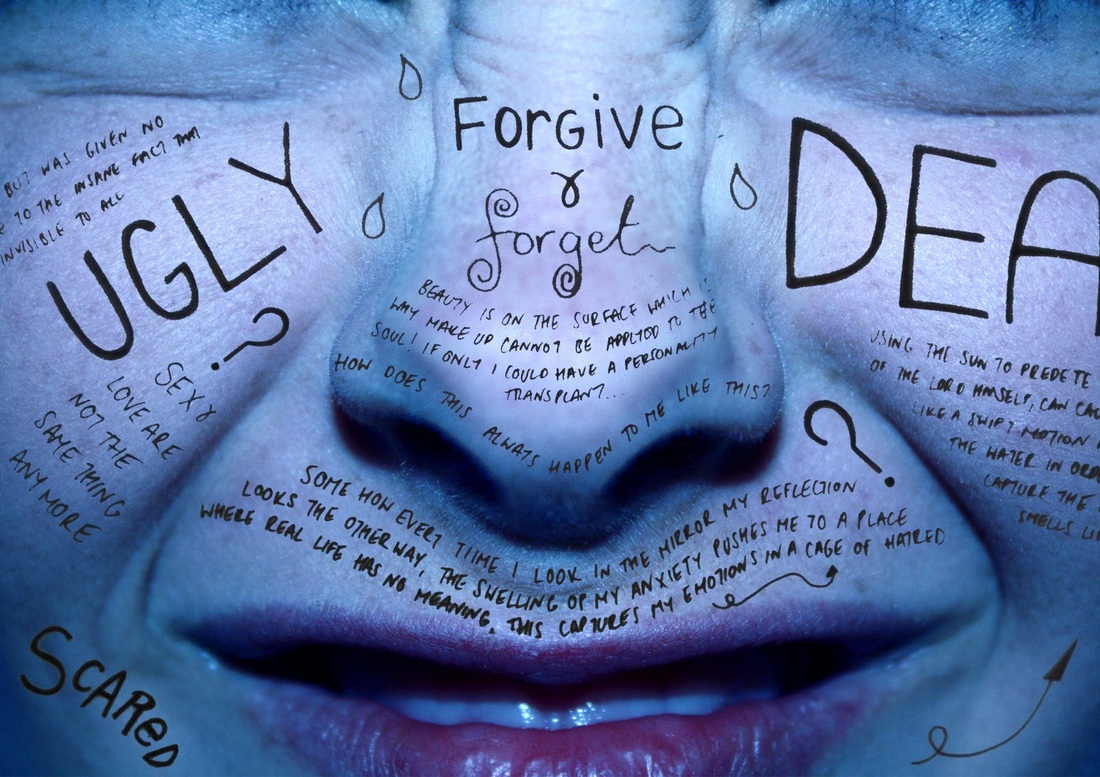
Stefan Sagmeister is a New York based graphic designer and typographer. He studied graphic design at the University of Applied Arts Vienna. Sagmeister co founded a design firm called Sagmeister & Walsh inc. with Jessica Walsh in New York city. He has designed album covers for a number of artists, including the rolling stones.
I like his work because I think its different and I like the concept of typography and how its not used that often. also, the pictures below intrigue me because they are eye catching and contrasting.
I like his work because I think its different and I like the concept of typography and how its not used that often. also, the pictures below intrigue me because they are eye catching and contrasting.
Refining my Ideas
|
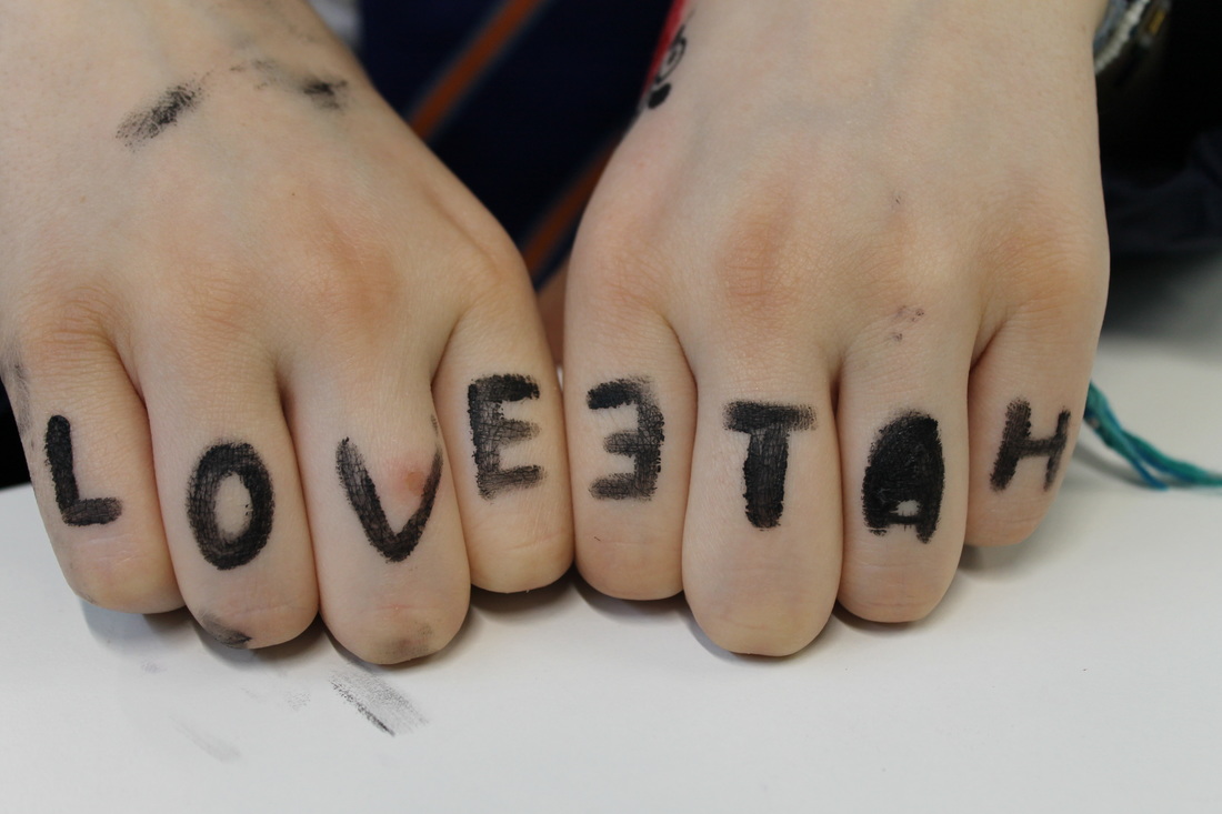
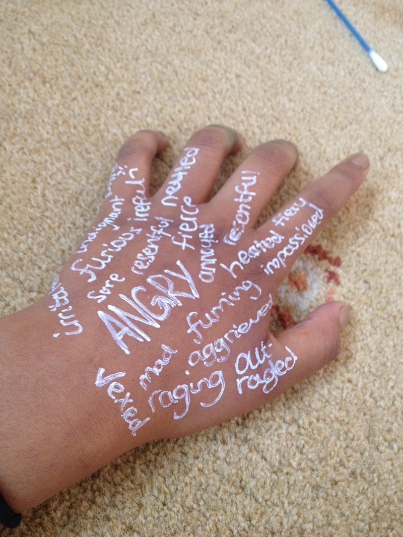
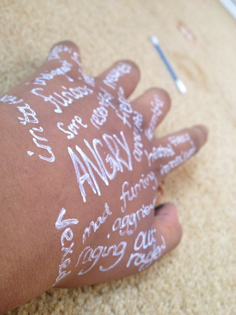
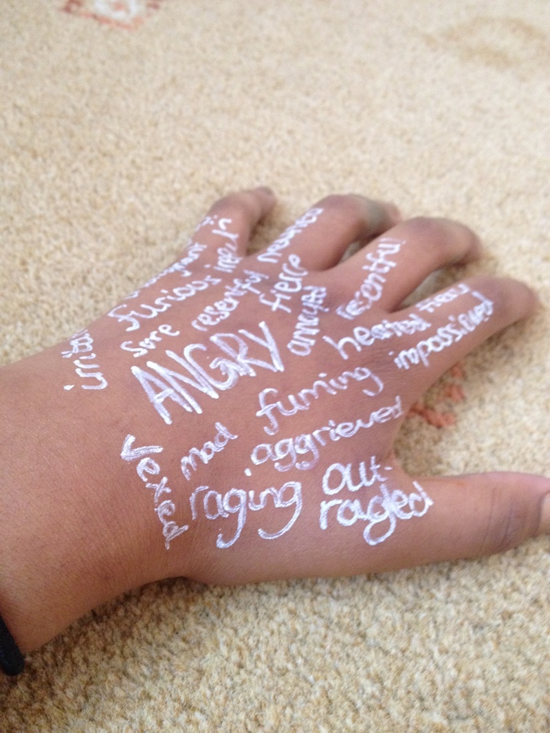
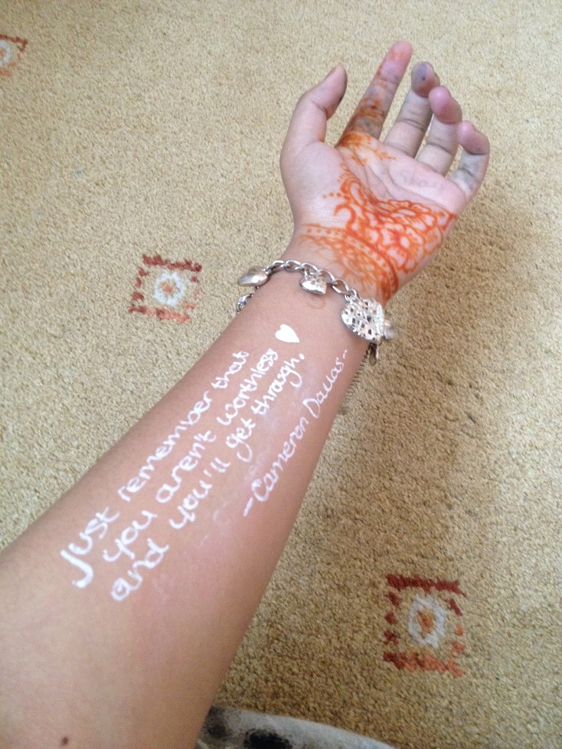
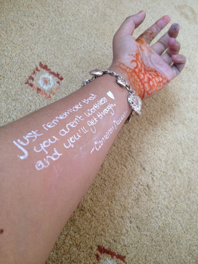
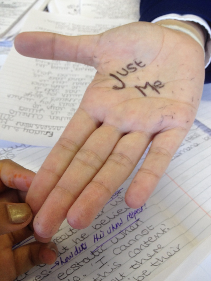
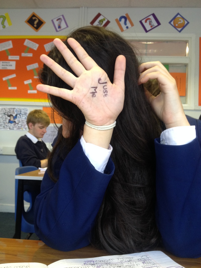
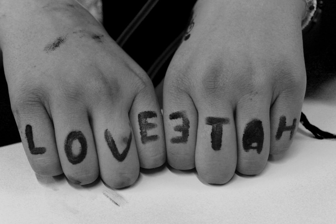
In response to Stefan Sagmeister’s work, my friends and I recreated some of his photographs on our own.
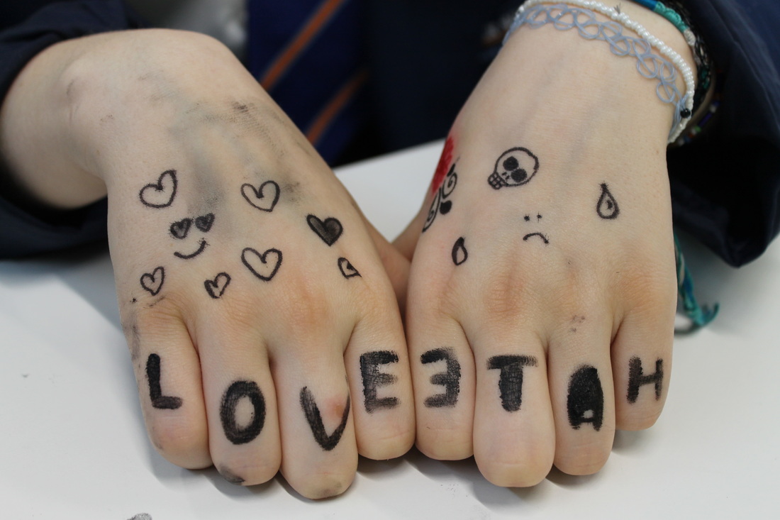
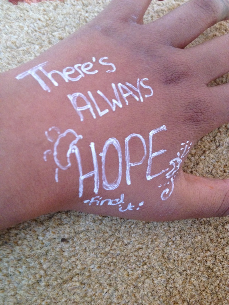
We used pen rather than Photoshop, as we found it as easier to produce what was needed. Quotes and sayings were chosen rather than random word, as we felt that the sayings meant something to us. The word ‘angry’ was used with synonyms around it to show what was being felt inside. Also a quote from Cameron Dallas was used as it meant a lot to us. The final pictures, with 'Just Me' written on them, were taken to symbolise that we are not afraid to be who we are and let the real you out. |
          |
Developing my Ideas // Photoshop Edits
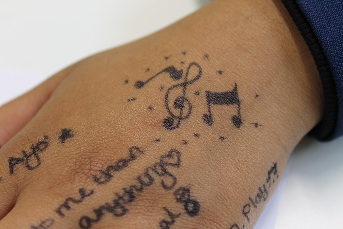
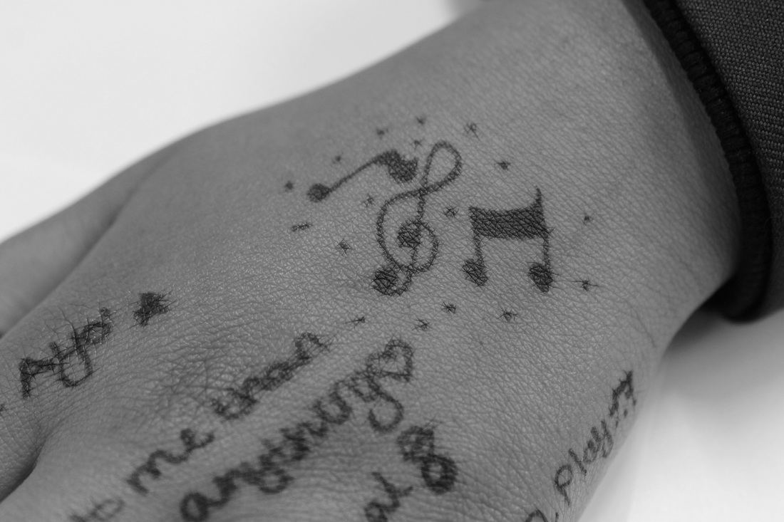
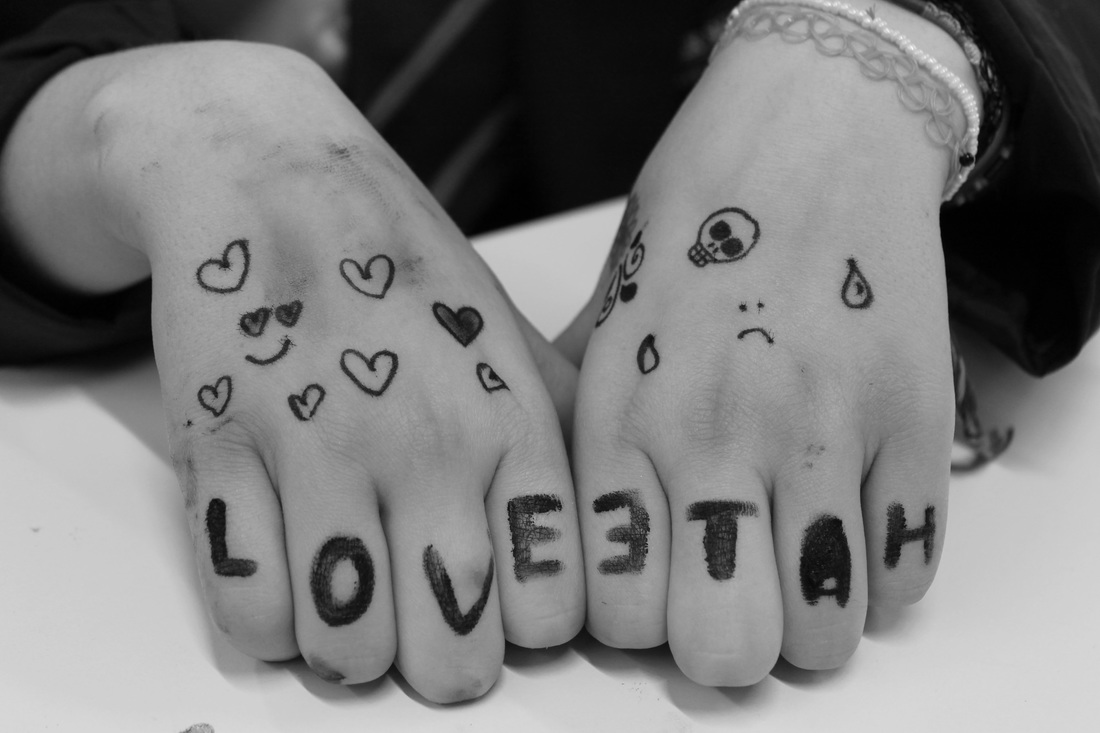
We chose the music notes because we have an interest for music. We also included lyrics to songs that mean something to us because it symbolises the relationship we have.
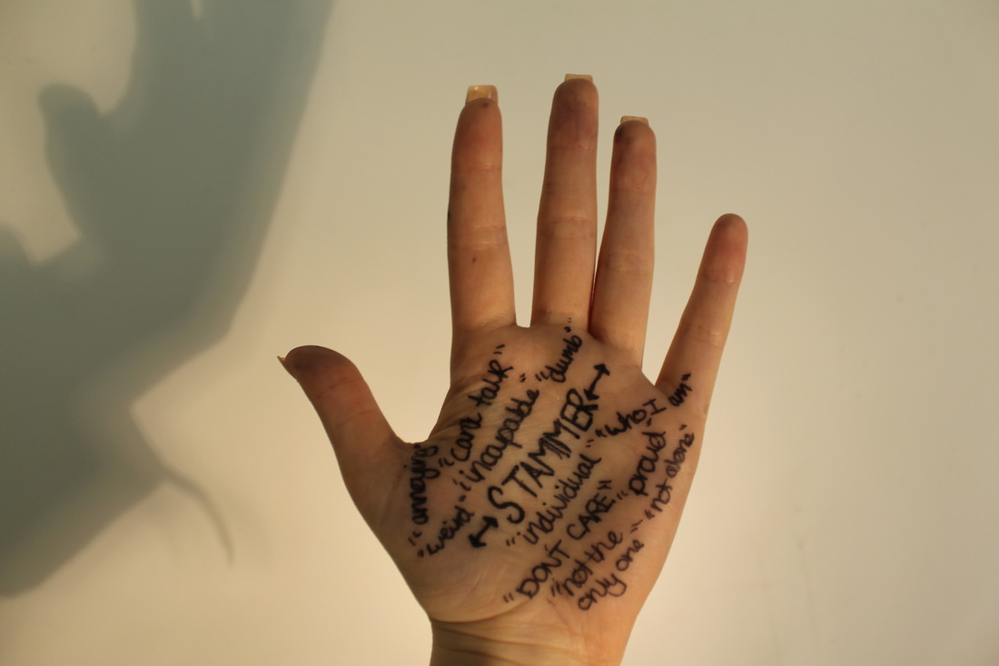
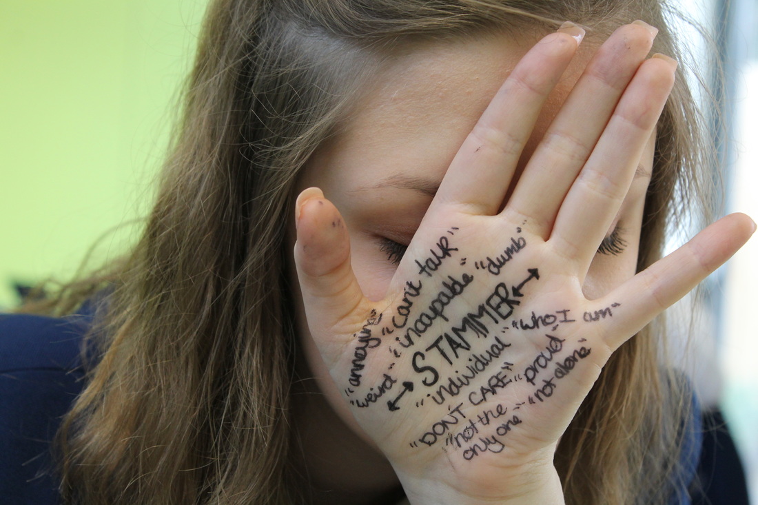
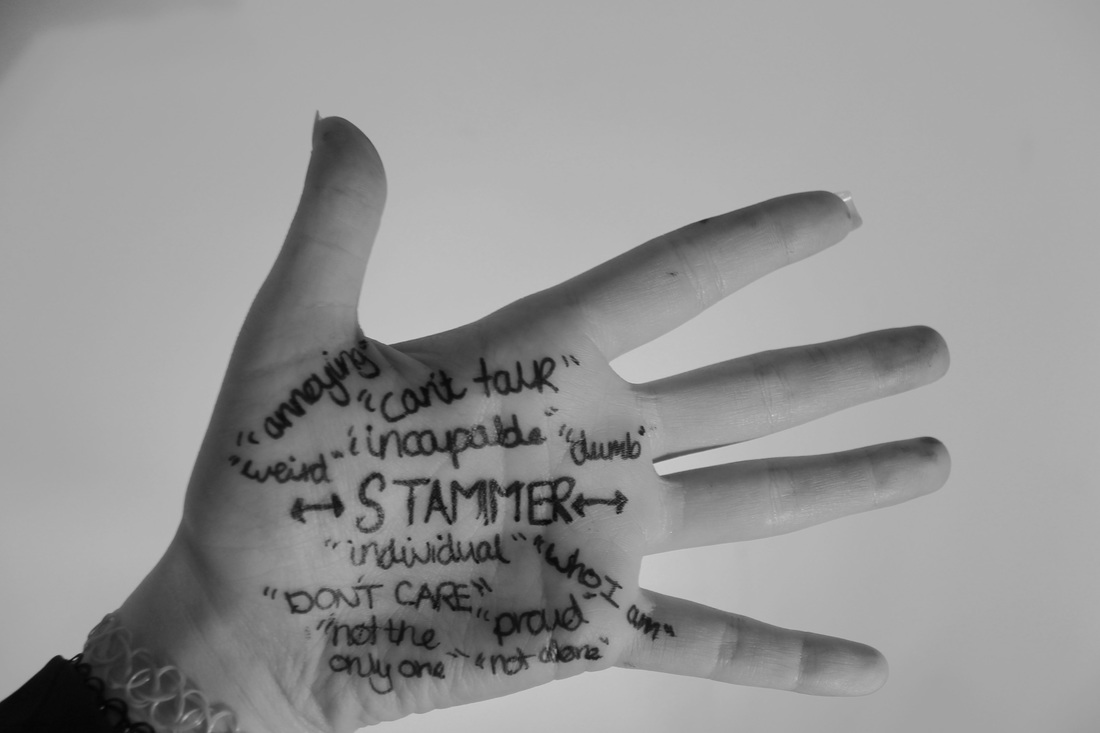
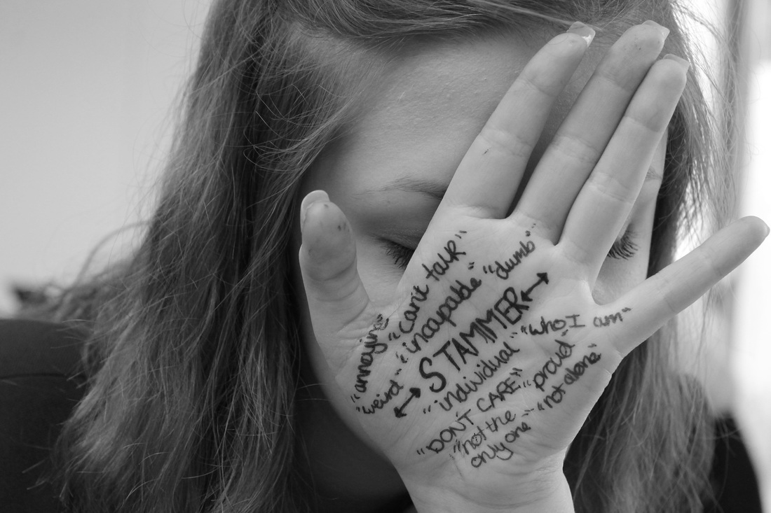
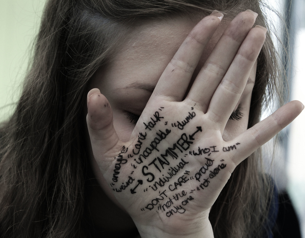
The theme of the photographs is to not be ashamed of who you are and to let the real you out. My partner wrote 'stammer' in bold and lots of other words that show how she feels around it, as she is not afraid to show people what she has.
I am pleased with the outcome because we worked hard to get good photographs. I particularly like the 'Stammer' photographs, as they represent Megan's personality.
Bryant Eslava
Bryant Eslava is a 22 year old fashion photographer from California. At the age of 16, he used social media as an outlet to publish his work. At 18, he moved to New York to shoot for brands, magazines and modelling agencies. With over a million followers on Instagram and Twitter, Bryant still continues to use social media to publish his work, as his audiences and followers are growing daily. I enjoy looking at and recreating Eslava's work because they are simple and yet so effective. I think this is because he is just taking a photo of a person, but the lighting, angle and positioning of the photograph is accurate, and where it should be.
Here are some examples of his work:
Here are some examples of his work:


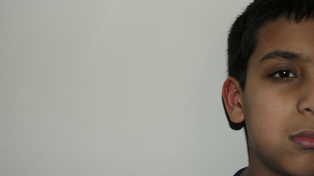
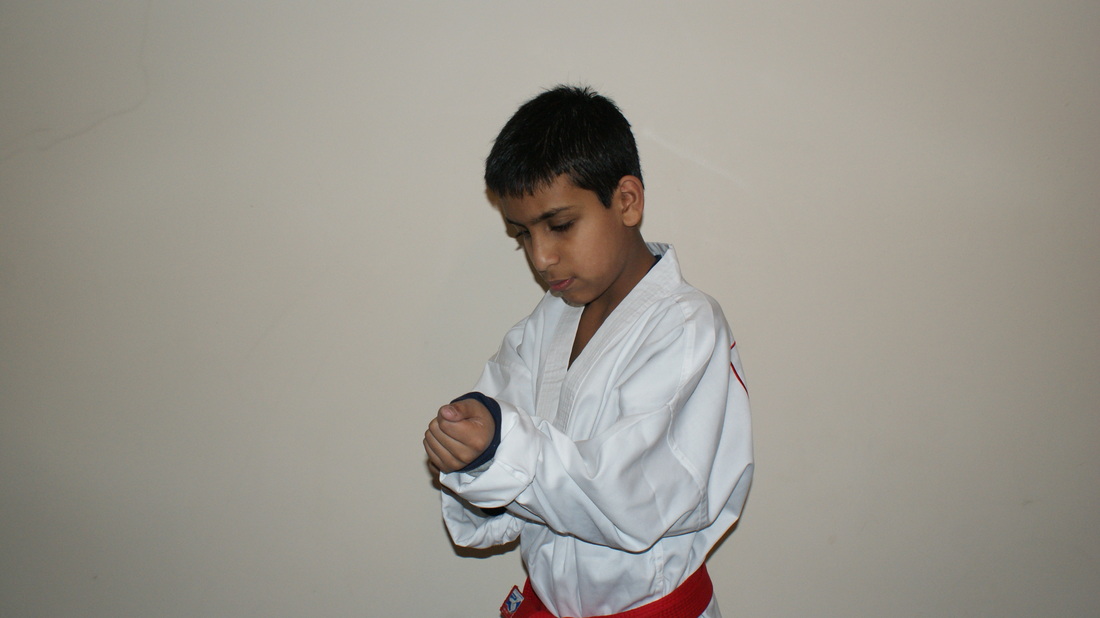
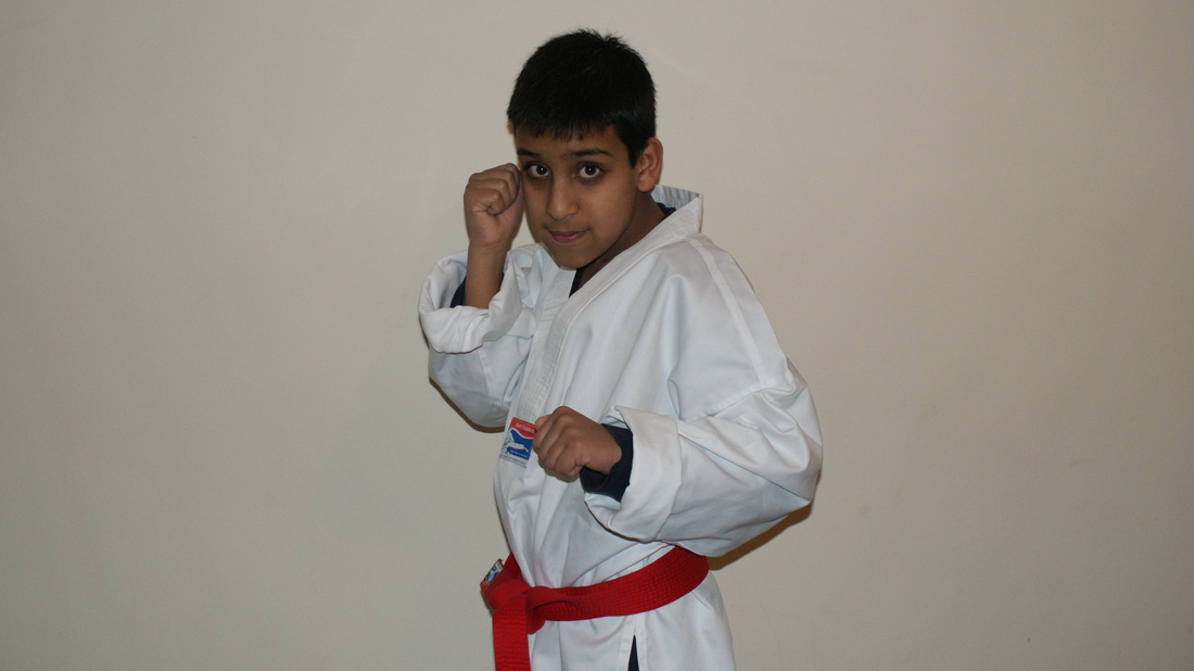
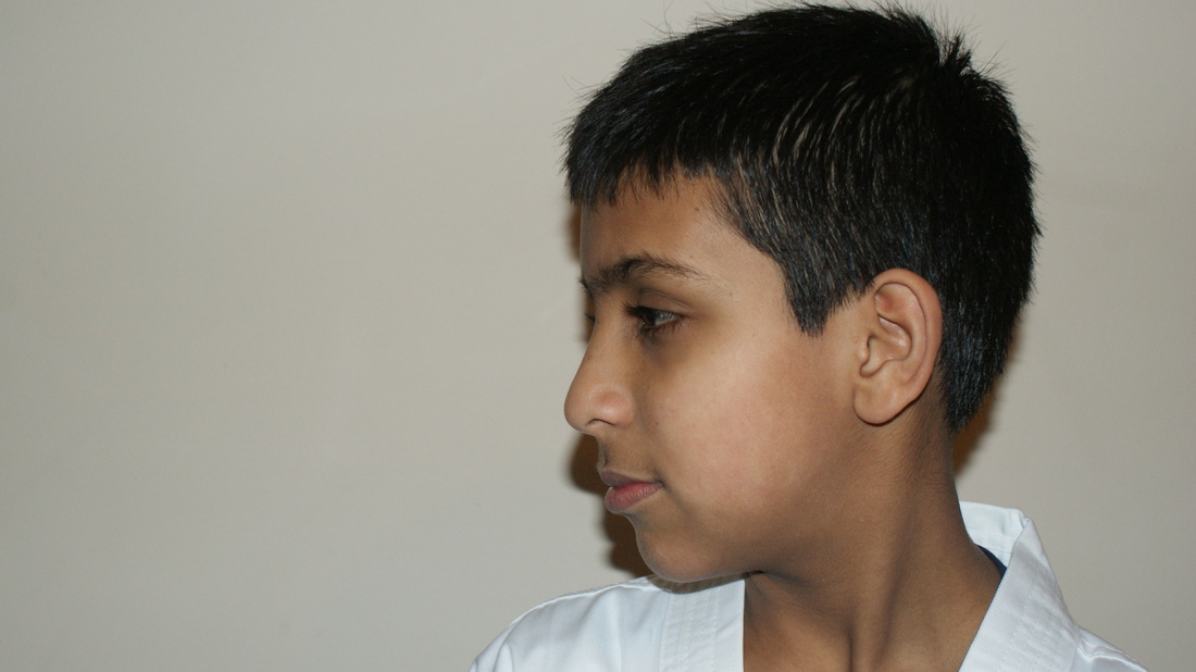
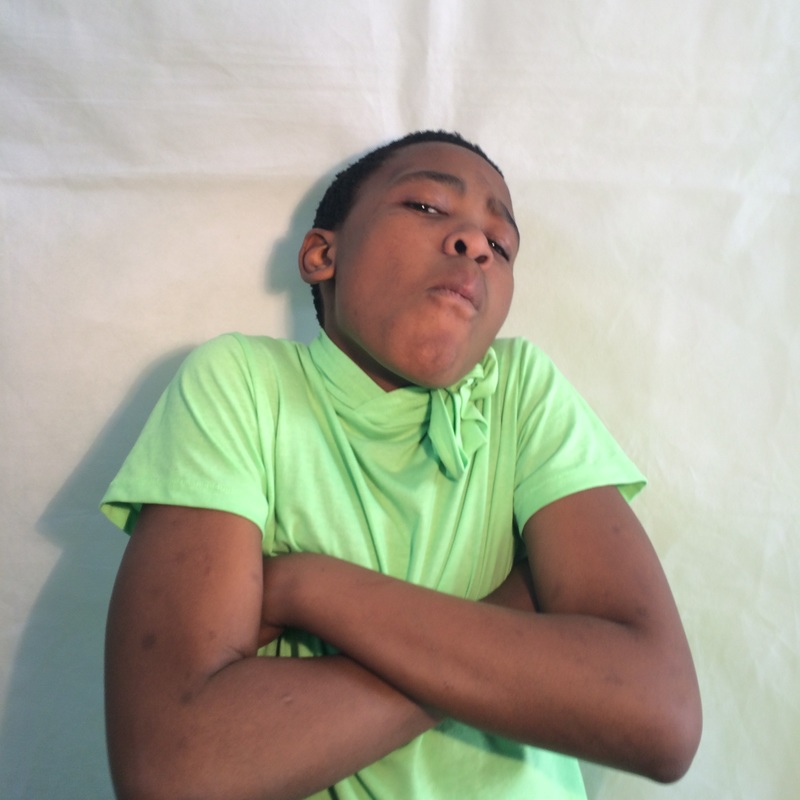
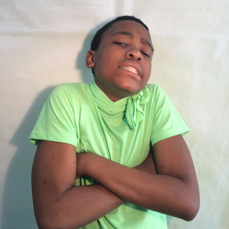
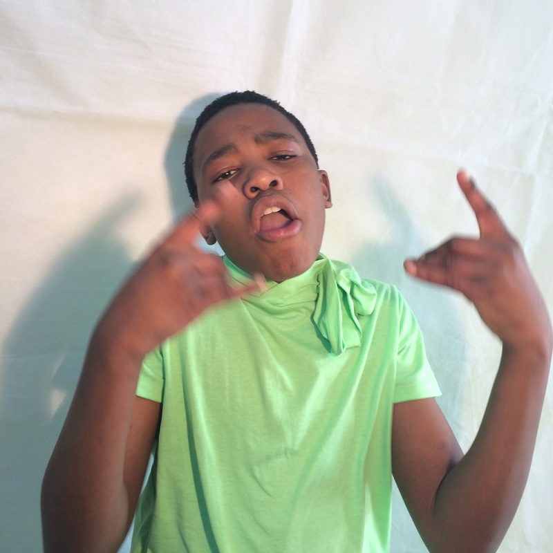
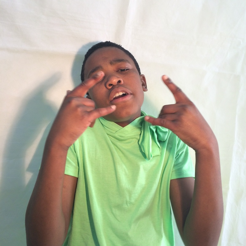
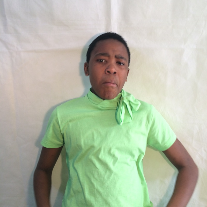
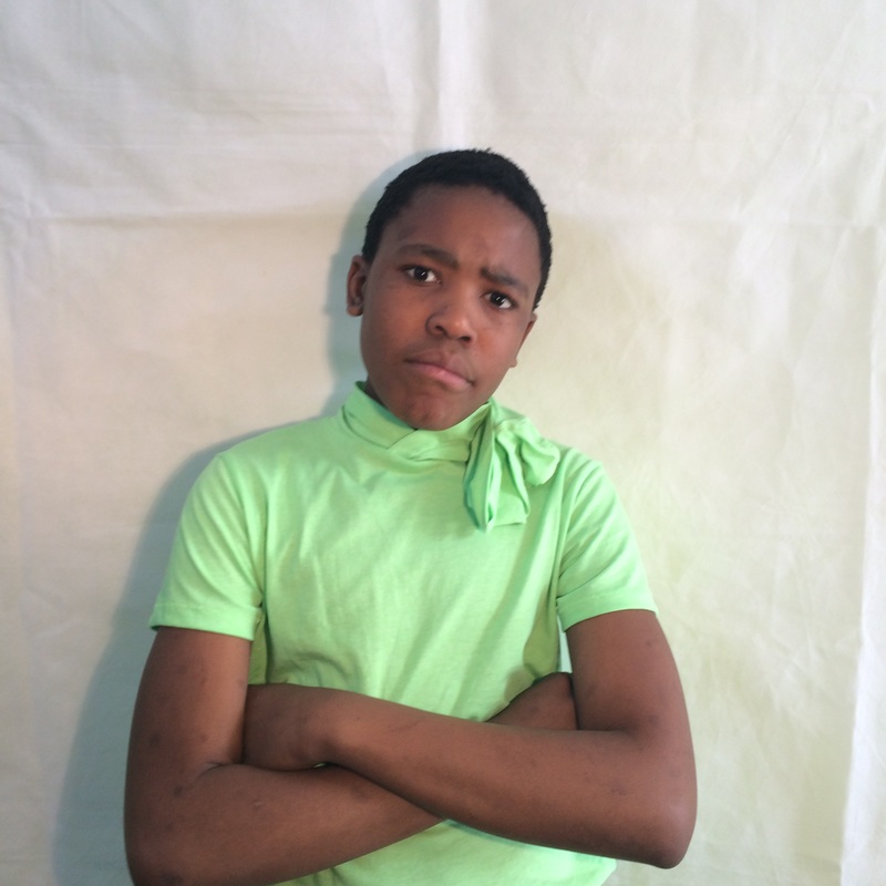
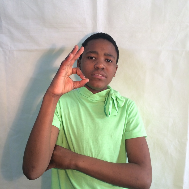
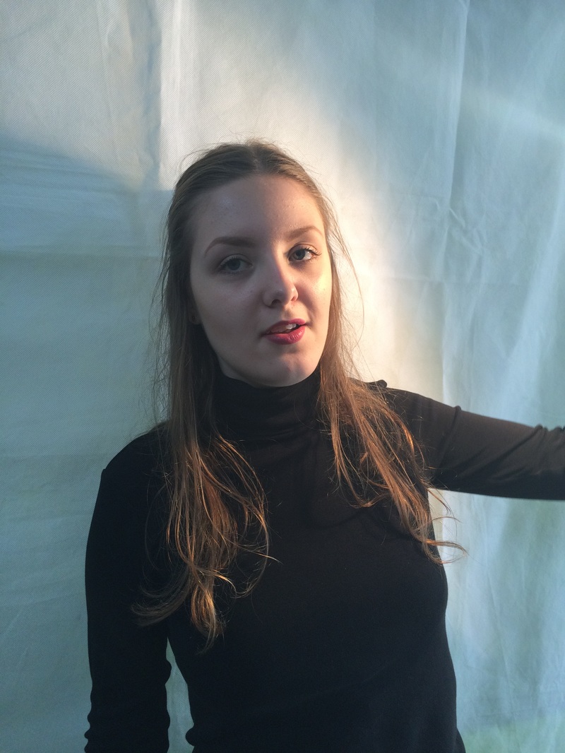
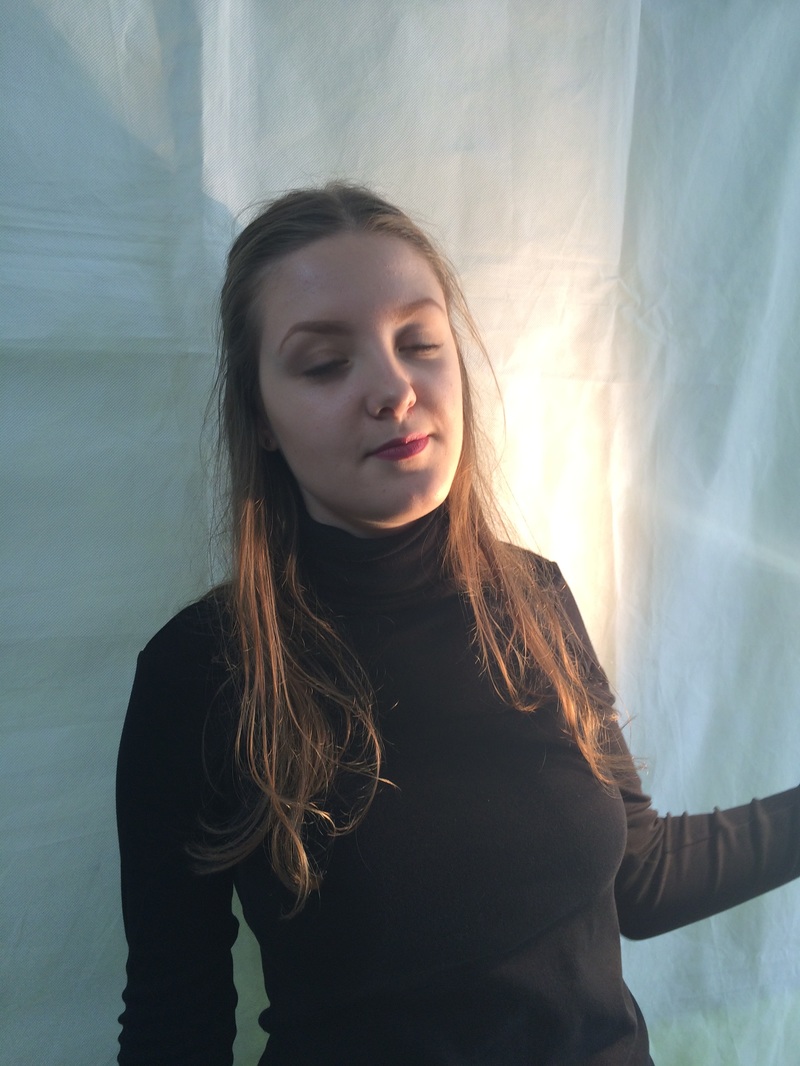
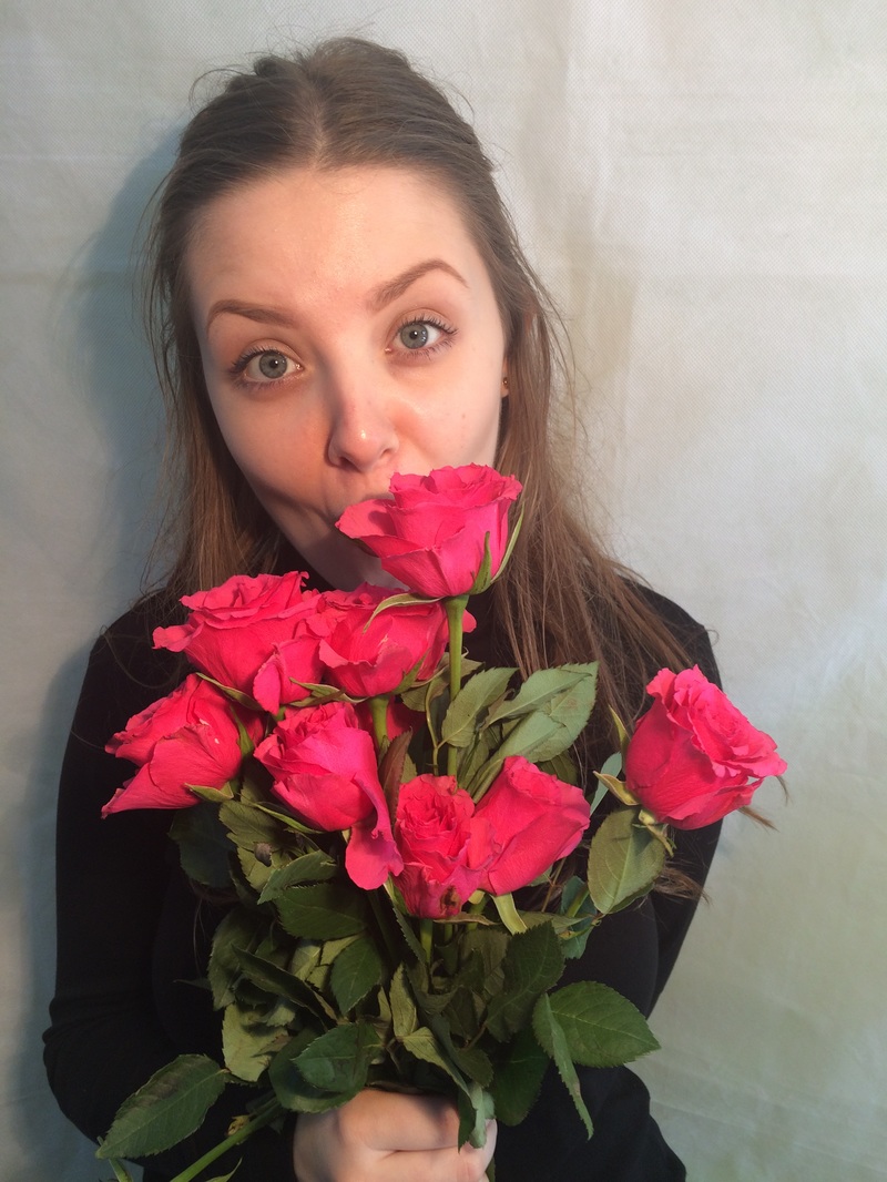
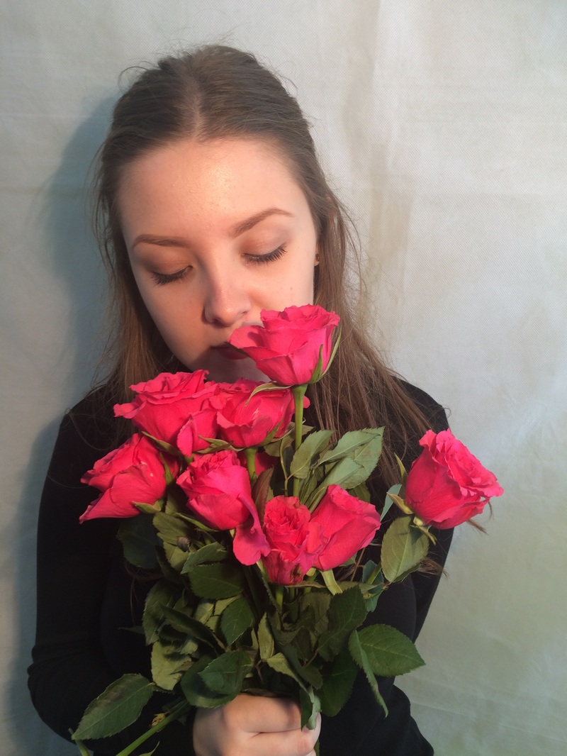
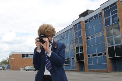
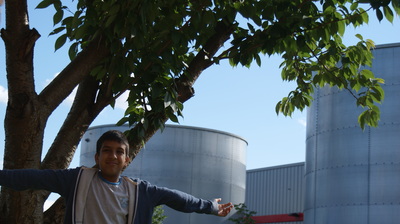
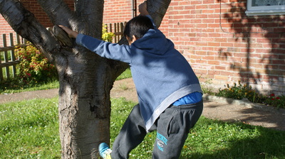
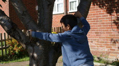
My response to Bryant Enslava


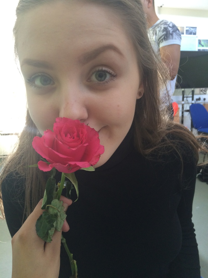
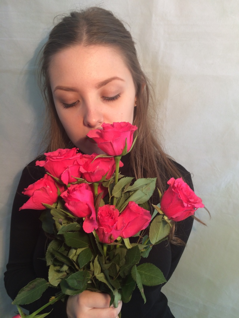
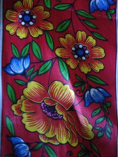
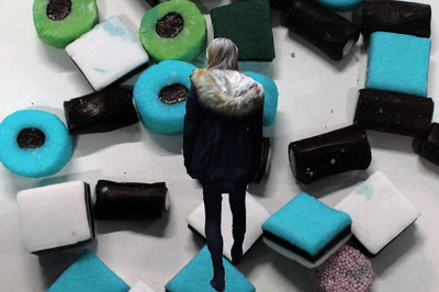
Background Images


Controlled Assessment
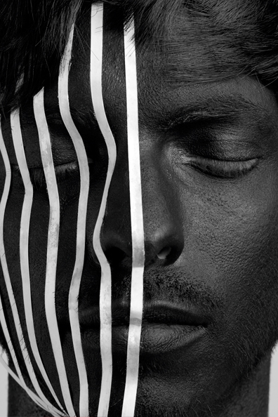
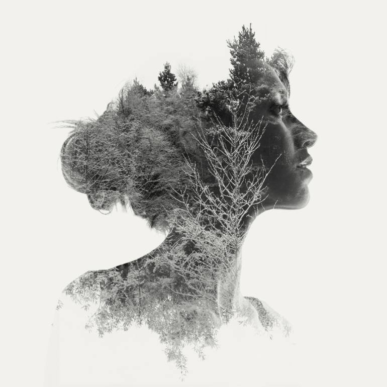
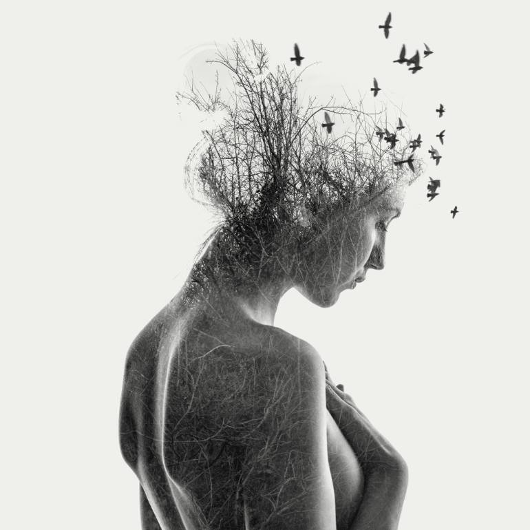
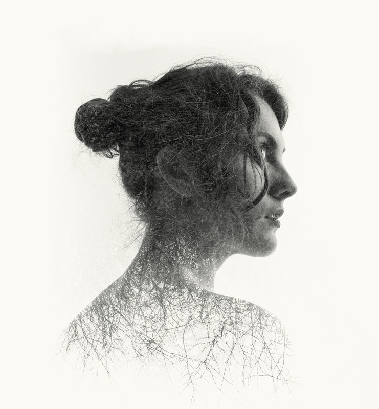
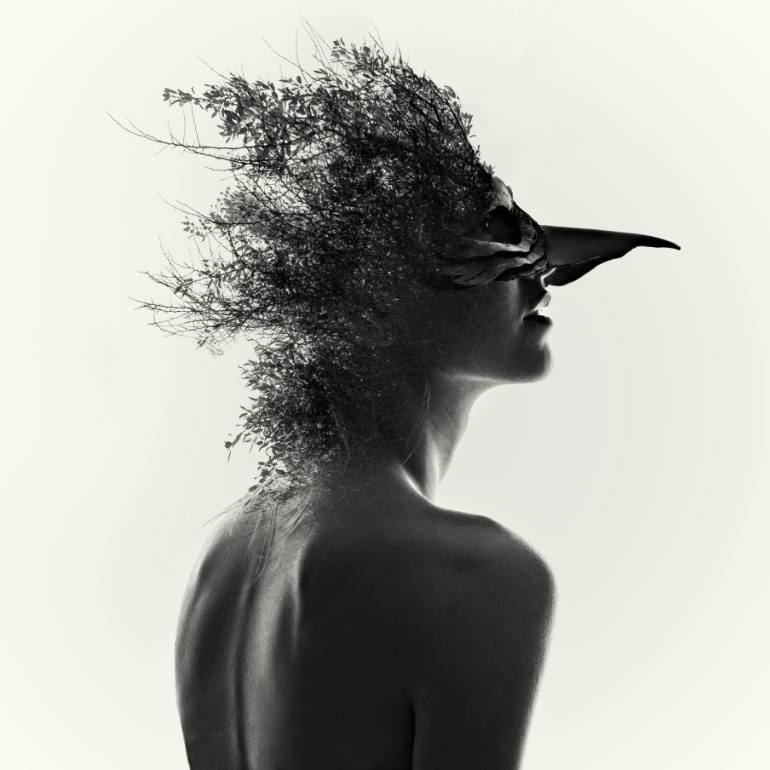
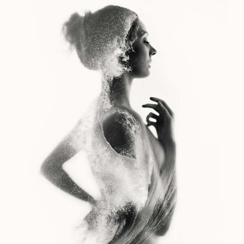
Laurence Winram
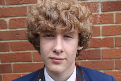
For my final piece, I was inspired by Lawrence Winram because their edits are similar to what I had in mind. I though that these edits would be effective, as it presents the project very well. these are some of my favourite photographs because of the way they are edited.
Controlled Assessment Edits


For my final piece, I was inspired by Lawrence Williams because their edits are similar to what I had in mind. I though that these edits would be effective, as
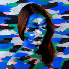
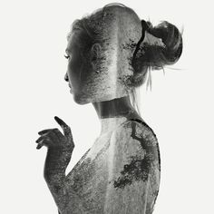
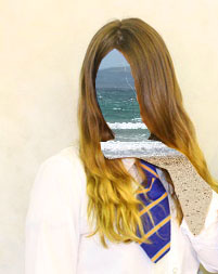
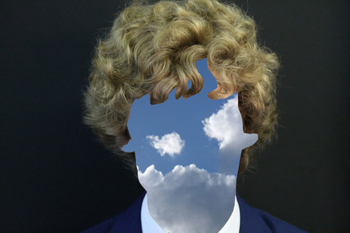
Final Piece
|
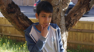
This is my favourite edit because it is different and is quite eye catching. In my opinion, this edit stands out to me the most. This is because I feel like there is a meaning behind it. I think that the person in the photograph’s imagination is incorporated into his personality, and that’s why he was my selected model.
|
