Diary
I have chosen to base my project on the theme of Diary. I have chosen this theme, as I think that I can get some good shots of what I see on an everyday basis. For example, I can get photographs of my friends and family, to show how I'd rather surround myself with positive people and how they're always there for me. I can also include what I encounter everyday and get photographs of the places I visit often.
|

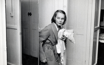
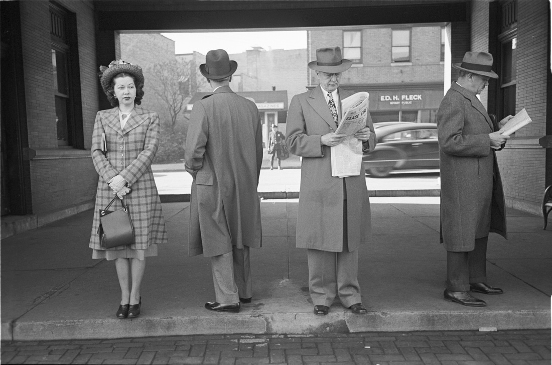
This photograph was taken by Esther Bubley. I like his photography, as they are iconic and modern, but old fashioned.
|
|
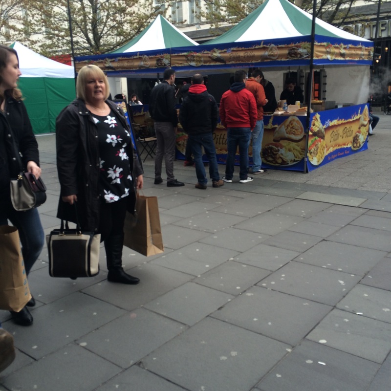
PlanI believe that social media has had a huge impact on society today, so I feel like I could produce some powerful and meaningful photographs, that could represent the behaviour of teenagers, and the way they document everything through social media.
The photographers that have influenced me are Esther Bubley and Richard Sandler. This is because their photography stands out to me and are actual representations of a diary. |
Esther Bubley
Esther started off as a photojournalist, using photos to tell her story. She photographed her share of celebrities, such as, Albert Einstein, Sherry Lewis, and Bennie Goodman, but she really preferred photographing ordinary people. She was a thriving professional, she travelled the world, photographing stories for popular magazines. Bubley, like most great photojournalists, found her art in everyday lie and successfully balanced her artistic ambitions with the demands of commercial publishing. Ester was an inspiration to the photojournalist community because she was capable of creating striking modernist patterns in black and white and colour using technology in challenging conditions.
|
How has she Influenced me?Bubley has influenced me because I like the way her photos are taken, as they're old fashioned and show what society was like back then. This has influenced me to take some photos that present today's society and how everyone relies on technology to do everything for them. I also enjoyed looking through her photographs, because they were very meaningful in the point that Ester was trying to put across about society and how it effects each individual in different ways.
|
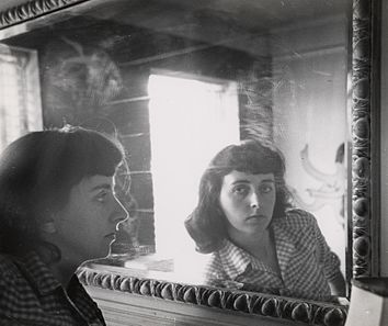
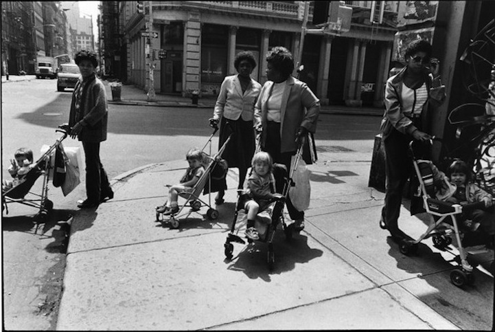
Examples of Esther Bubley's Work

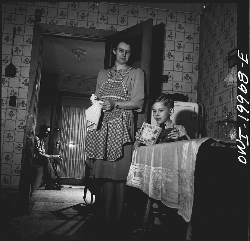
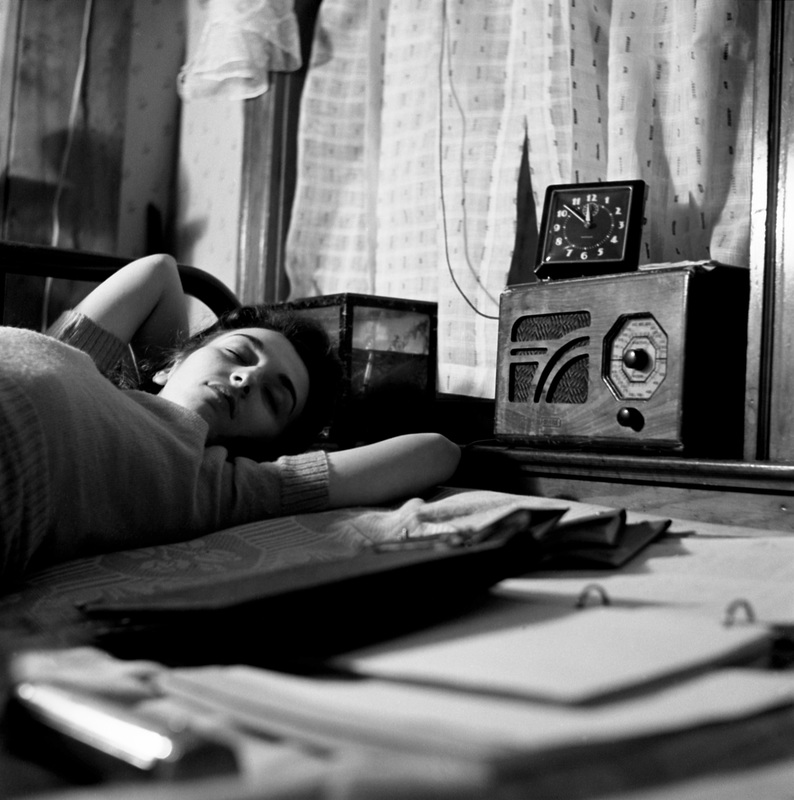
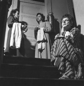
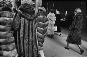
This is my favorite photo by Bubley, because I stands out to me. This is because it represent women in the old days, as they're holding towels, signifies that they're doing house work, which is what women were expected to do.
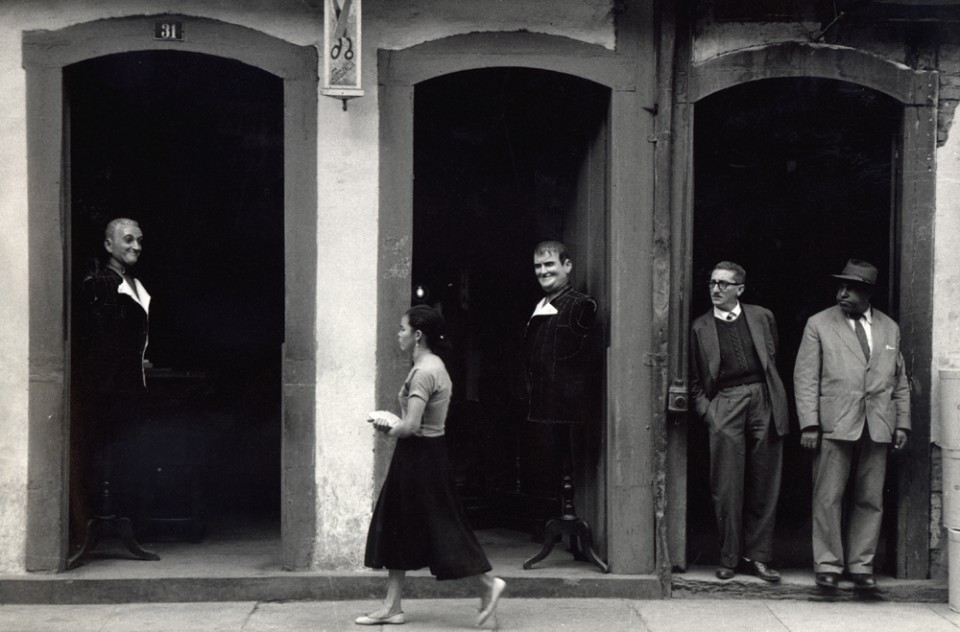
The angle of the photo is effective because it implies a hierarchy, as the girl on the bottom step is alone and the other two are together at the top.
The black and white effect can represent the lone girls' feeling towards being isolated from the others.
The angle of the photo is effective because it implies a hierarchy, as the girl on the bottom step is alone and the other two are together at the top.
The black and white effect can represent the lone girls' feeling towards being isolated from the others.
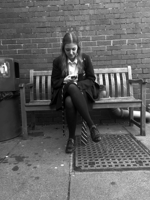
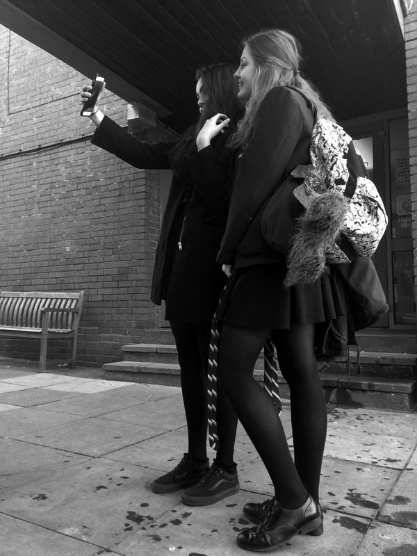
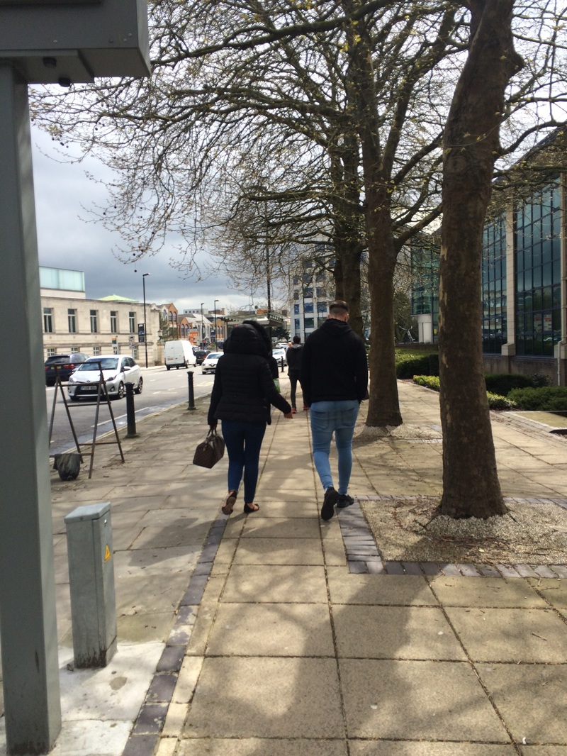
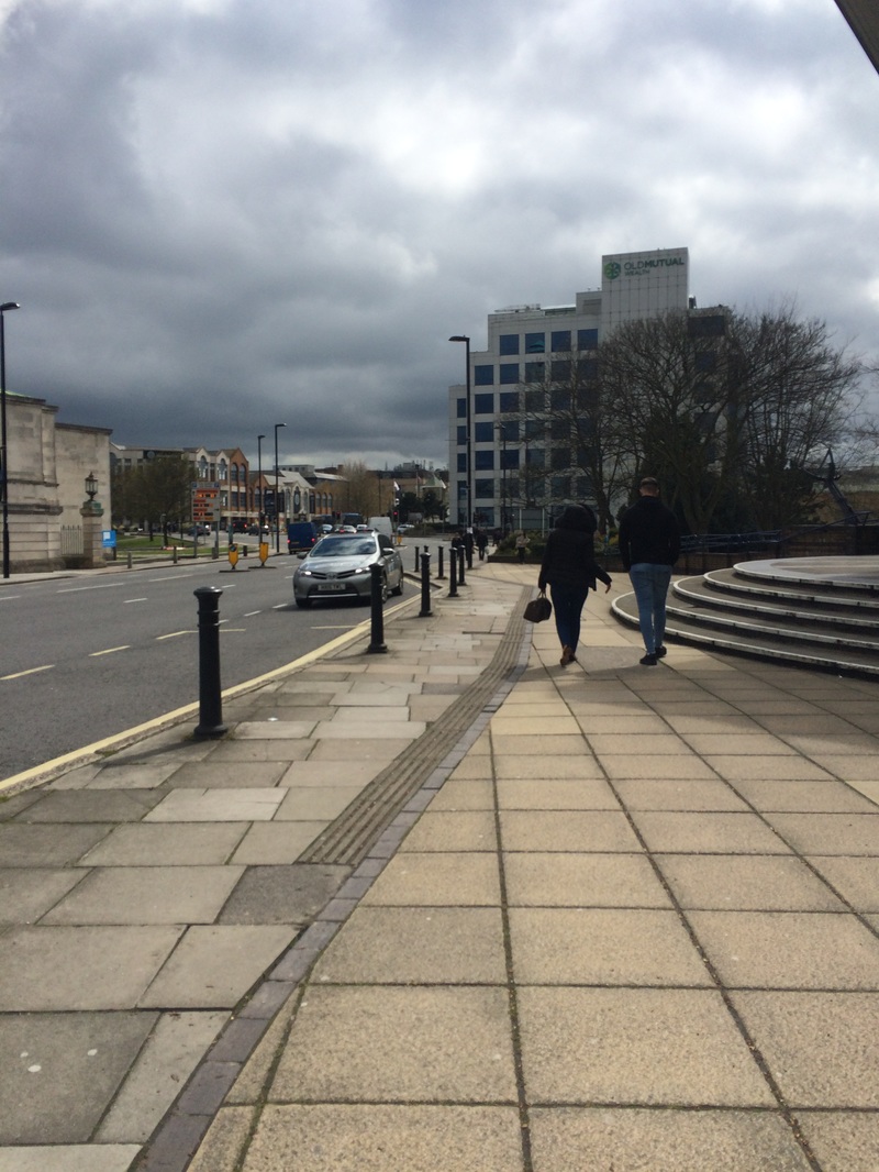
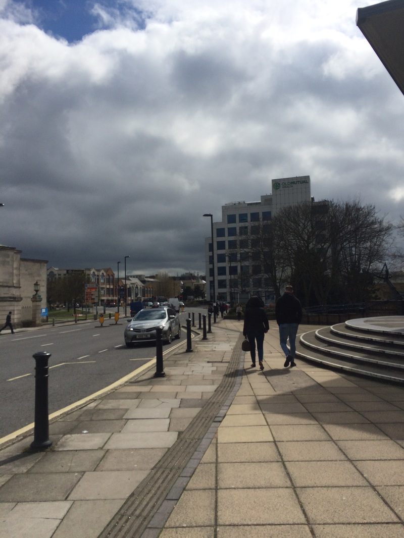
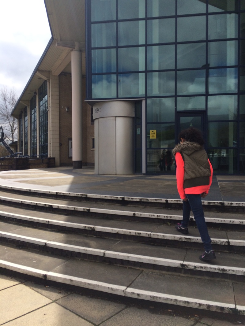
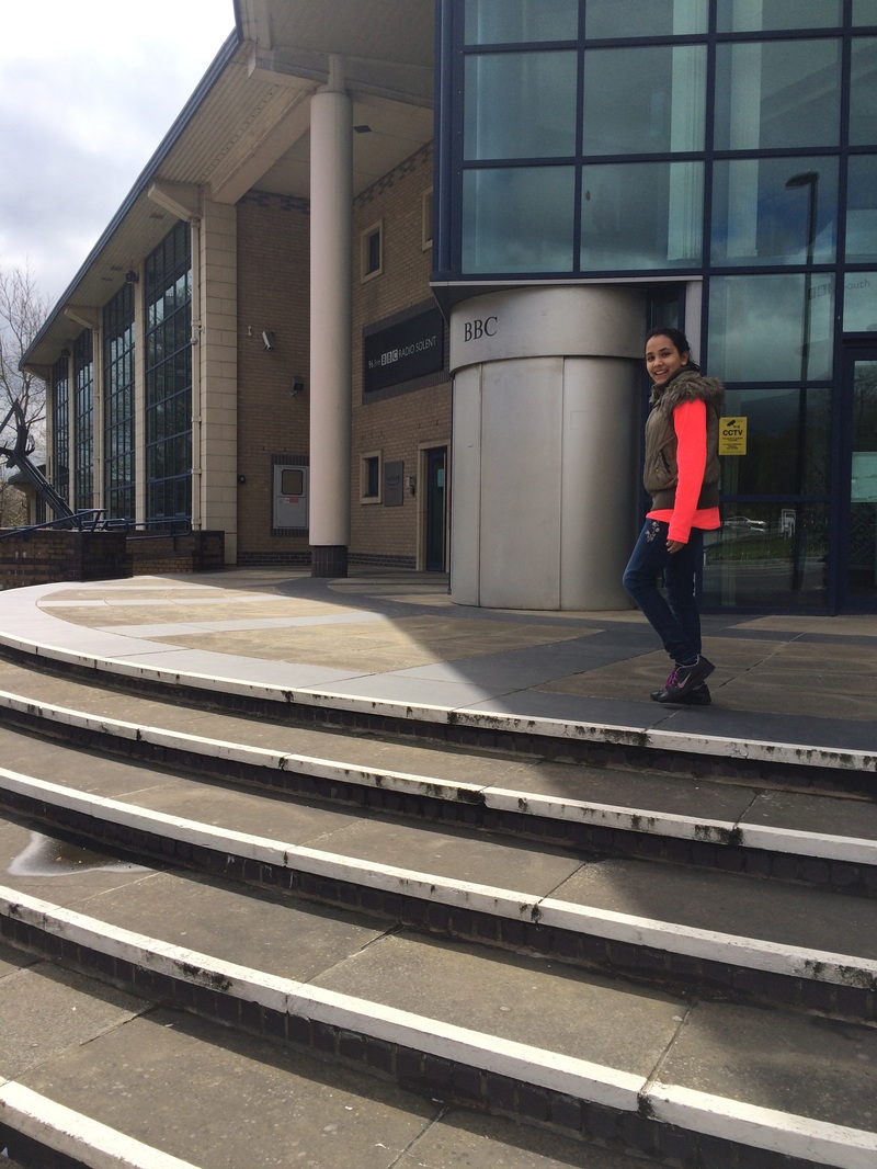
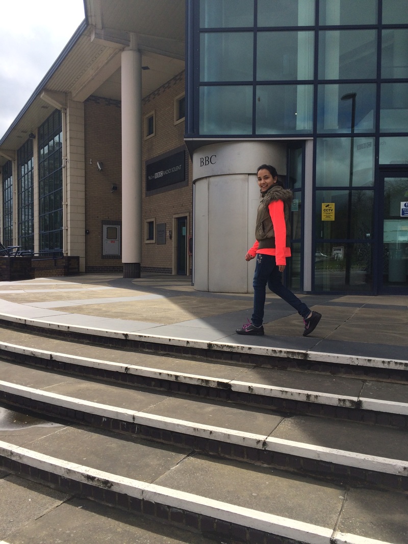
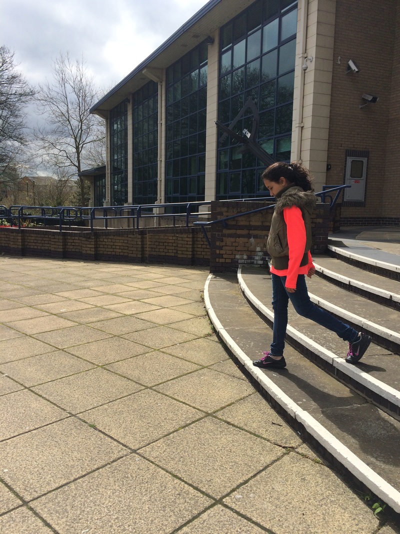
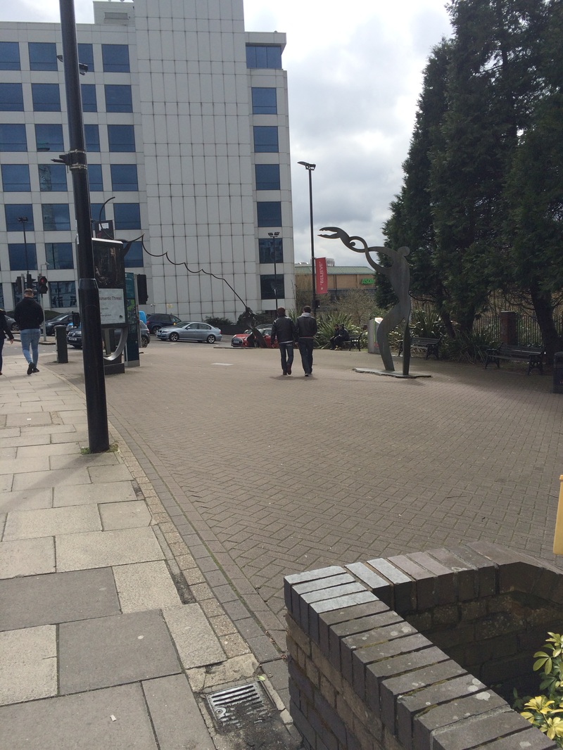
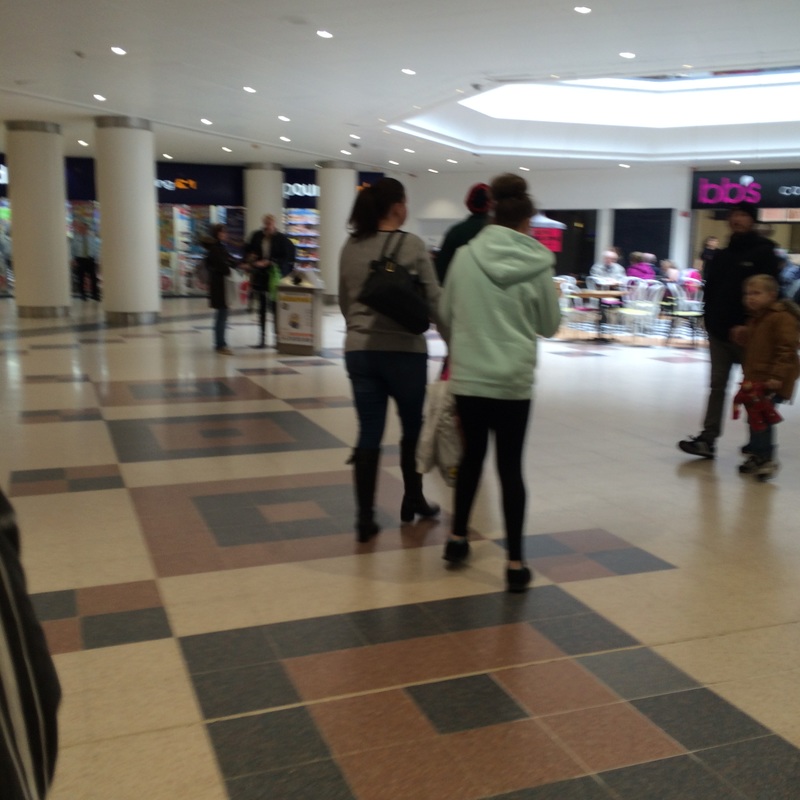
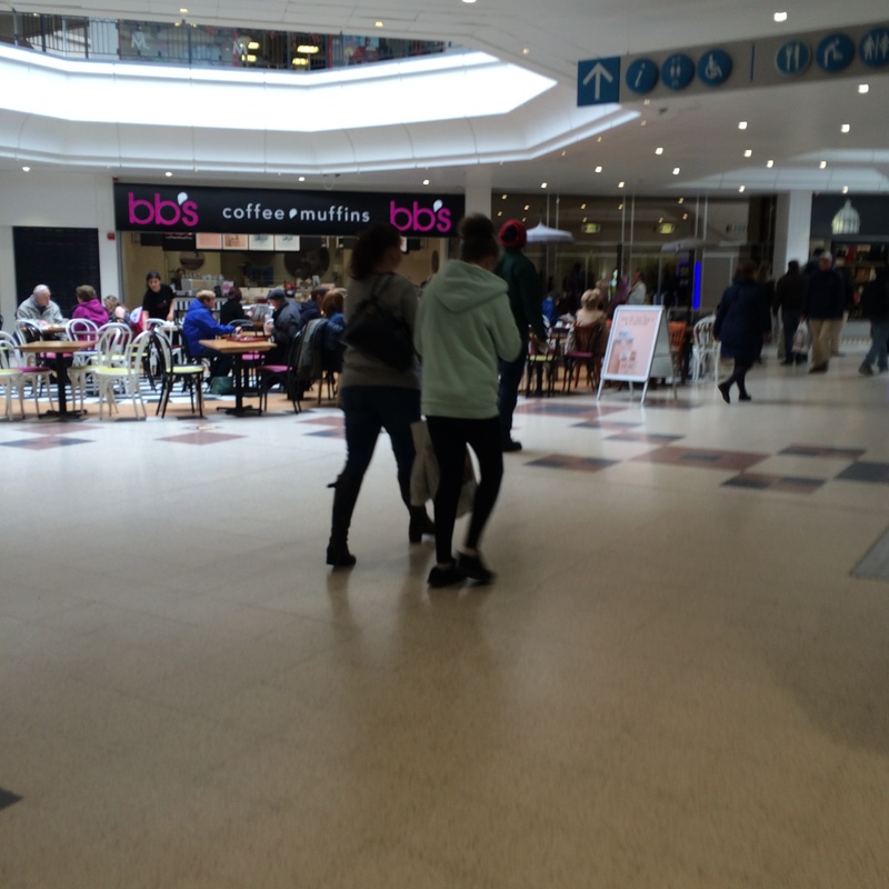
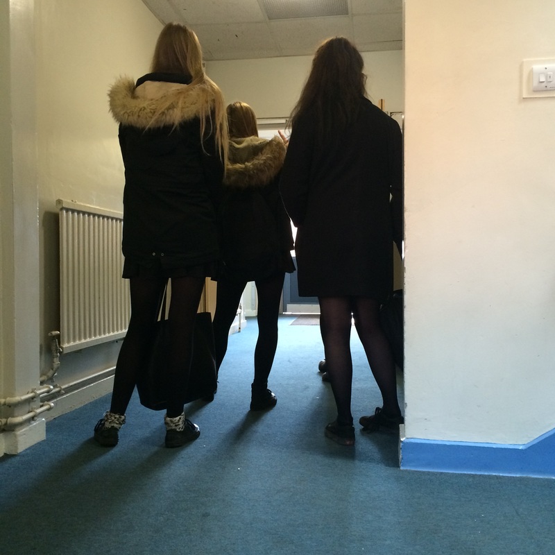
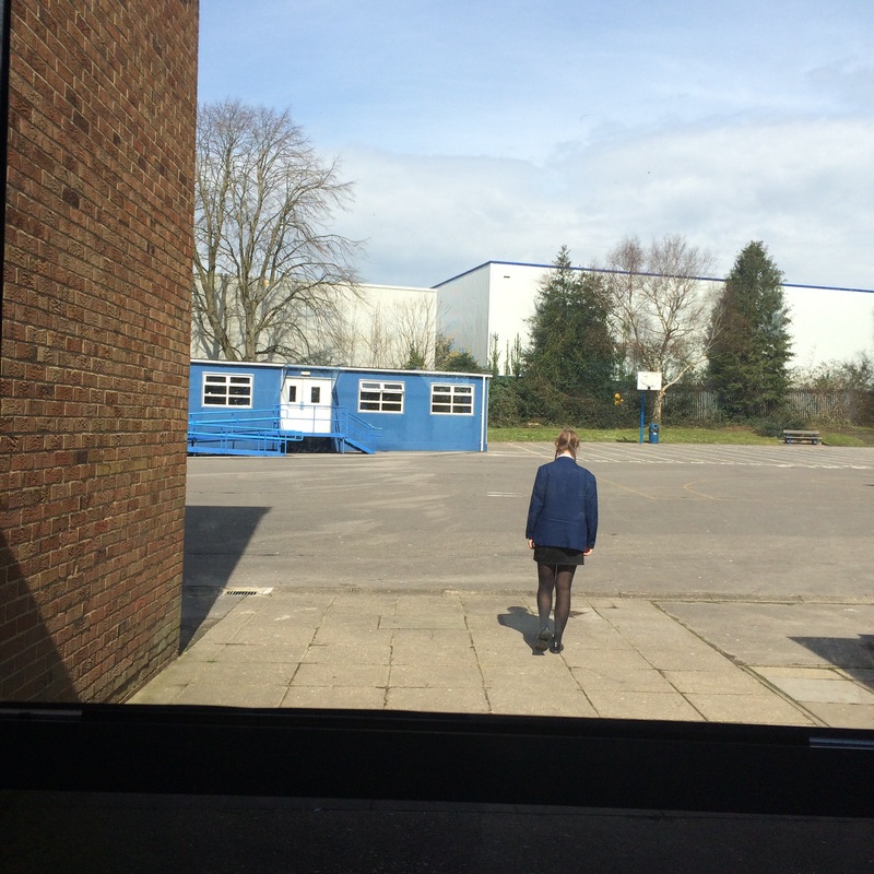
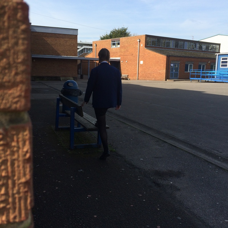
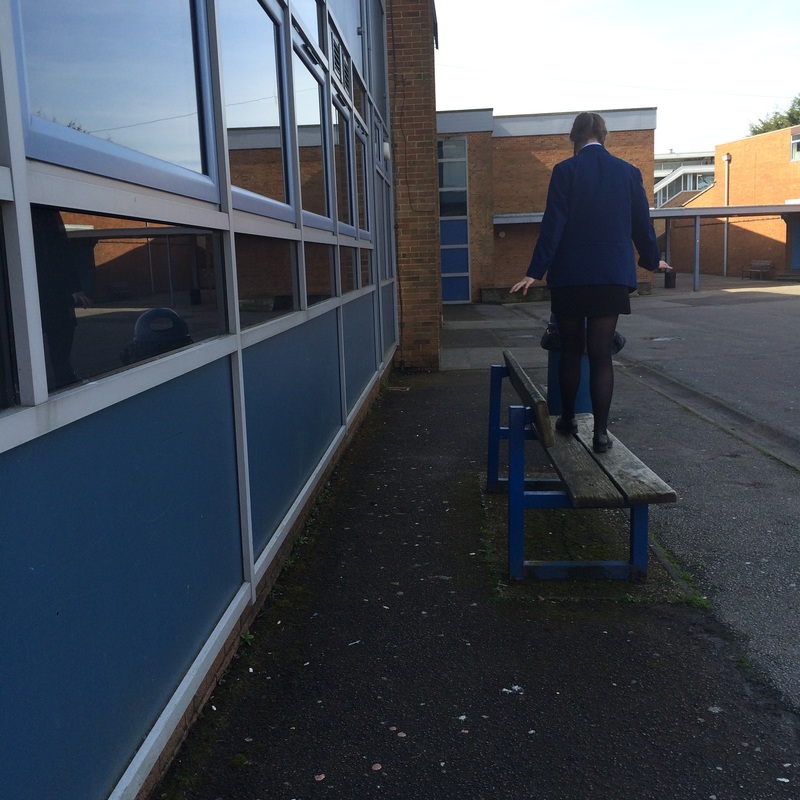
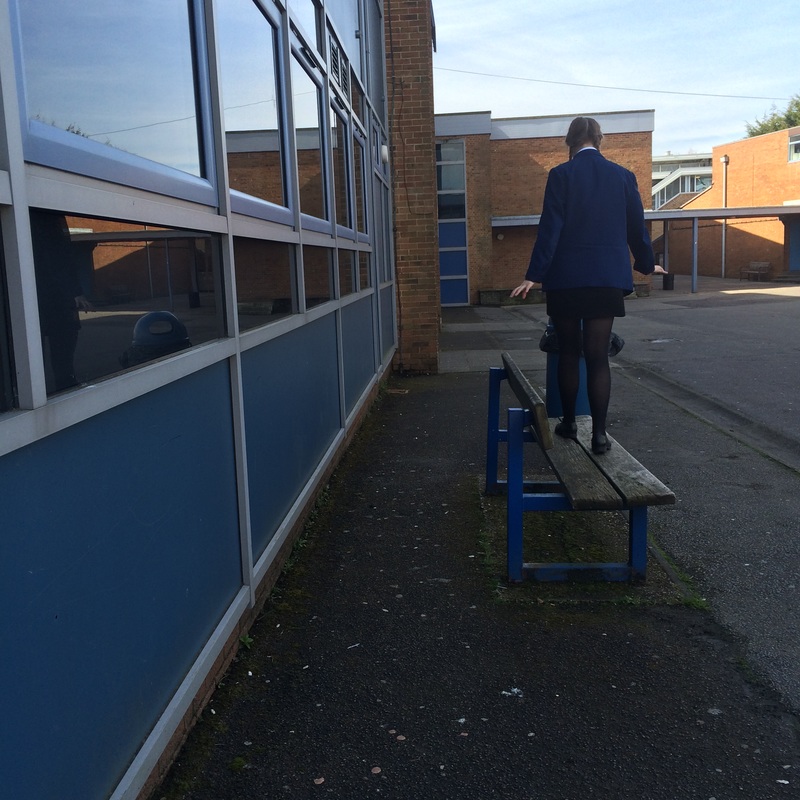
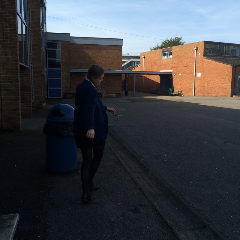
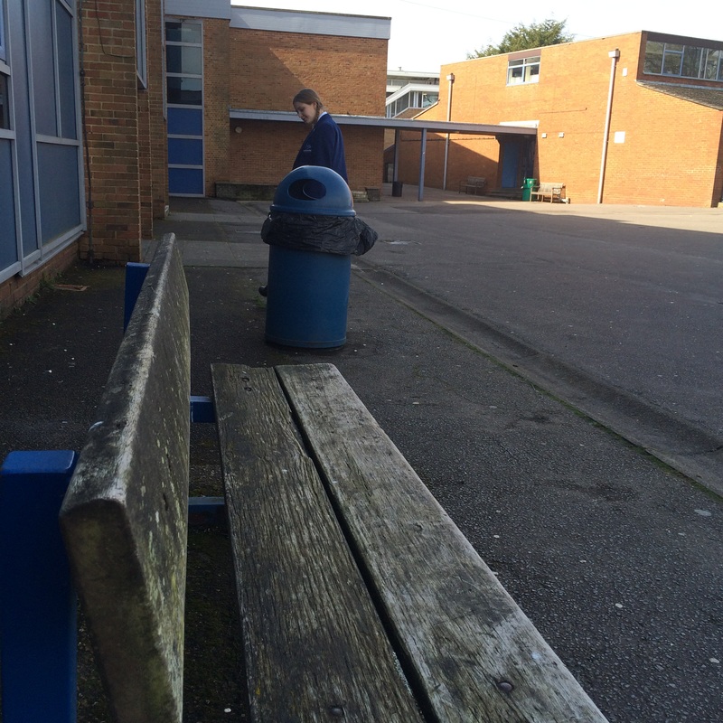
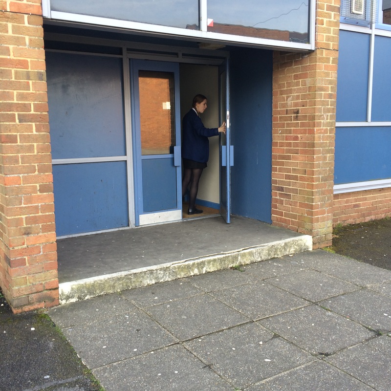
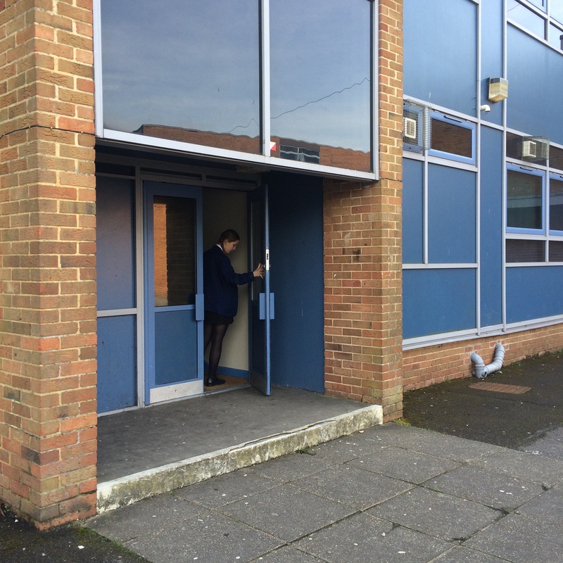
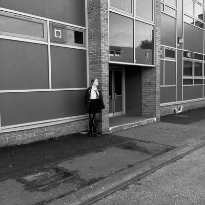
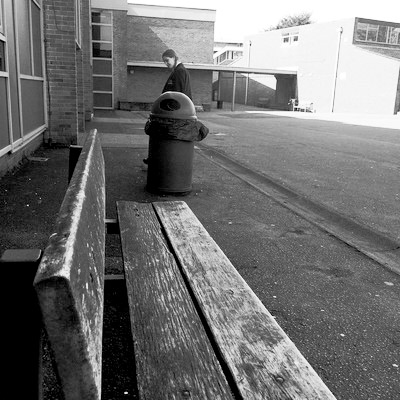
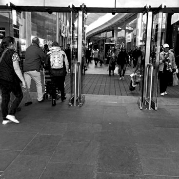
Photo Shoot in Response to Esther Bubley
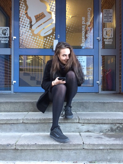
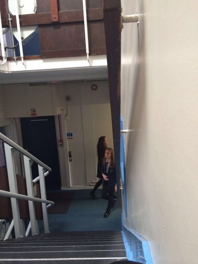
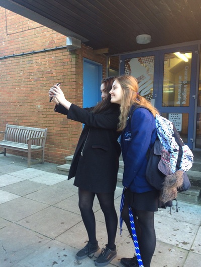

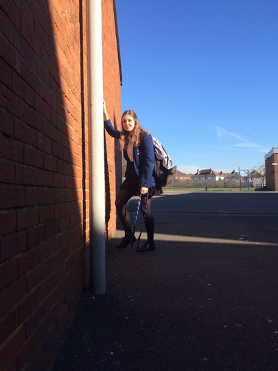
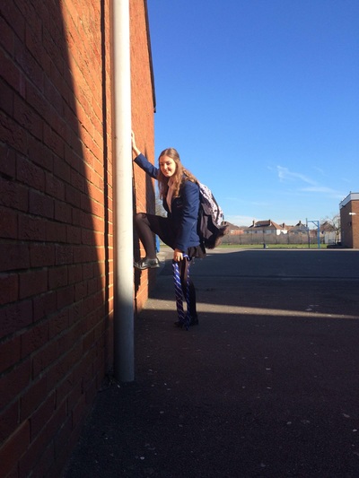
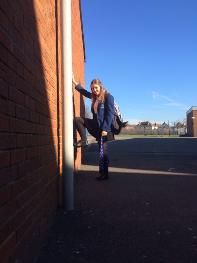
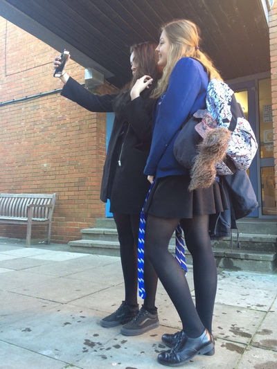
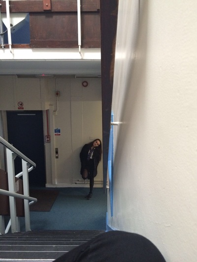
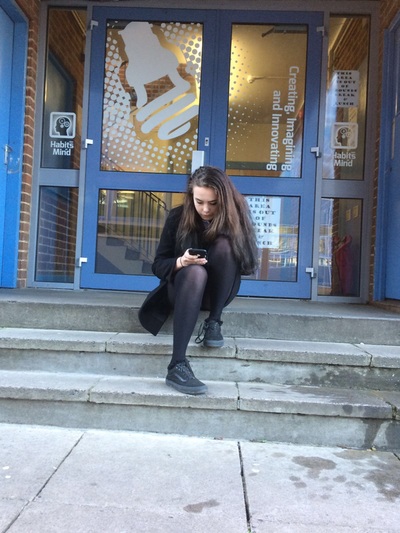
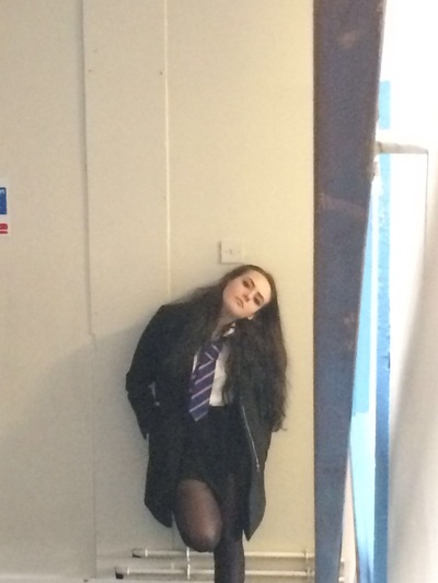
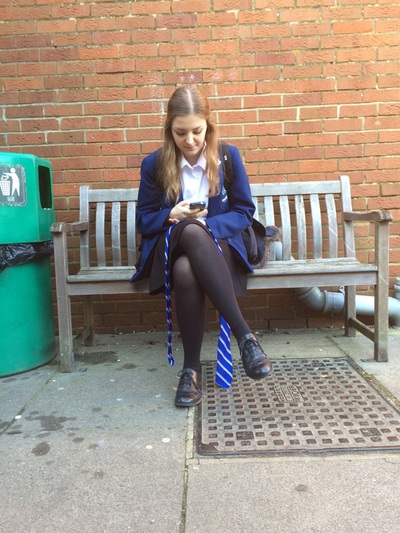
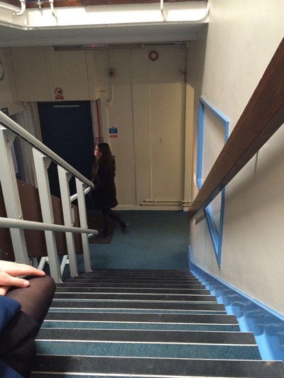
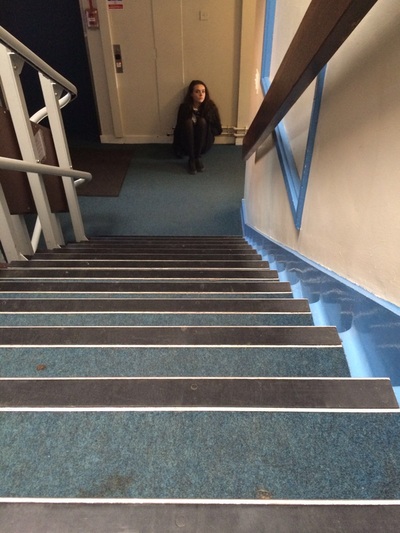
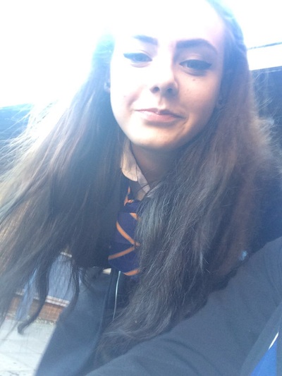
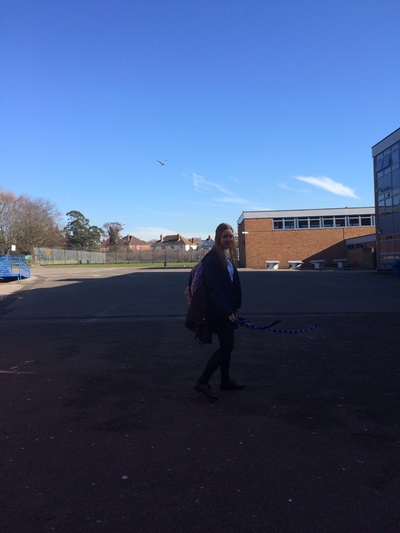
Photo Shoot Edits
To give some of the photos a more 'Esther Bubley' effect, I used Photoshop to edit the pictures, to make them more in the style of her work. i made the photographs black and white, to represent Esther's work and to give an 'old fashioned' effect.
How I Edited the Photographs
Using Photo Shop, I edited the photographs so they look similar to Bubley's work. Fist, I selected the picture that I wanted to edit. I then made it black and white, as most of Esther's edits are the same. I then adjusted the brightness and contrast and the curves to make the picture bolder or lighter i different areas, to give them an old fashioned feel.
|
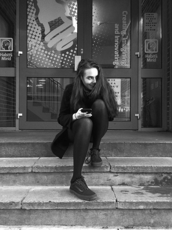
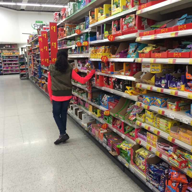
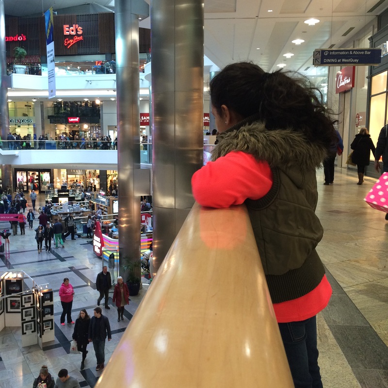
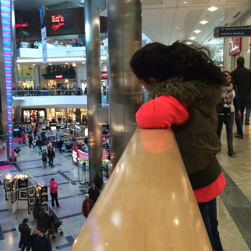
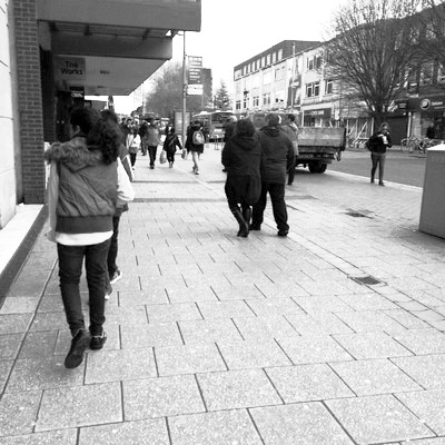
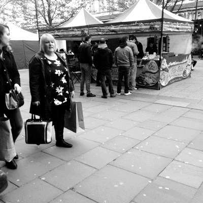
This is my favourite photograph from this photo-shoot because I think that the lighting looked natural and the angle of the camera was at its best.
It also matches my theme very well, as it portrays the image that society now a days is all about looks rather than personality, and how many followers or likes you get. It also shows how young teenagers spend their time when they're together, which is using technology, rather than communicating in real life. |
|
Richard Sandler
|
Richard Sandler is a New York based photographer and journalist. he began photographing the streets of New York, tapping into the pulse of the 80s. He believed in recording his time and looking for trends, which is what his work is inspired by.
|
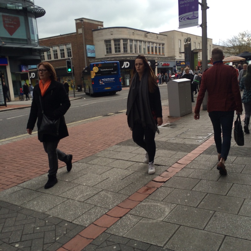
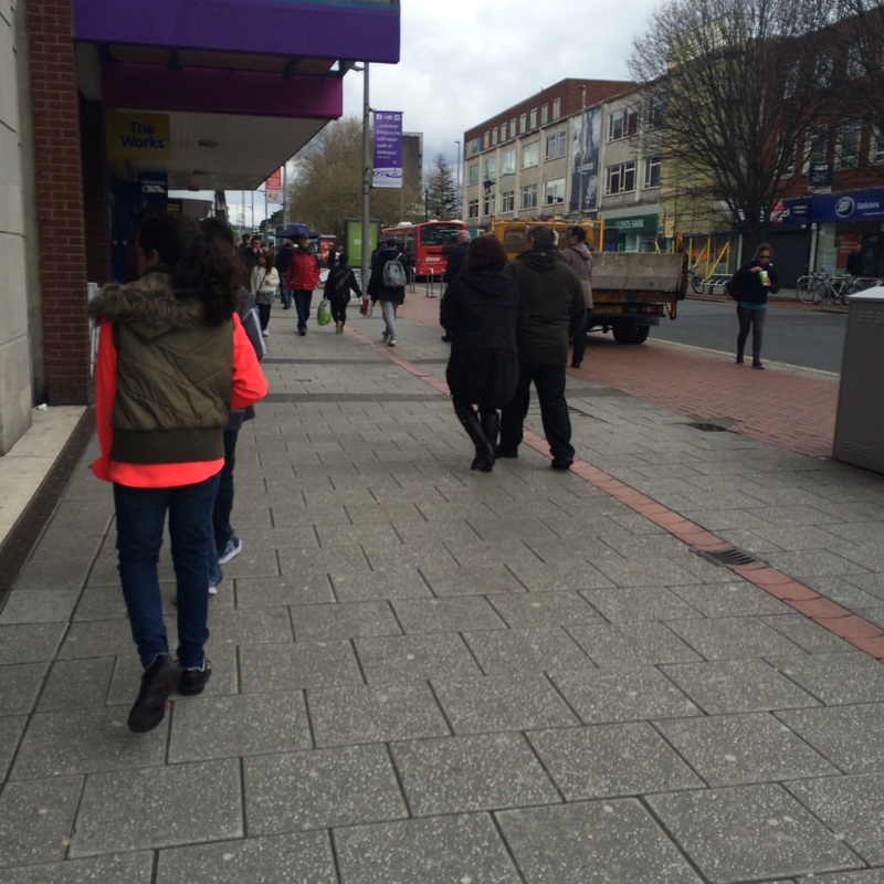
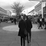
Sandler has influenced me to create some street based photography, because I like the way his photos are taken and how he uses them effectively to show the interesting side of the streets. The thing that intrigued me most, what the way they were all in black and white, to show the era of time, and how different their society was compared to ours today.
|
For my final piece, my plan is to produce an A3 board with my best edits and a comparison with two photos edited differently. to do this, I will need to use photo shop to edit my photographs and
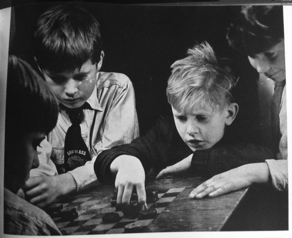
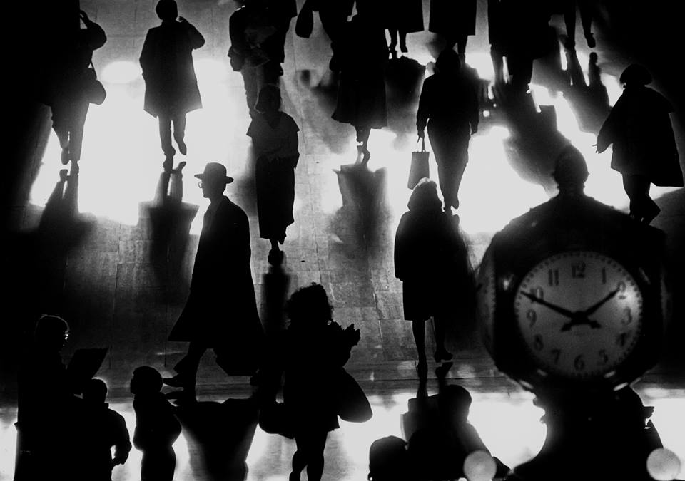
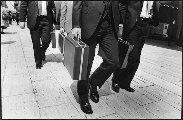
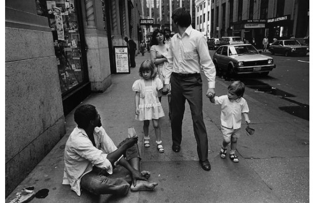
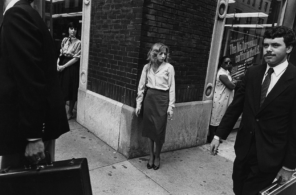
Examples of Richard Sandler's Work
Here are some of my favourite photographs that have been taken by Sandler:

|
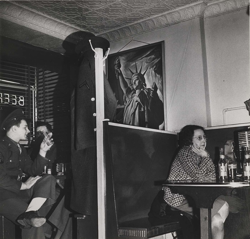
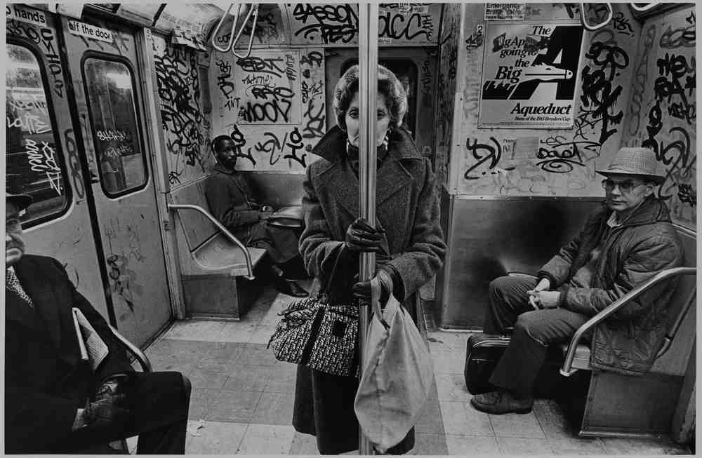
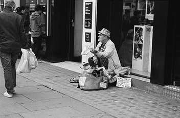
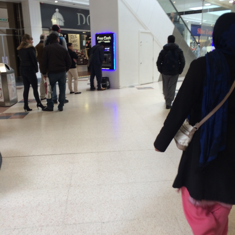
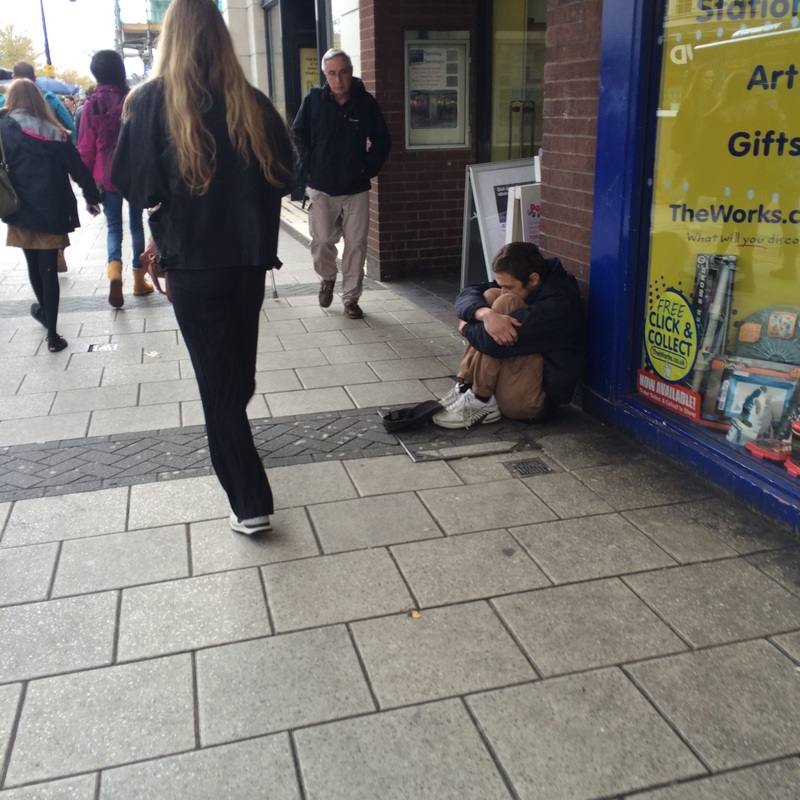
This is one of my favourite photos by Sandler, as it has a meaningful purpose to it. Richard is portraying that the less fortunate people are constantly being ignored, even though they are being seen by the people that go by.
The angle of the photo also shows a man looking down upon the homeless person and not doing anything. there are also people on the side at a cash machine and are not too bothered about the man that is sat near them begging for money. |
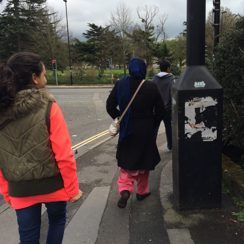
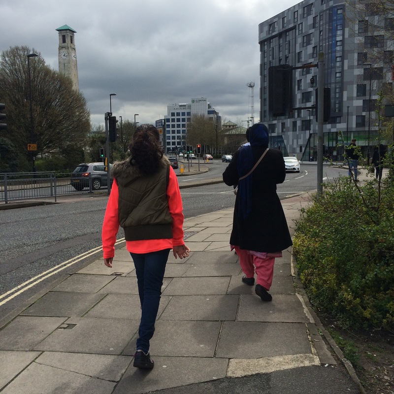
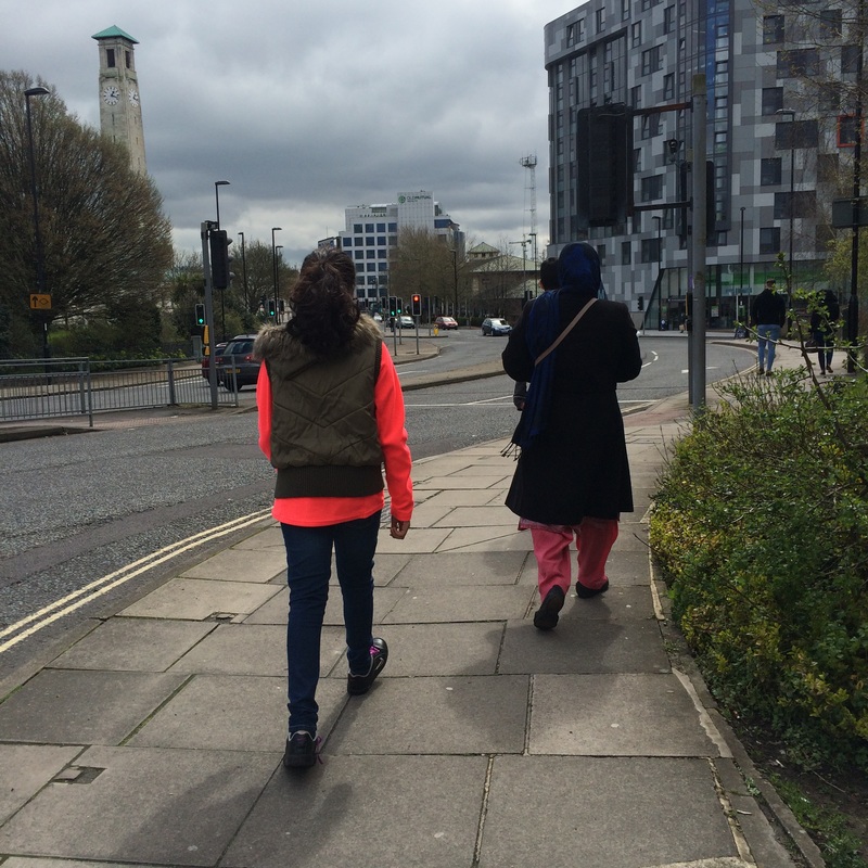
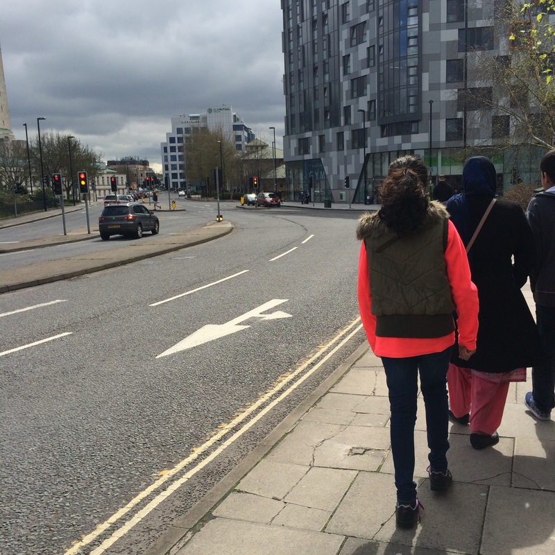
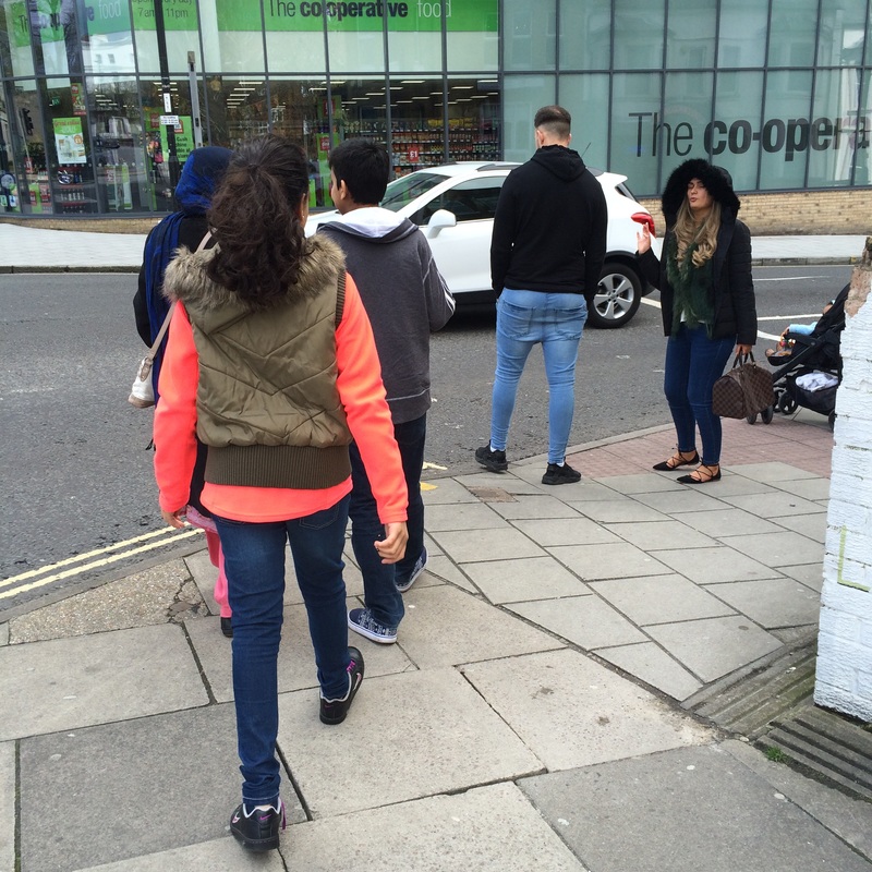
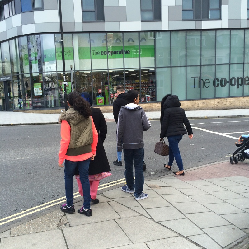
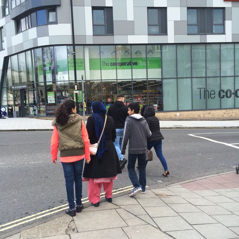
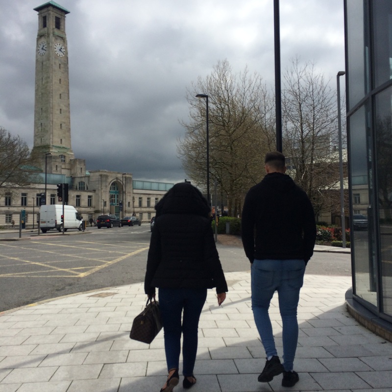
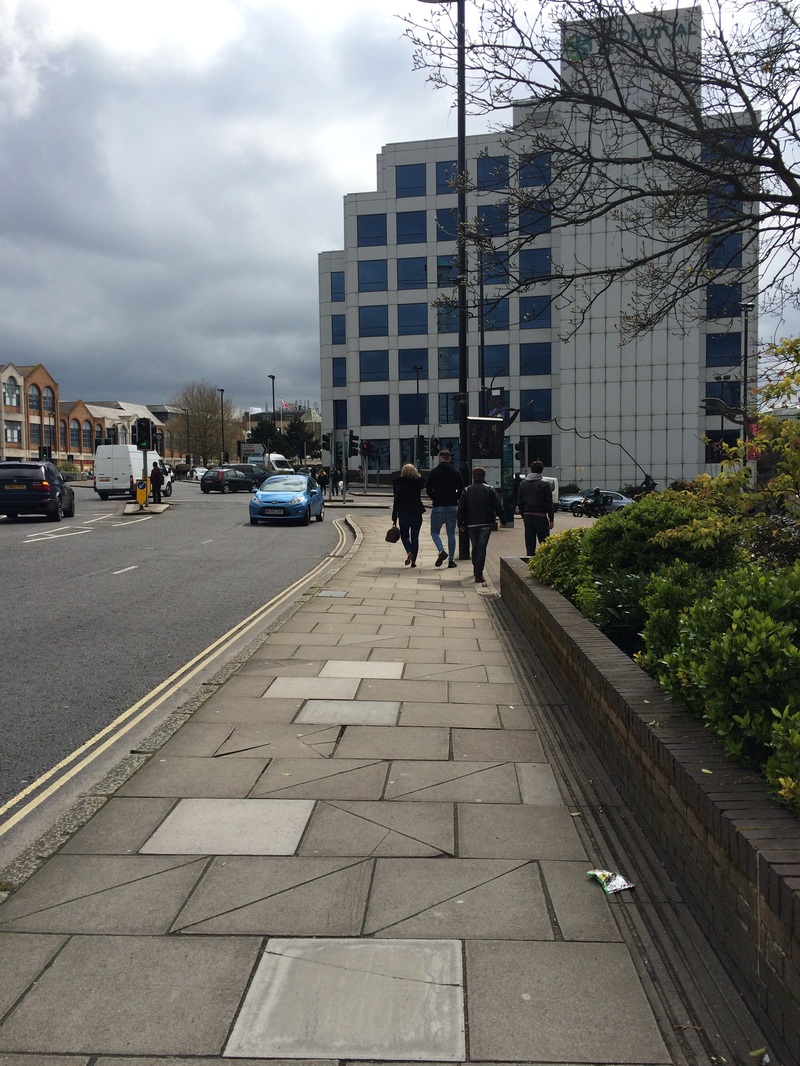
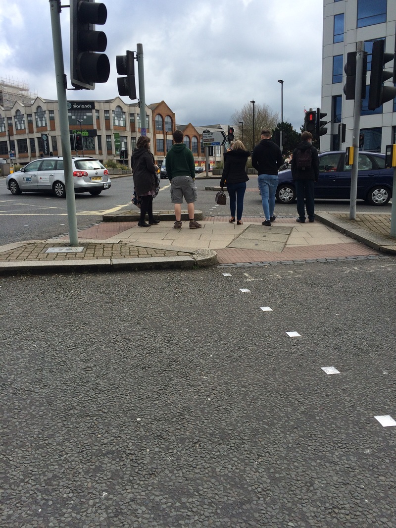
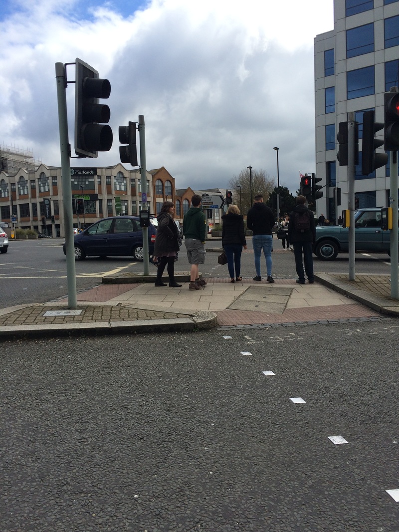
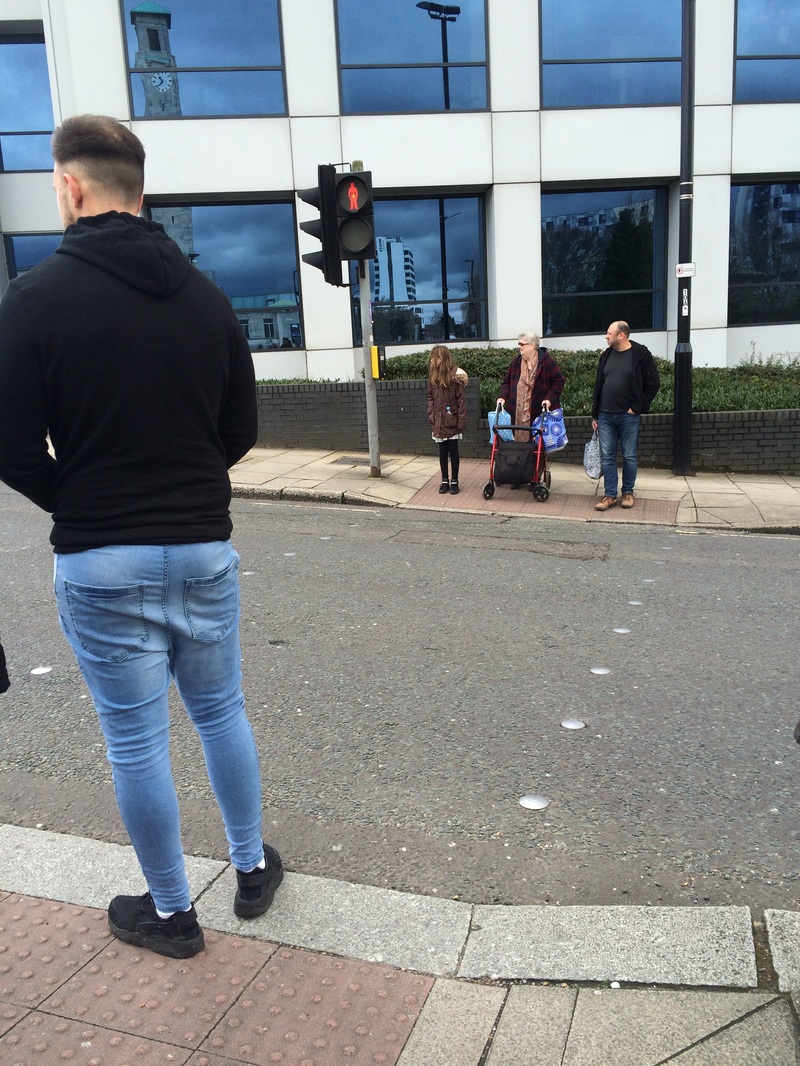
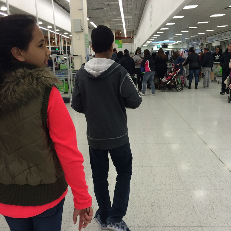
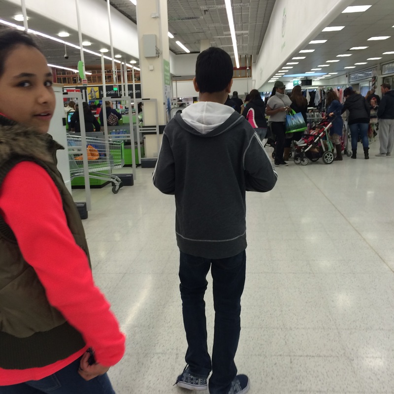
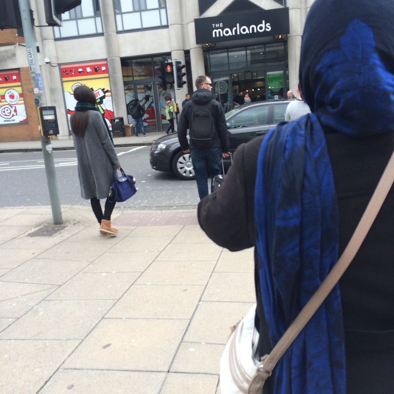
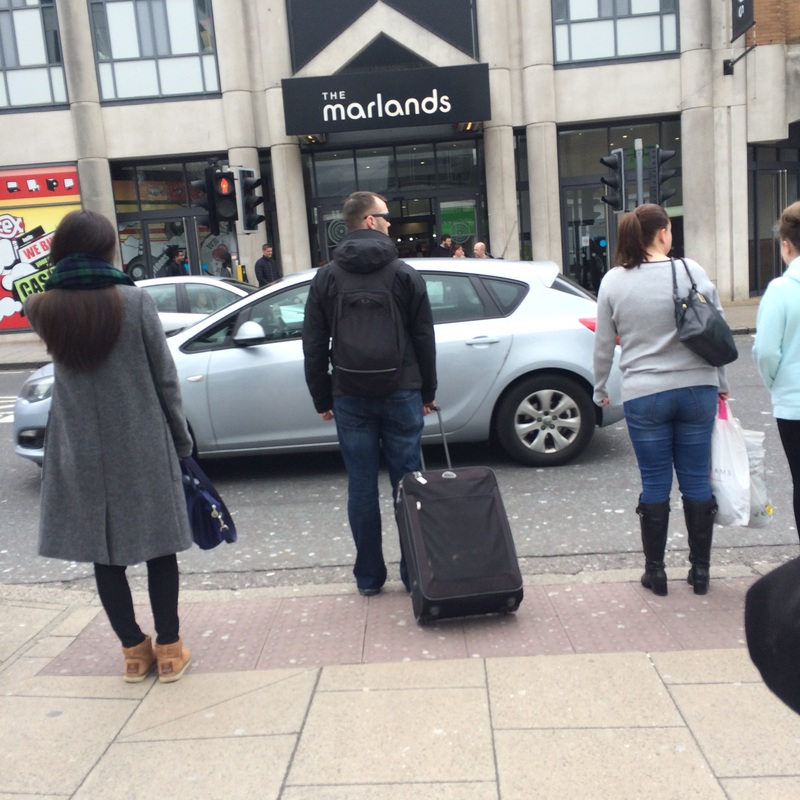
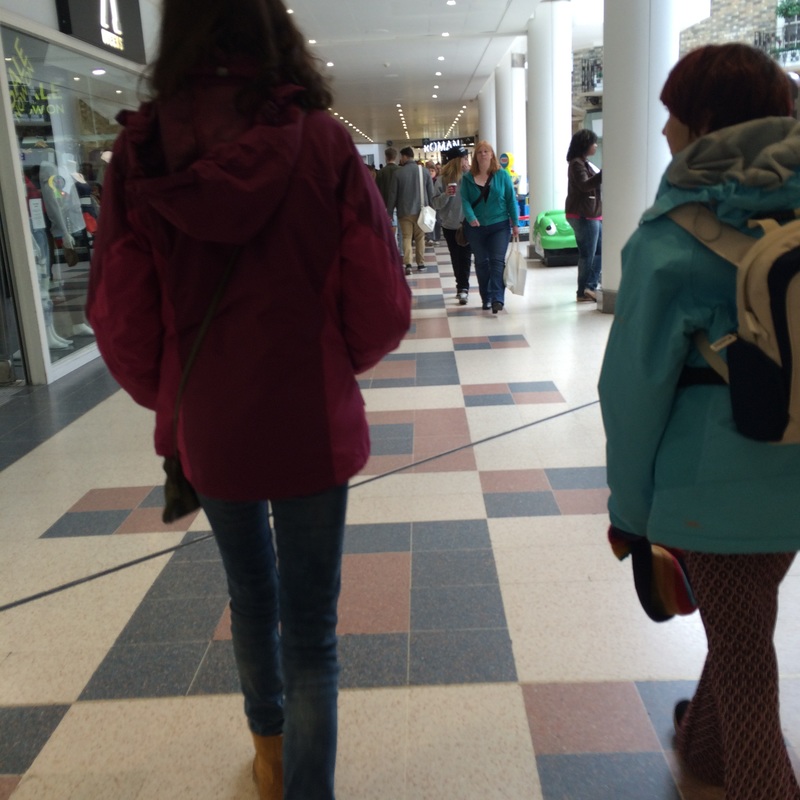
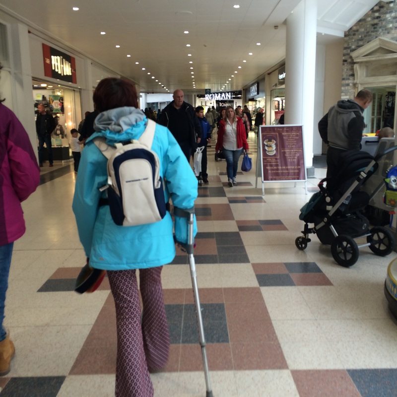
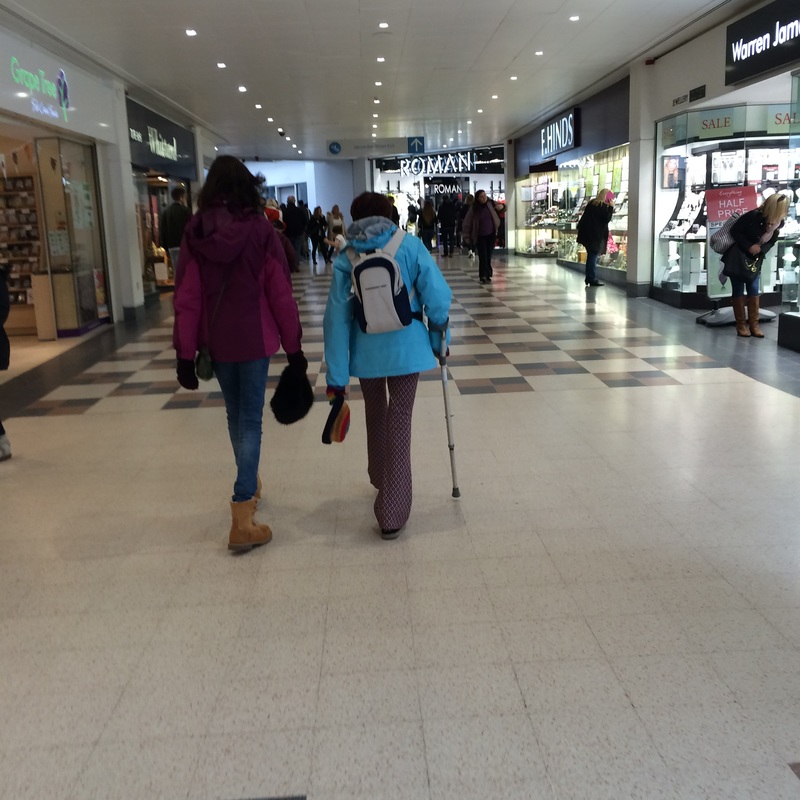
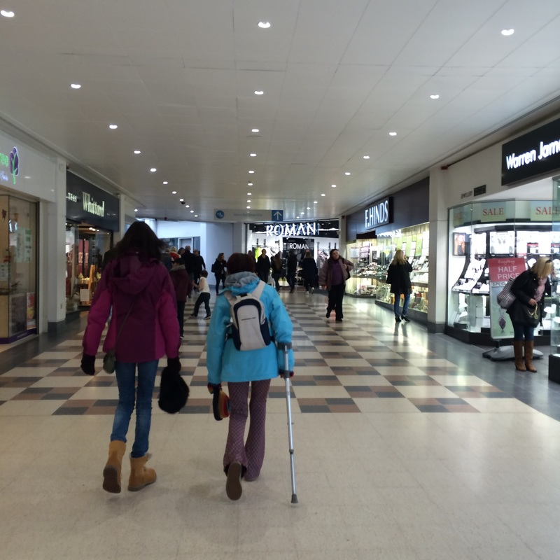
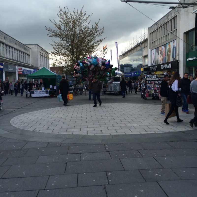
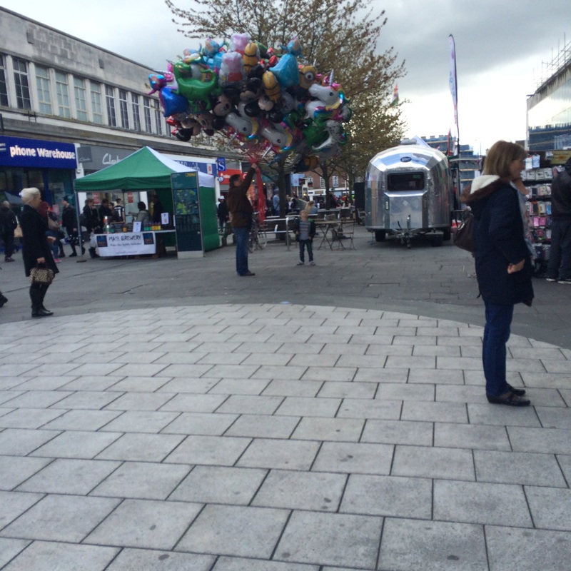
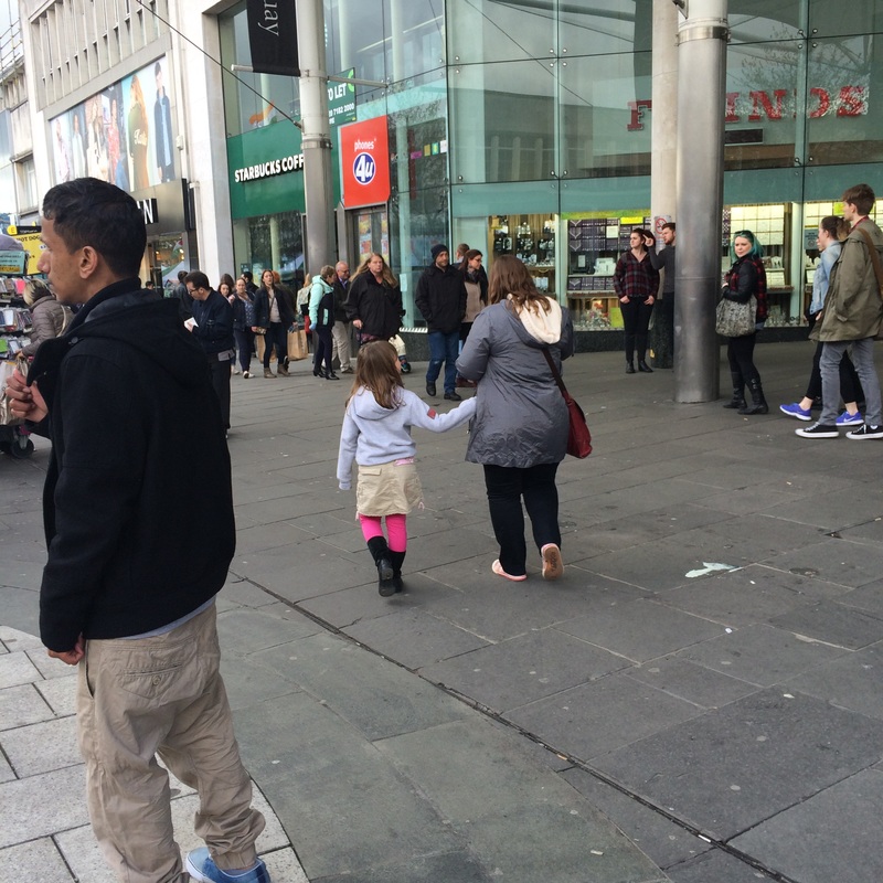
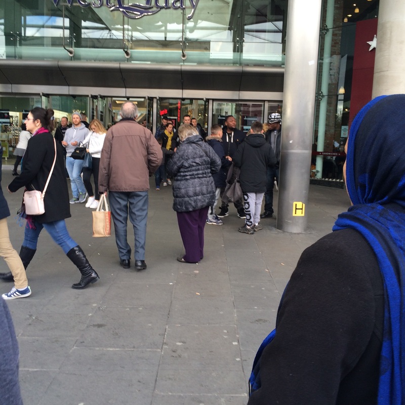
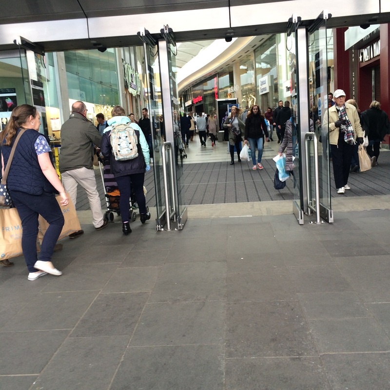
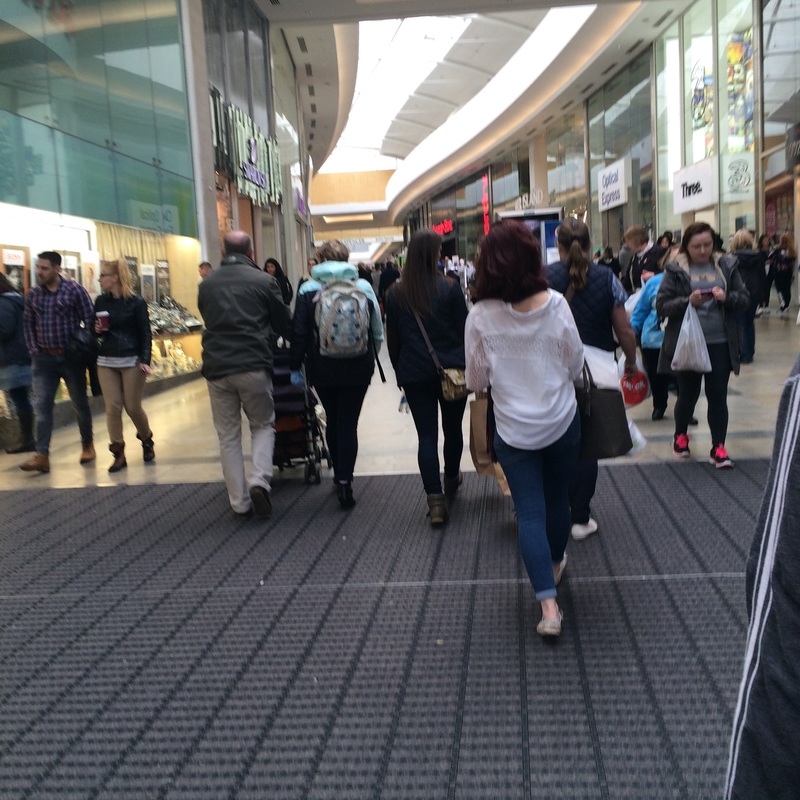
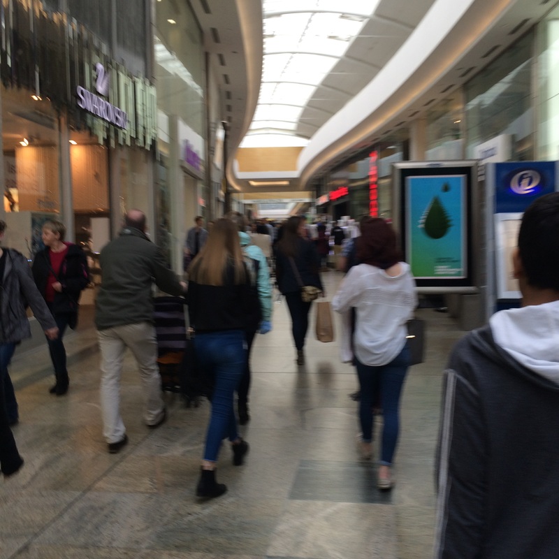
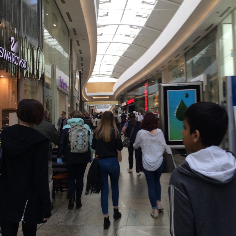
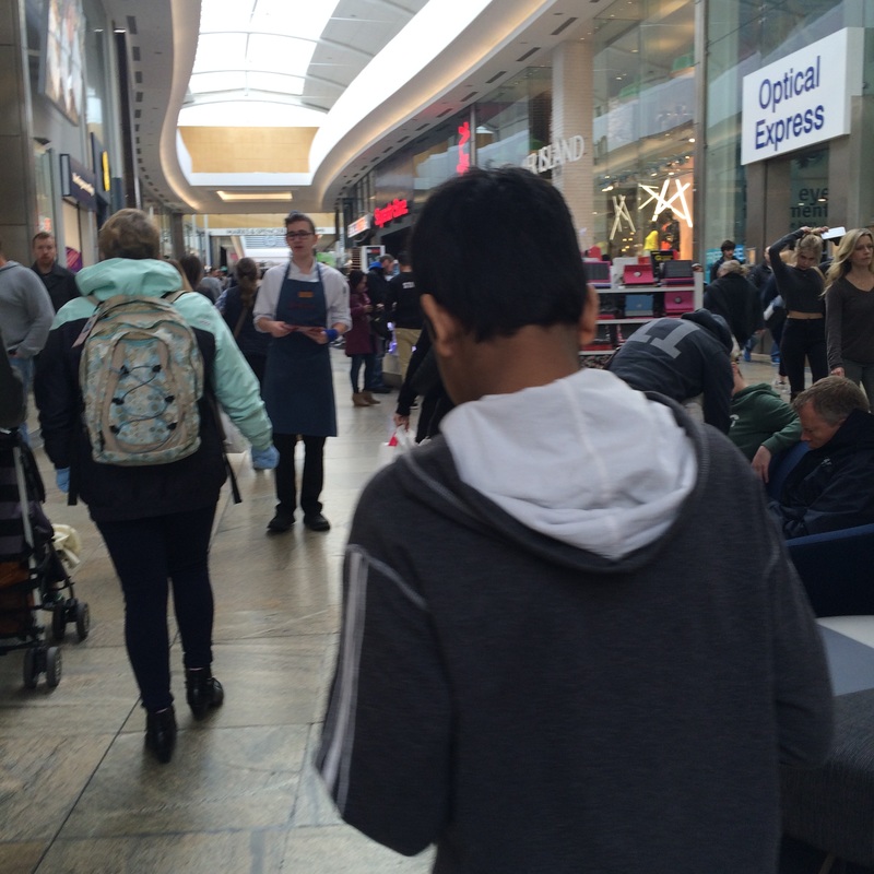
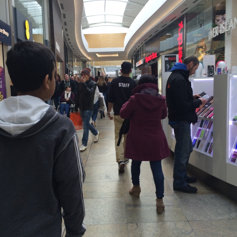
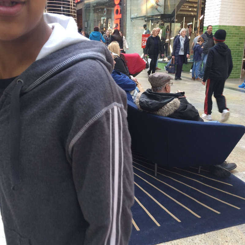
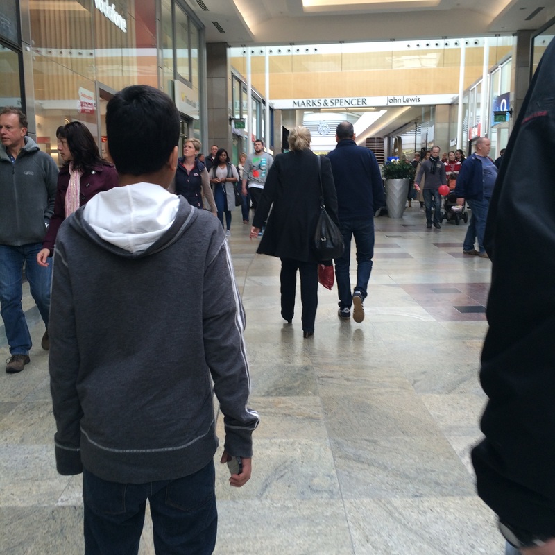
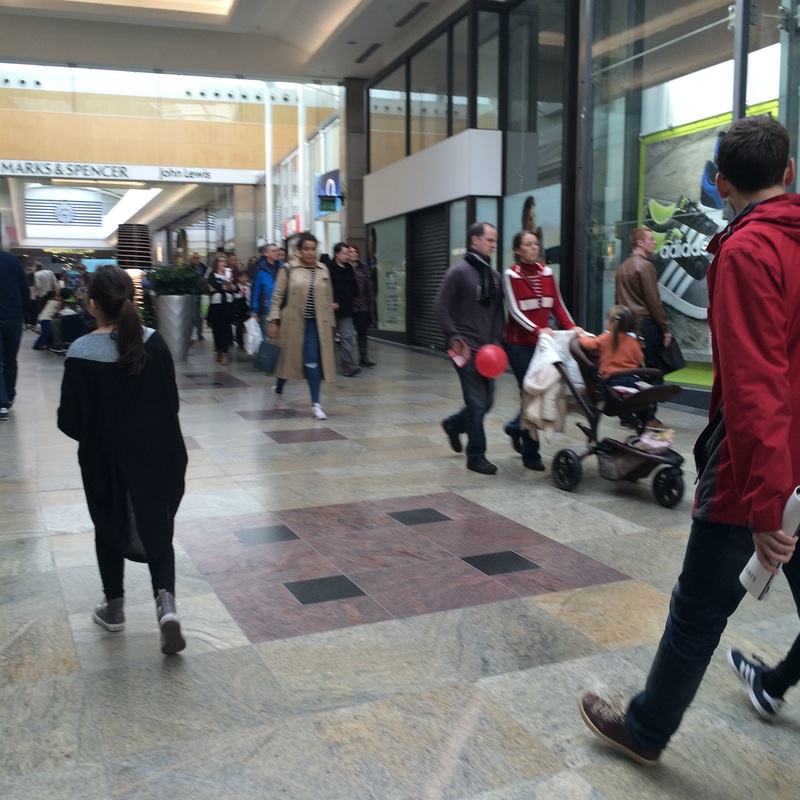
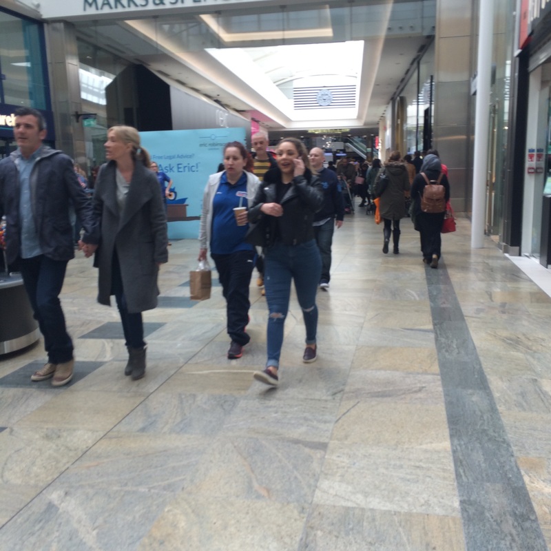
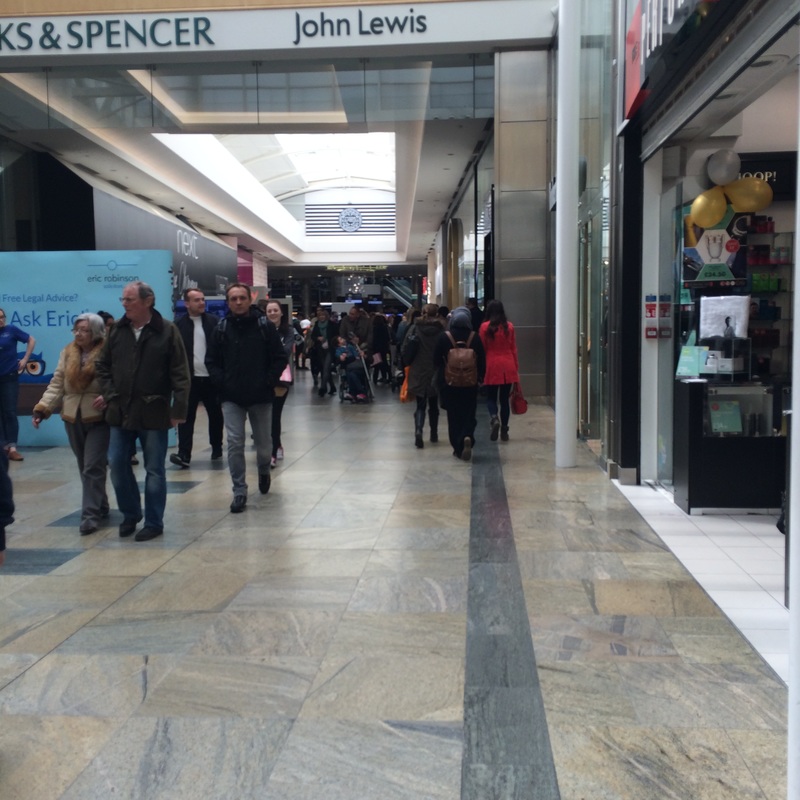
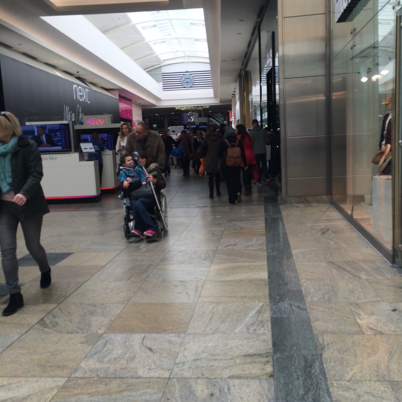
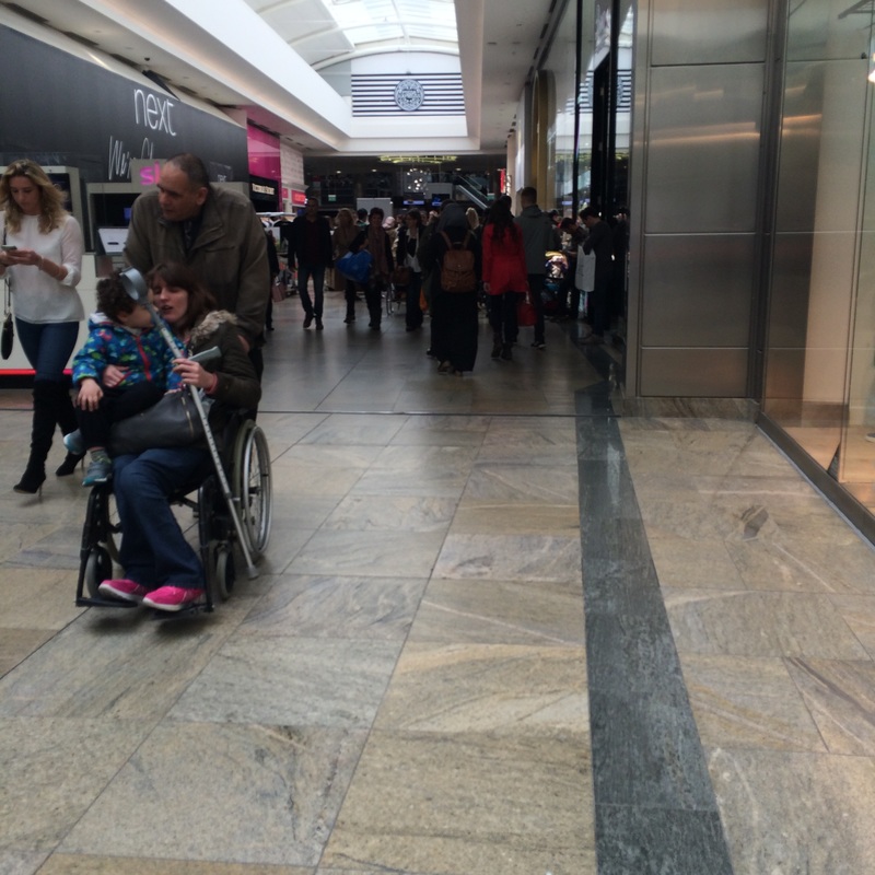
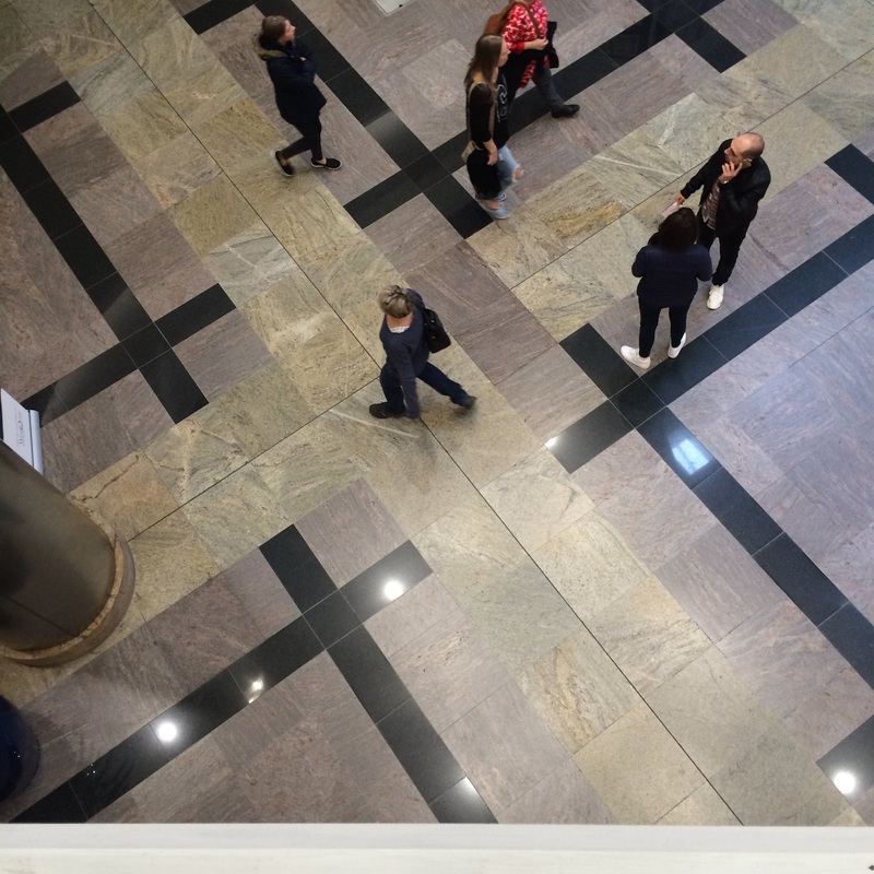
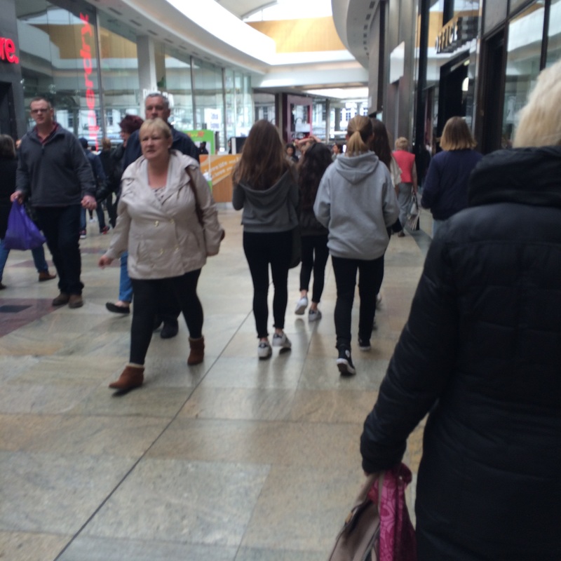
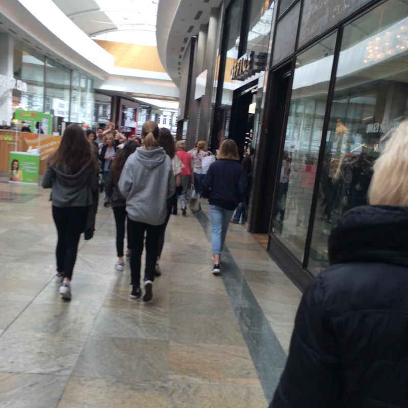
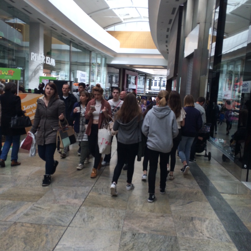
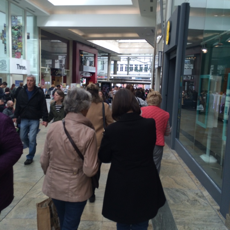
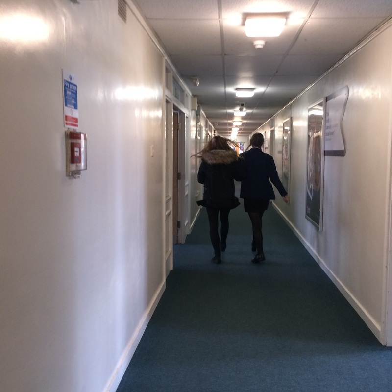
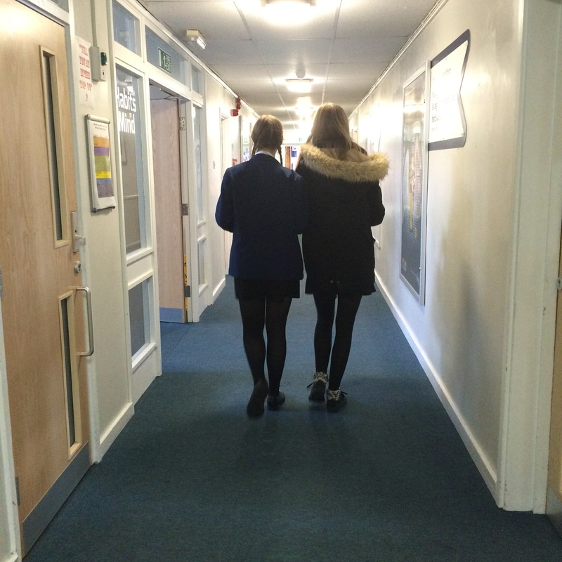
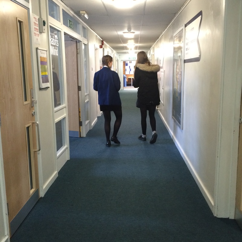
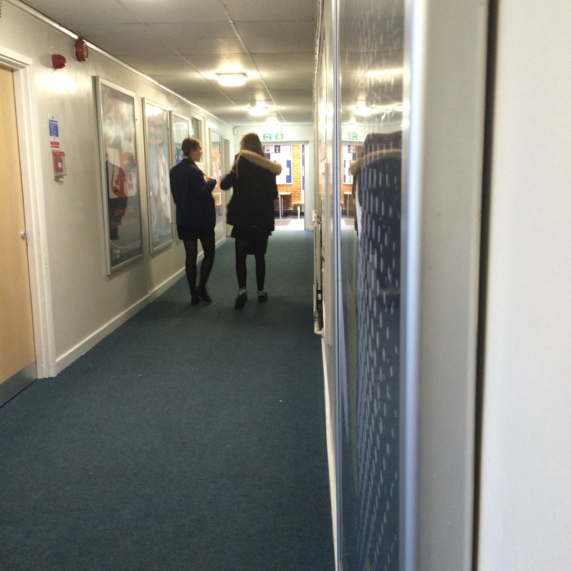
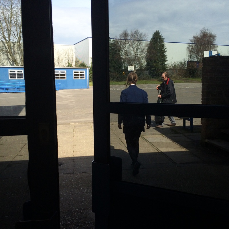
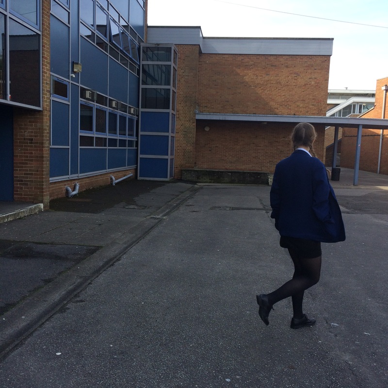
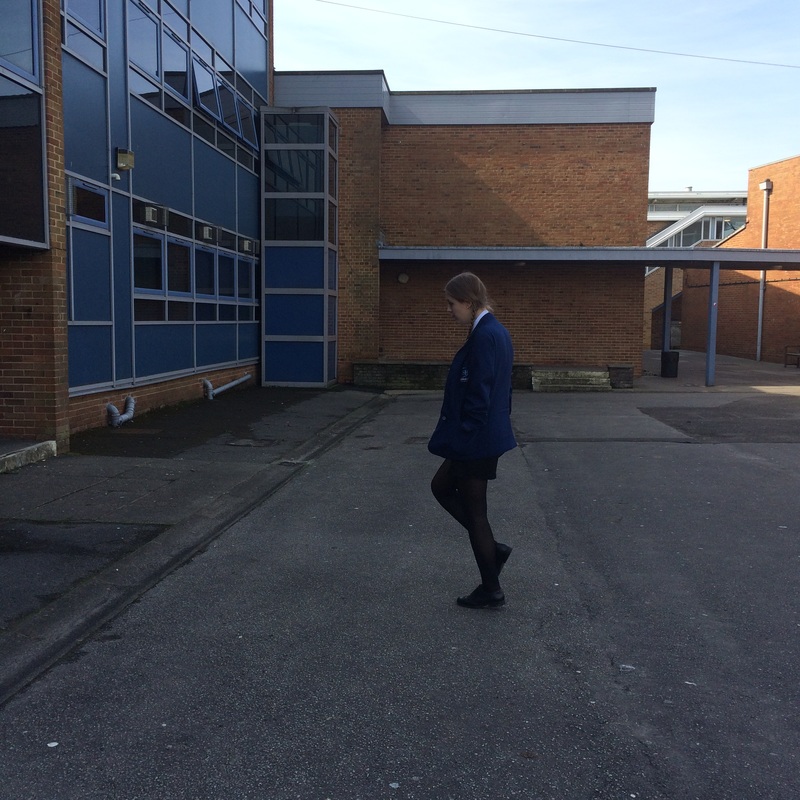
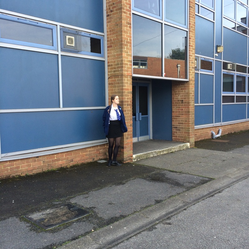
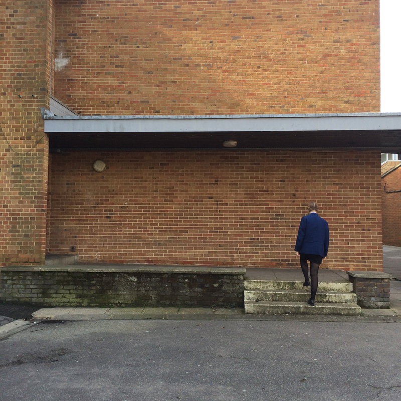
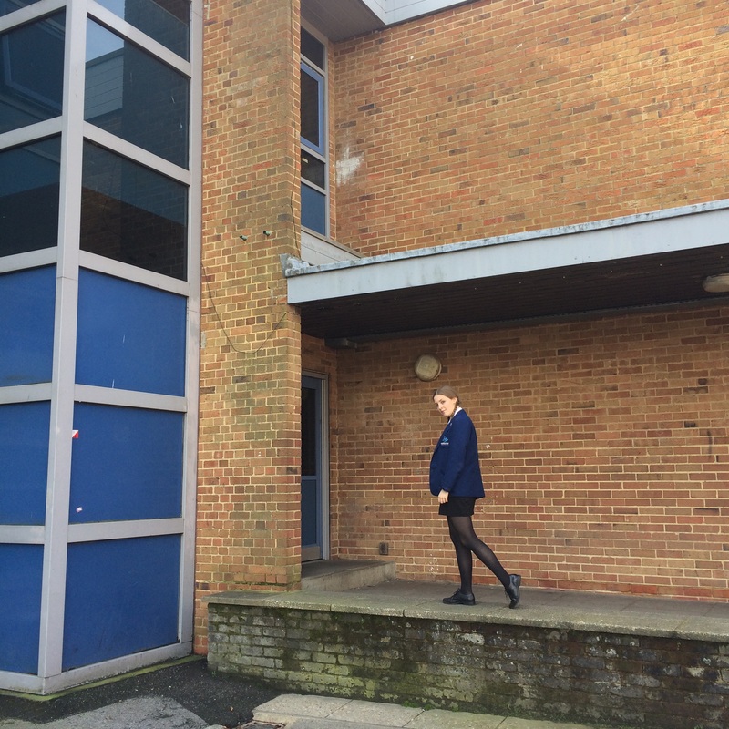
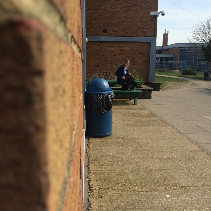
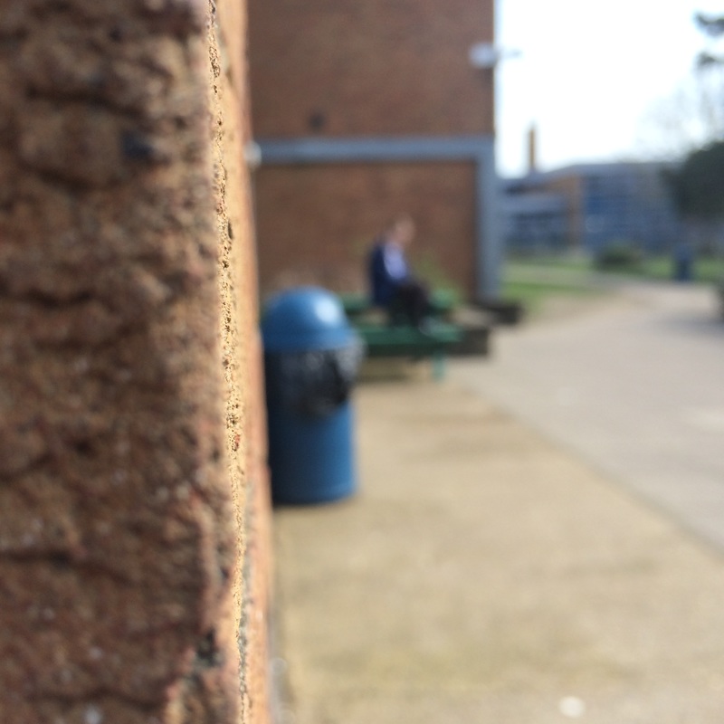
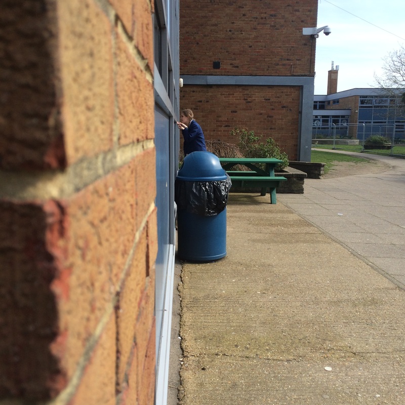
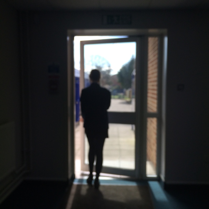
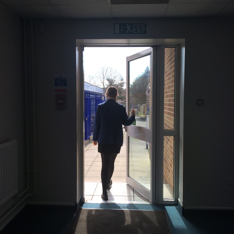
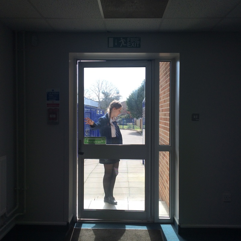
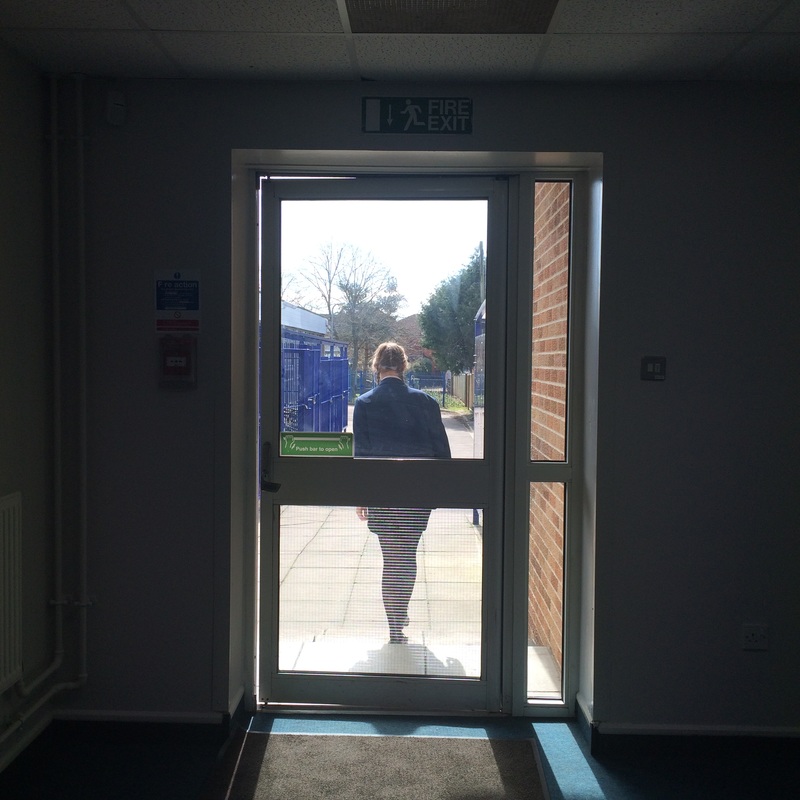
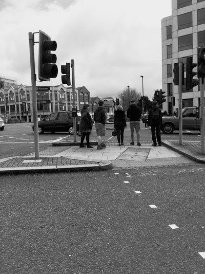
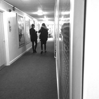
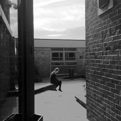
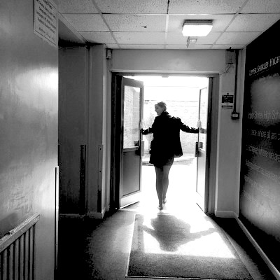
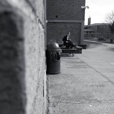
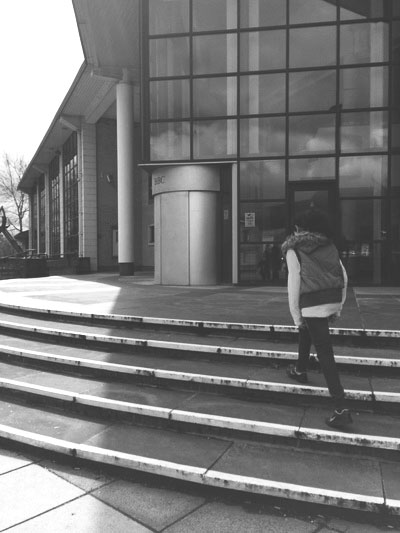
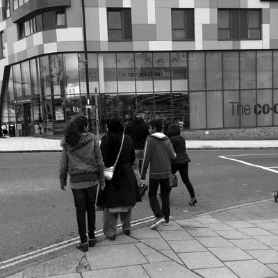
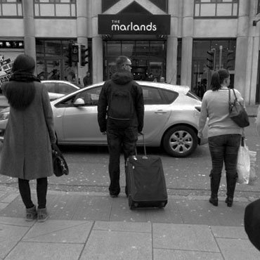
My Response to Richard Sandler
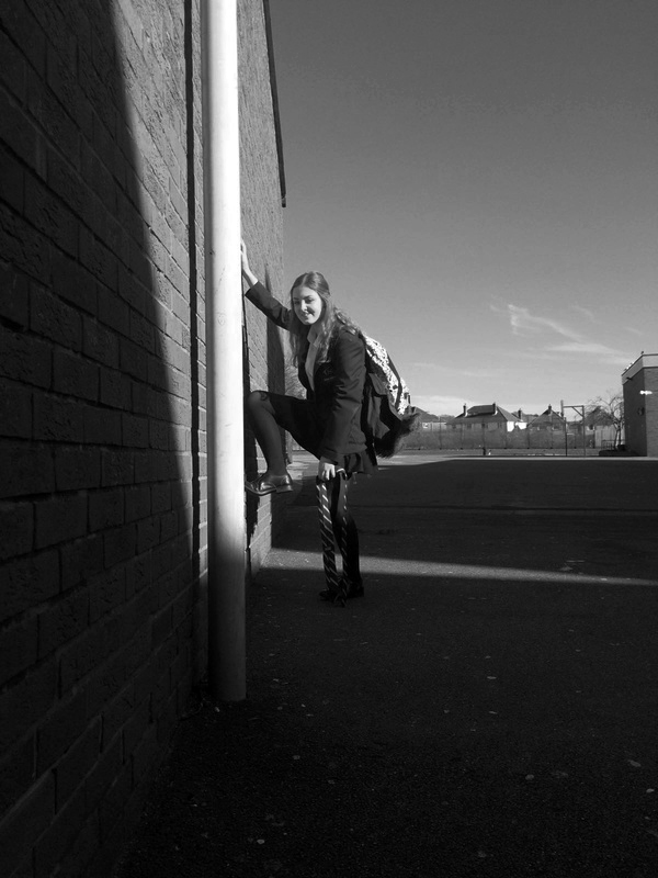
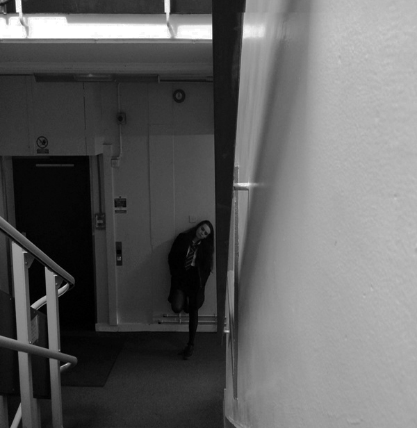
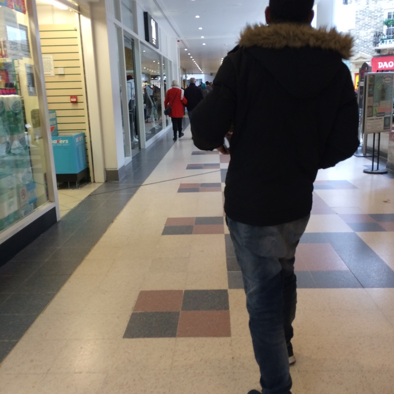
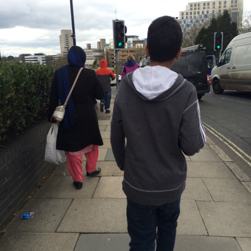
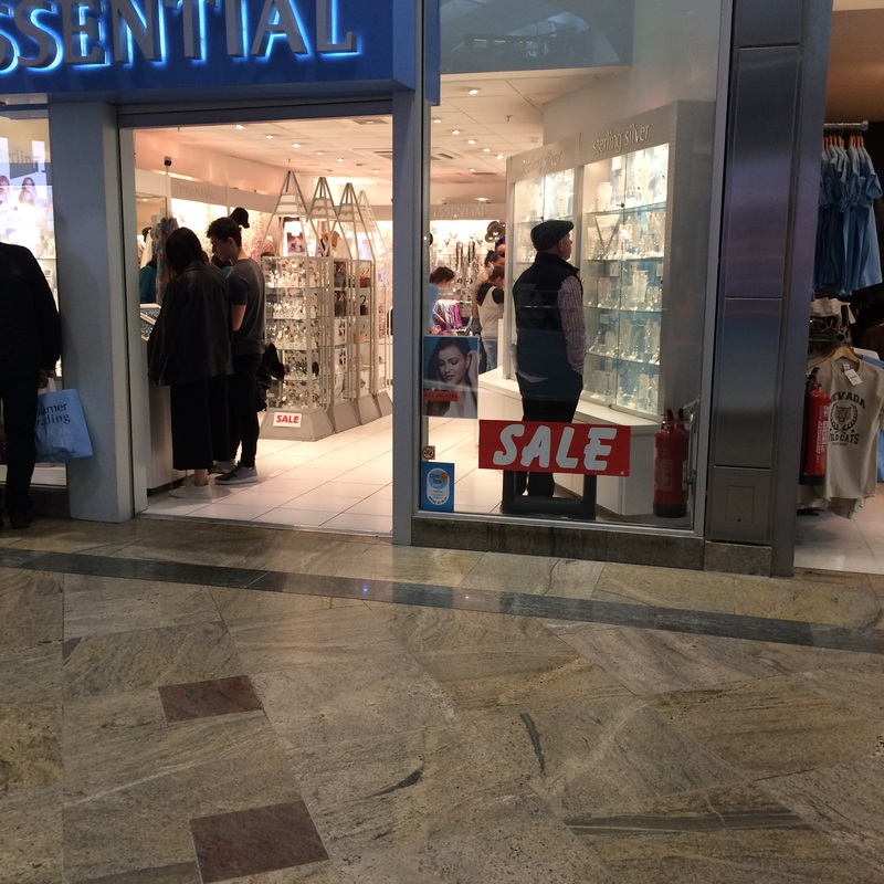
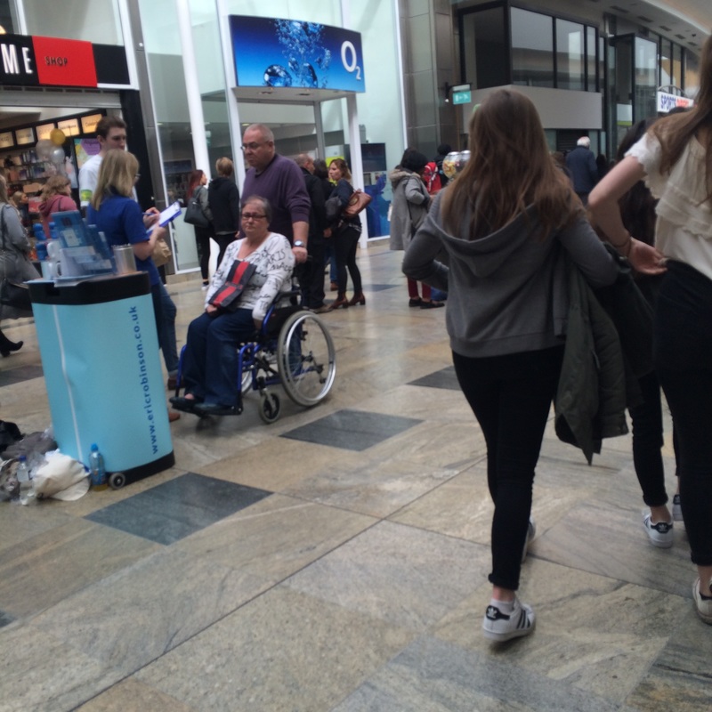
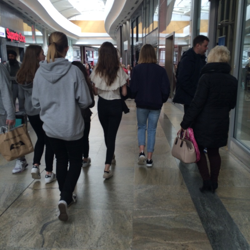
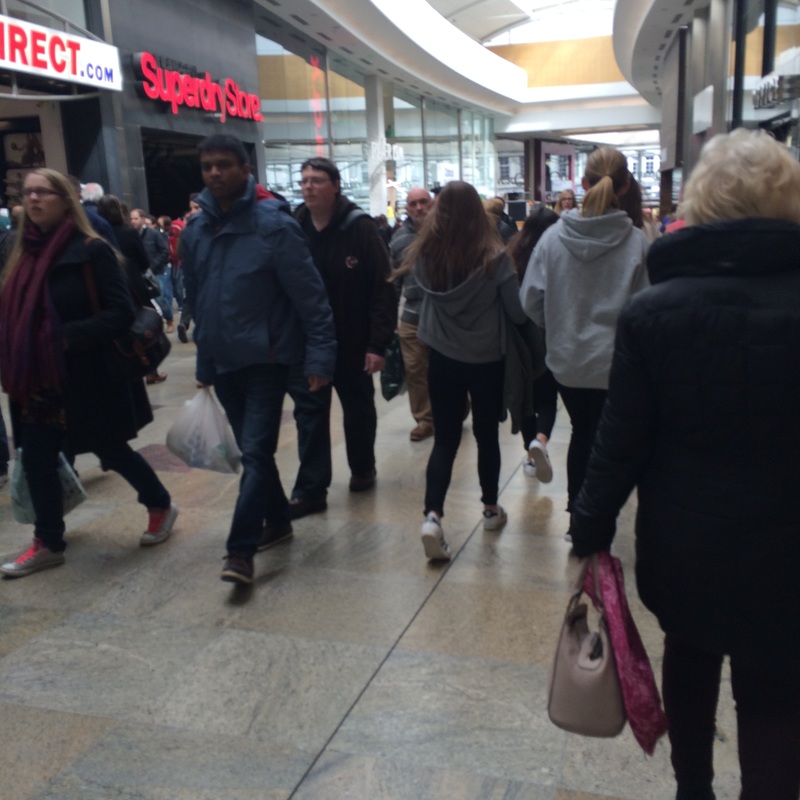
This photoshoot was in the style Dave Steward. I like his photographs, as they portrayed the image of his daily life and what he comes across during the day. His photogrphs show a series of events. There is also constant theme of following someone, walking behind them as they go about their own life. I wanted to try and recreate something similar to what he's done, because I was intrigued by what he was able to produce while walking through the streets.
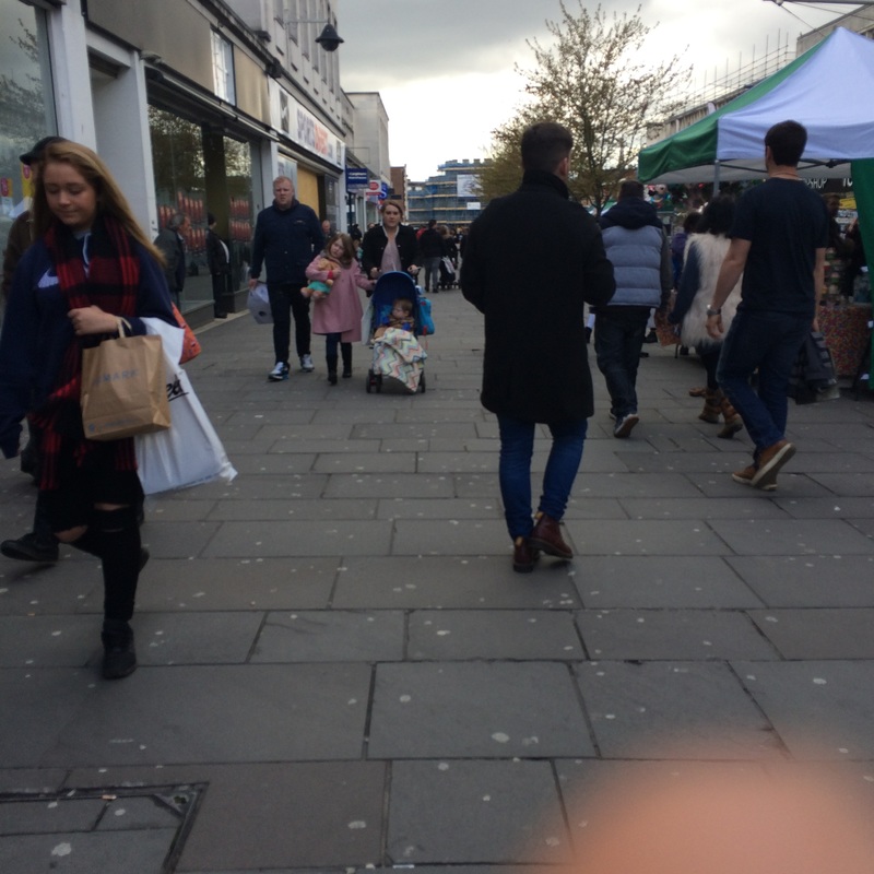
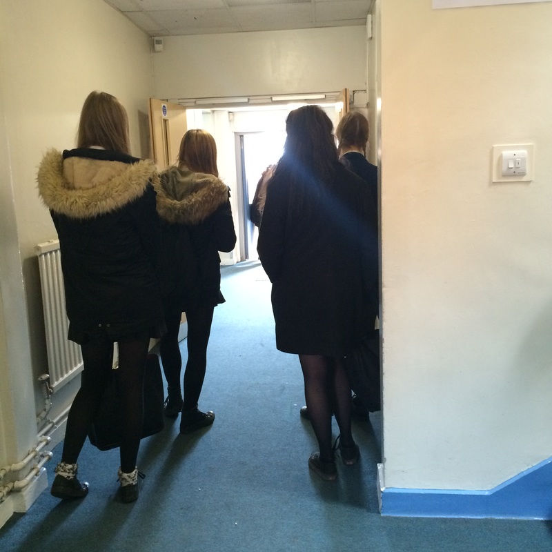
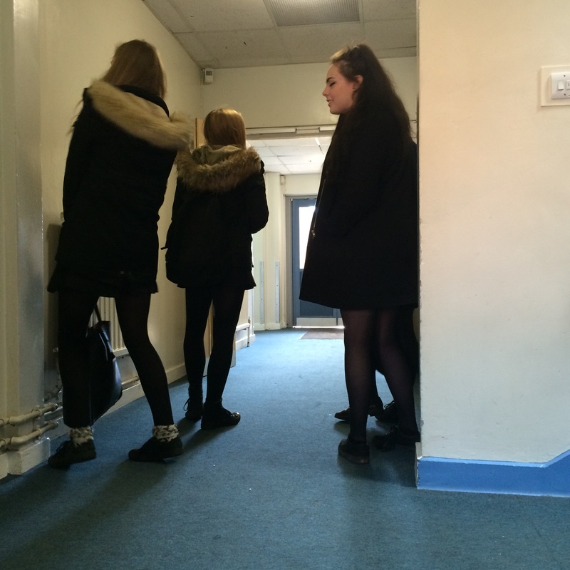
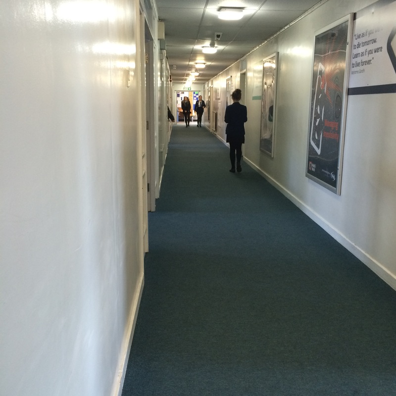
I did some things different, as I also took some of the photos indoors, where I felt there would be more interesting shots.
I did some things different, as I also took some of the photos indoors, where I felt there would be more interesting shots.
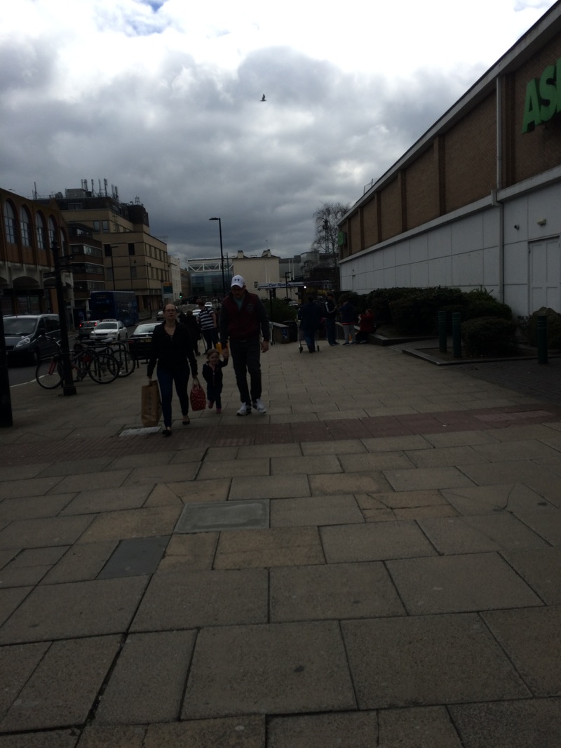
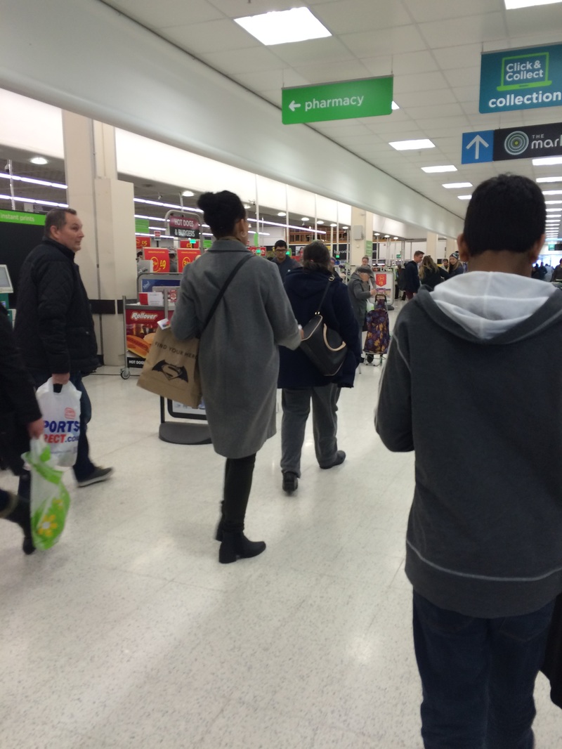
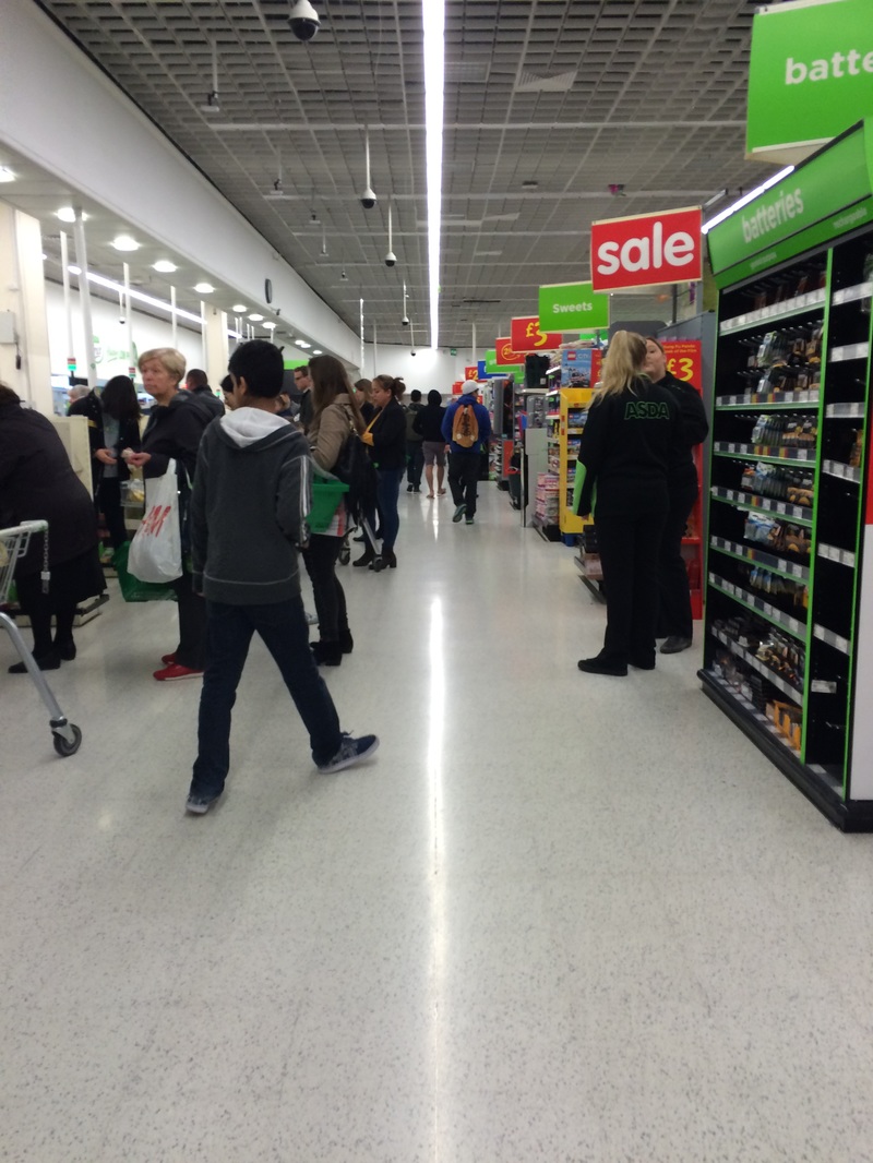
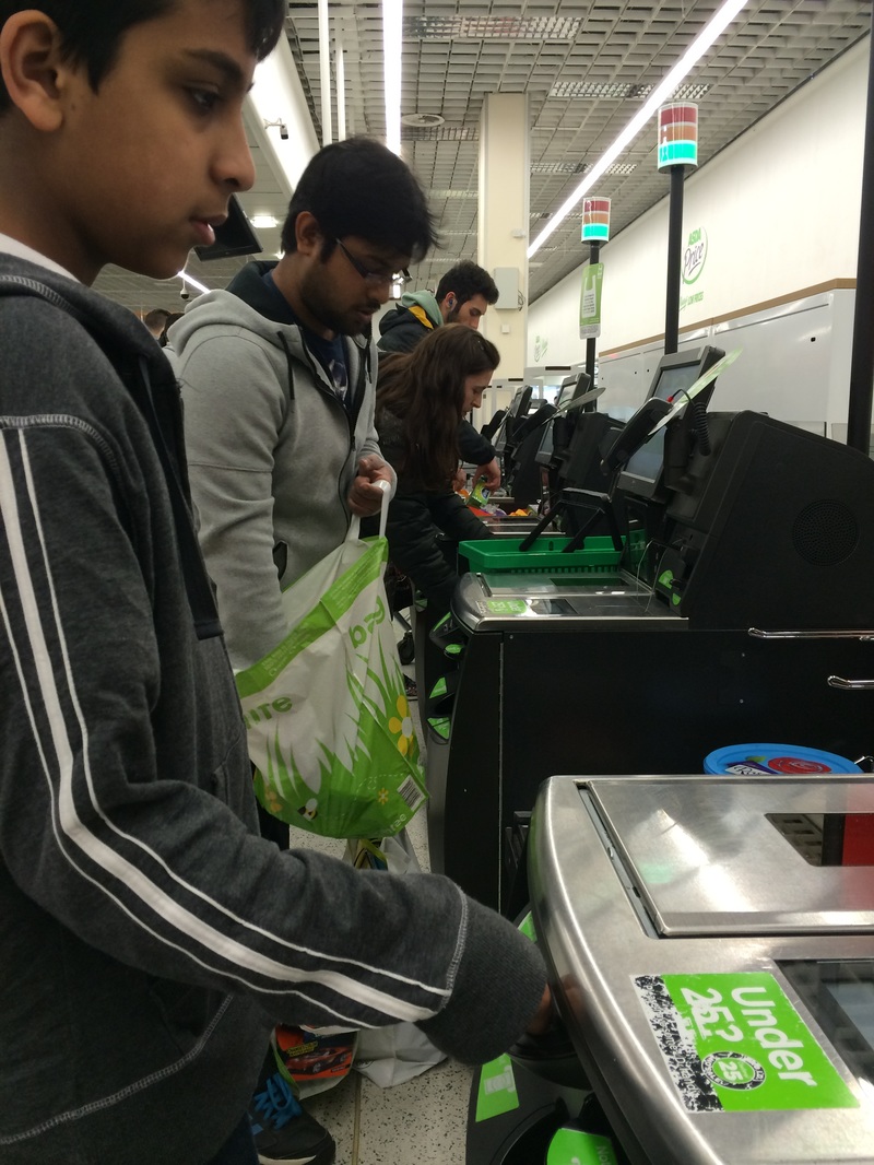
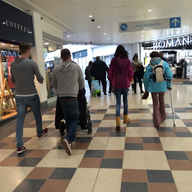
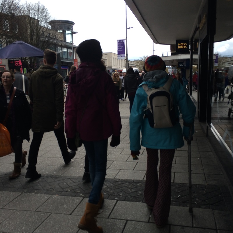
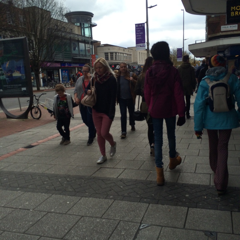
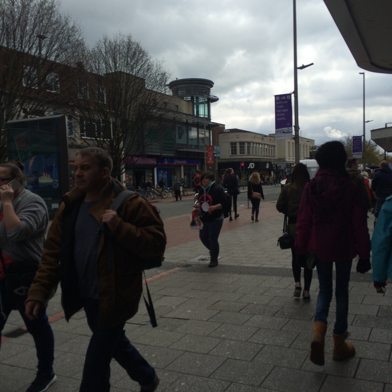
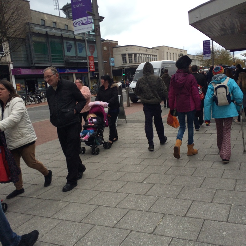
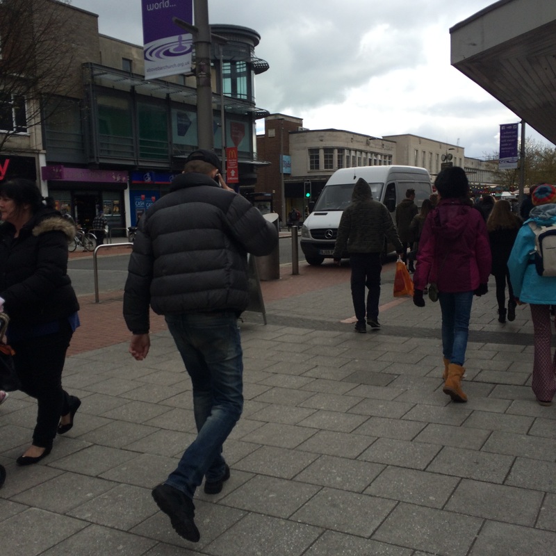
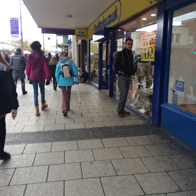
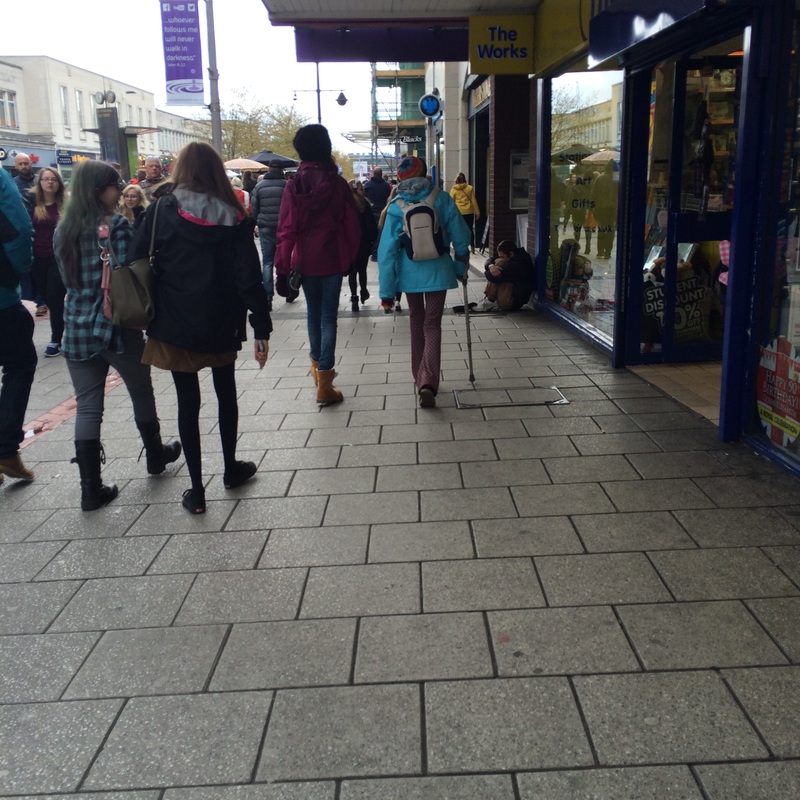
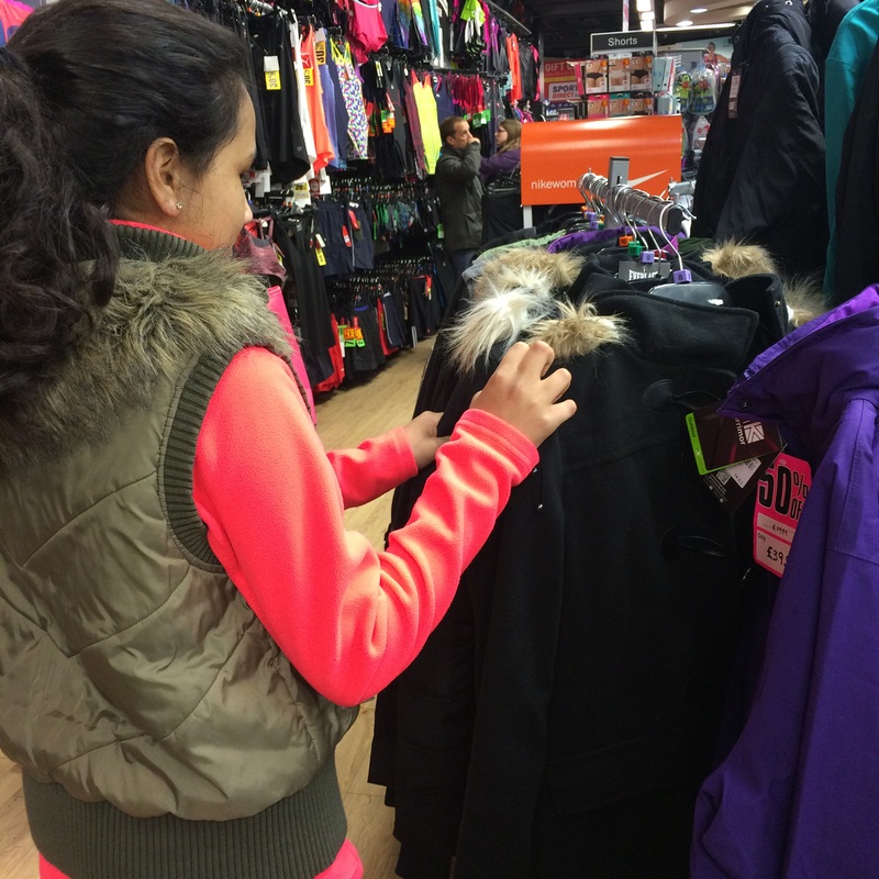
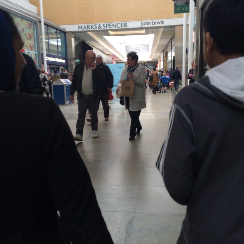
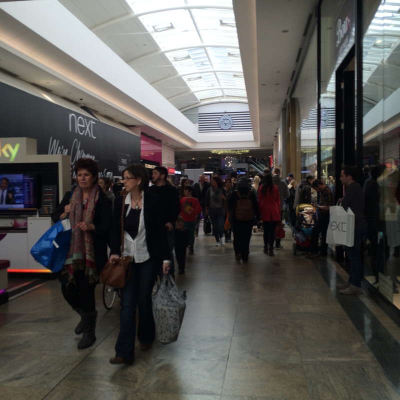
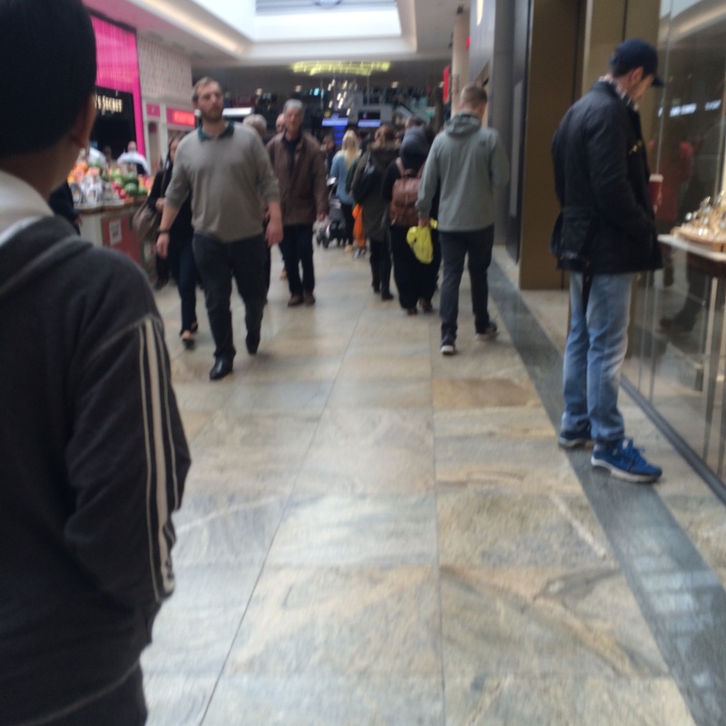
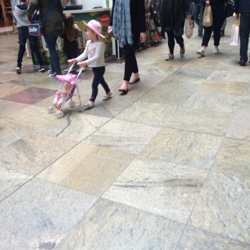
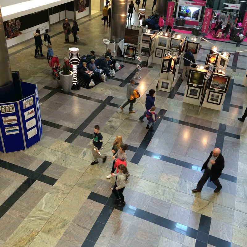
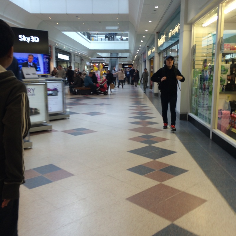
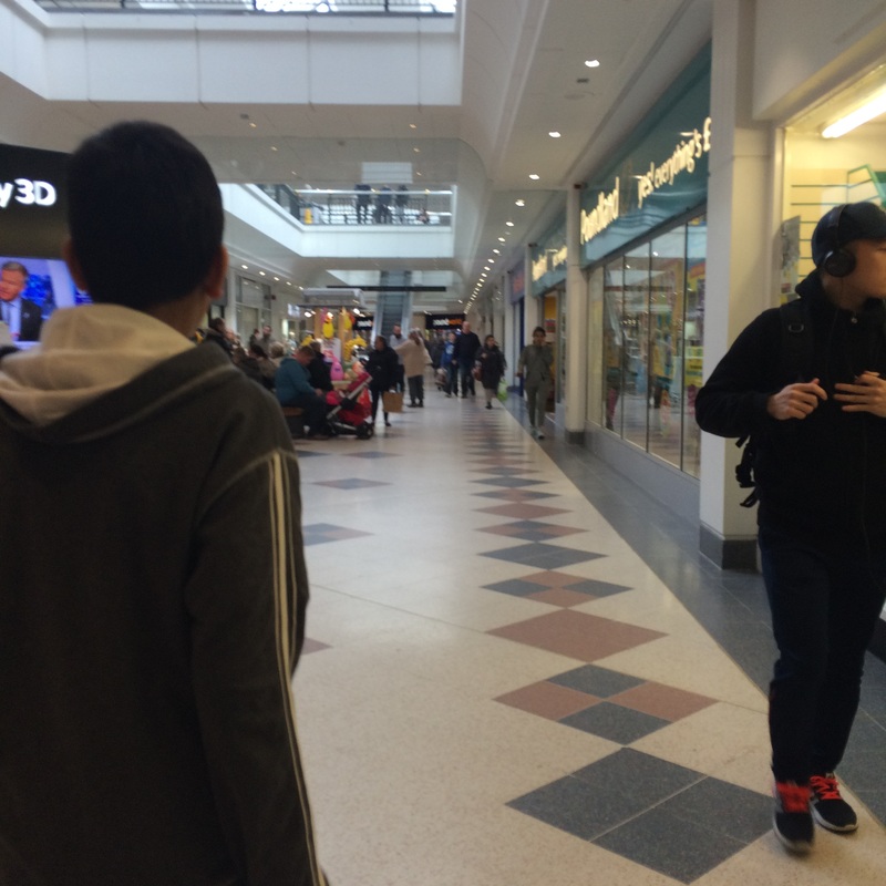
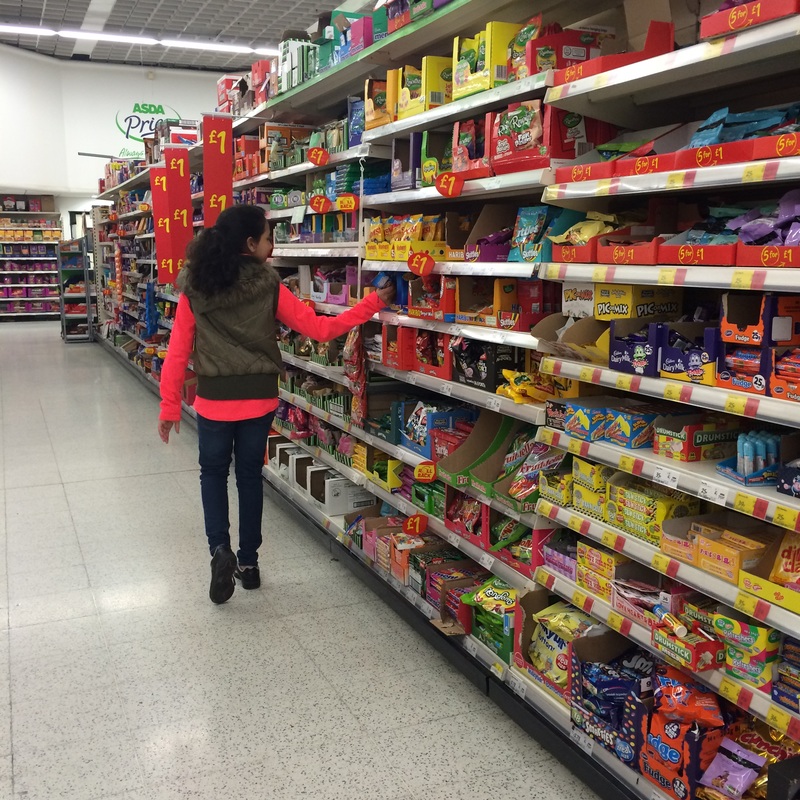
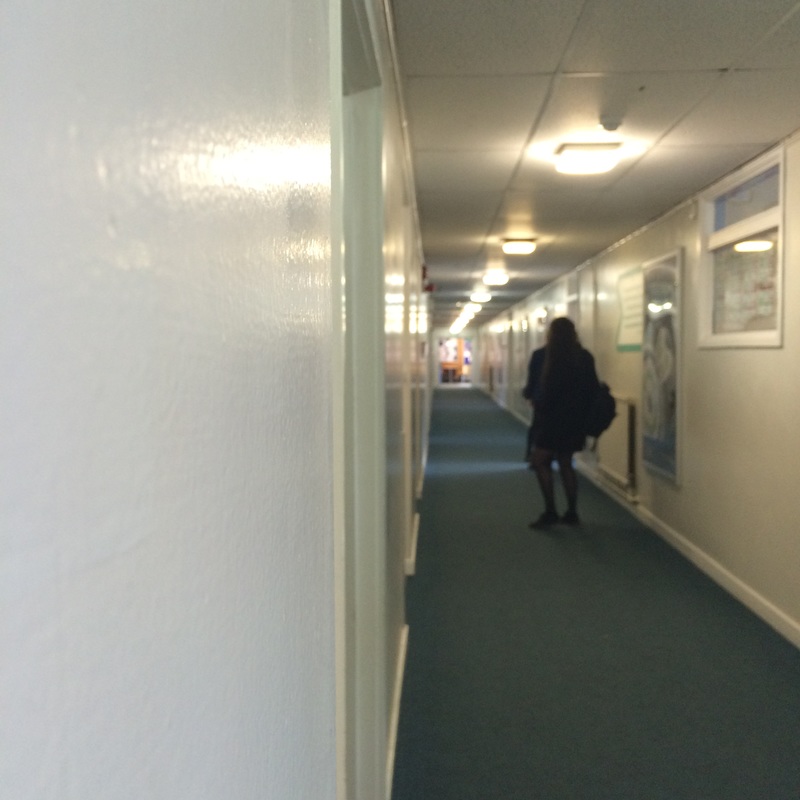
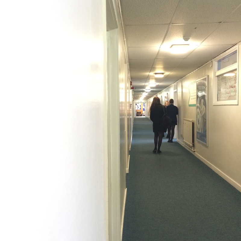
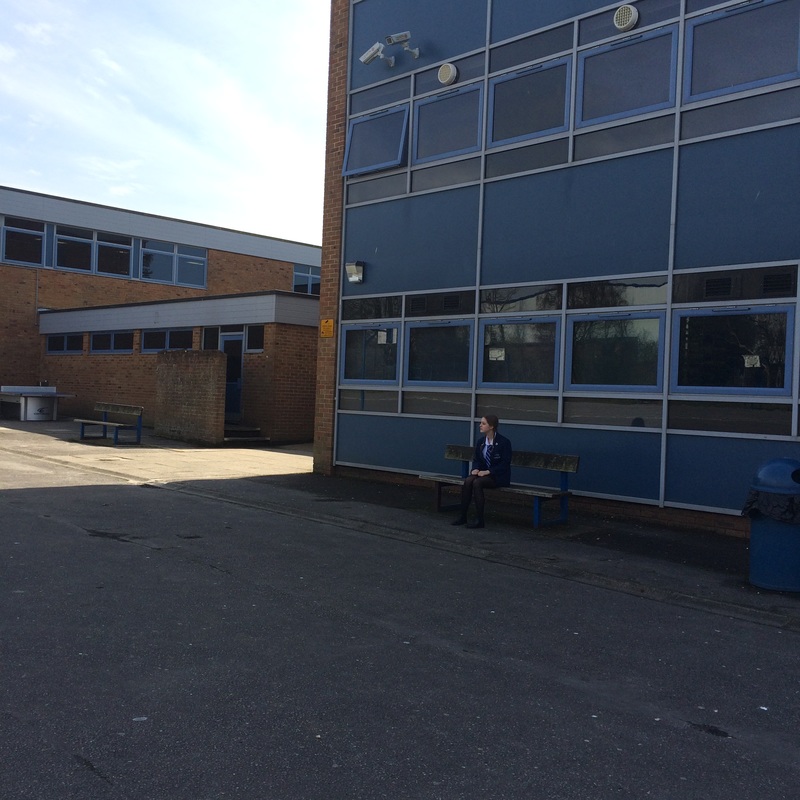
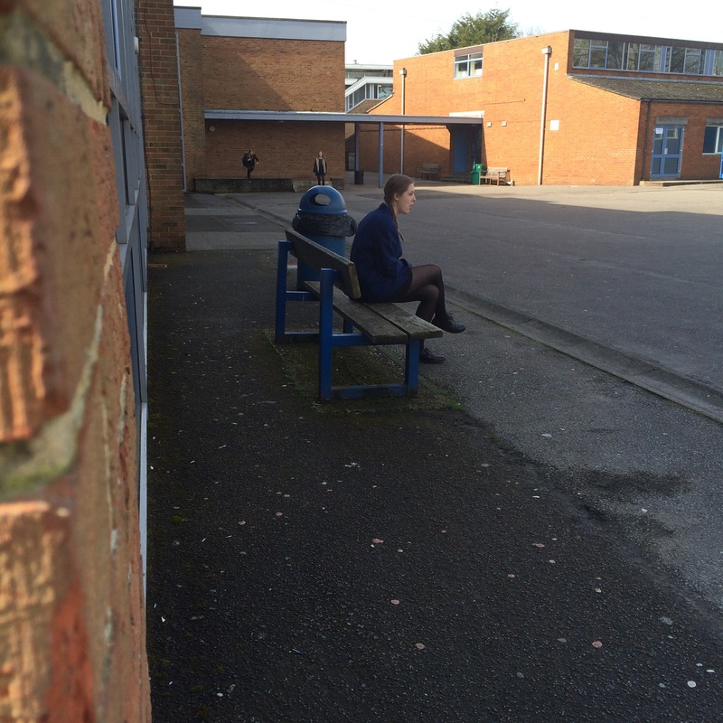
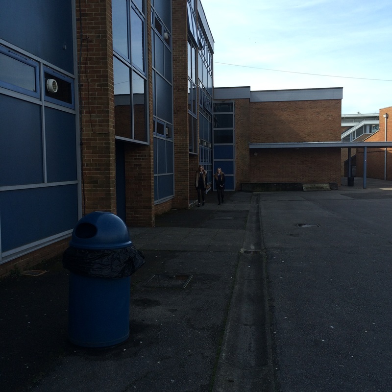
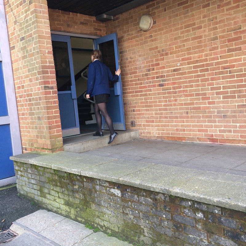
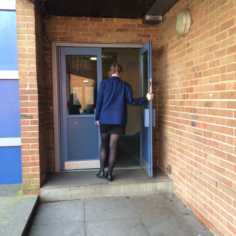
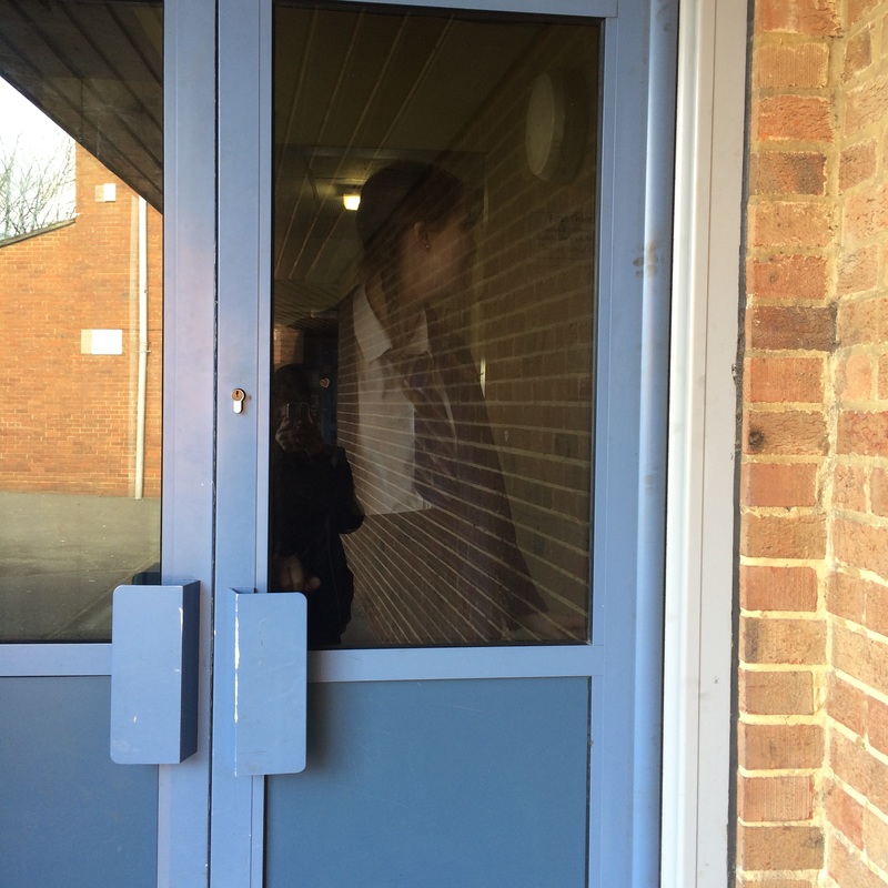
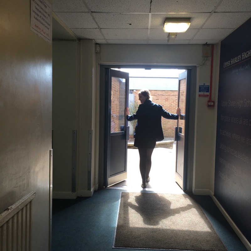
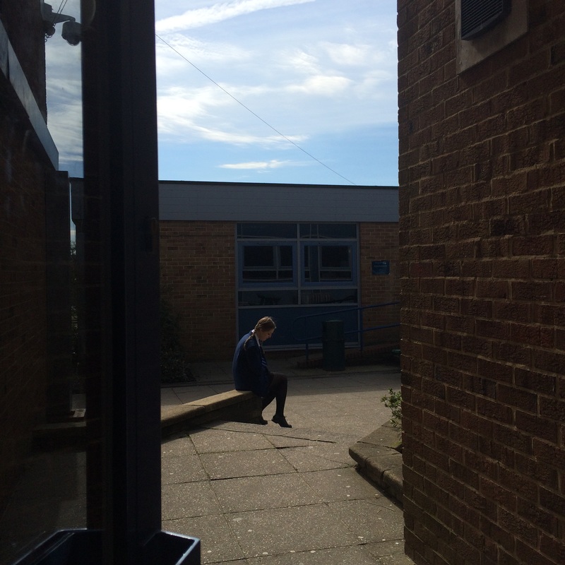
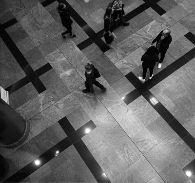
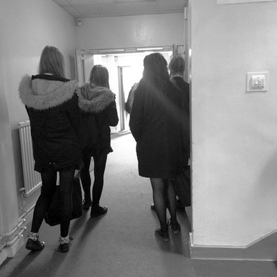
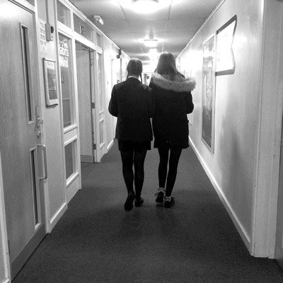
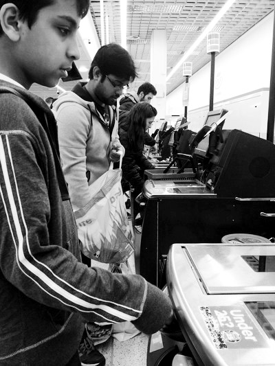
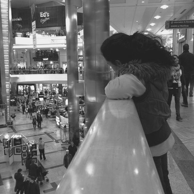
School Diary photo shoot
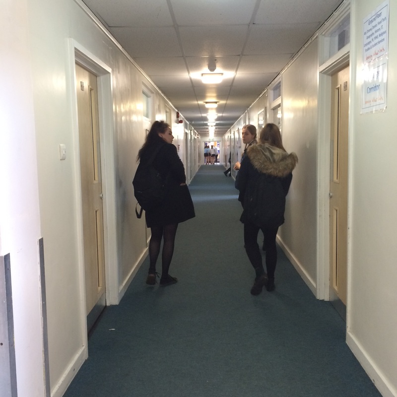
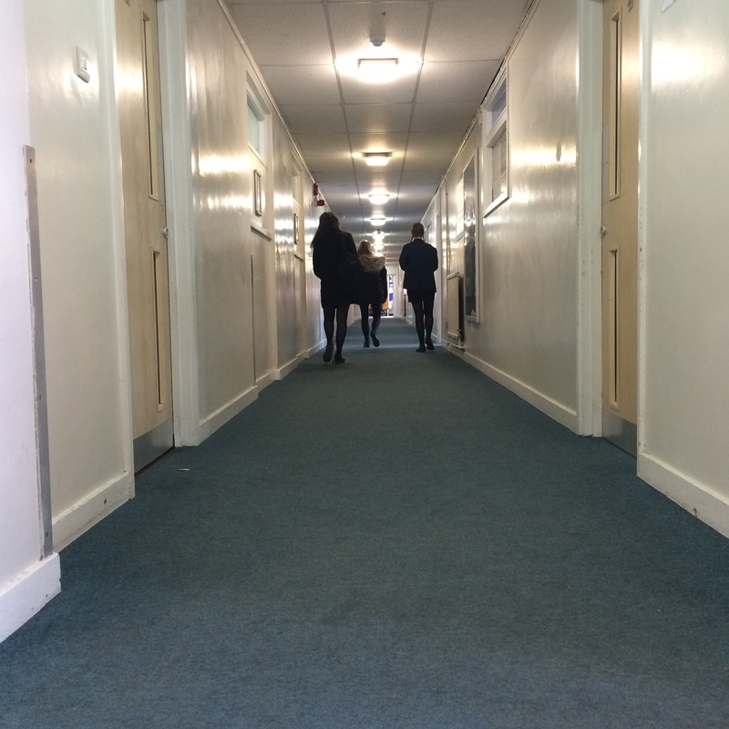
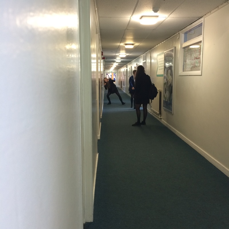
Developing my Ideas in the Style of Richard Sandler
I used photo shop to create edits to match Richard Sandler's work, and to give it the effect of that era.
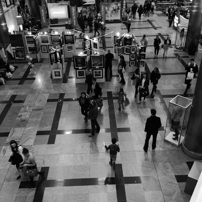
Developing my Ideas
Here are some more edits in the style of Richard Sandler.


How I edited the background photo
Using photo shop, I created an edit with two images. This is how I did it:
|
This edit was produced with a background image and another photo that I took in the photo shoot in response to Richard Sandler. This is effective because I moved two people to the background photo, which was quite empty.
I adjusted the brightness and contrast of the edit, to make the photo appear brighter and so it doesn't look like it's been edited. |
|
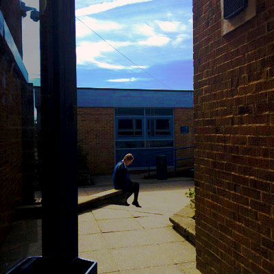
As I was editing my photographs, I decided to experiment with the different features in photo shop. I then ended up producing these two photographs and compared how different they are to each other. For the coloured photo, I changed the brightness and contrast to make the colours stand out more and adjusted the curves to make certain areas stand out more. doing this enabled me to create a vibrant edit, and the colours are bold in certain spots and they stand out. changing the brightness also enabled me to make the photo look lighter, so the colours can stand out.
|
|
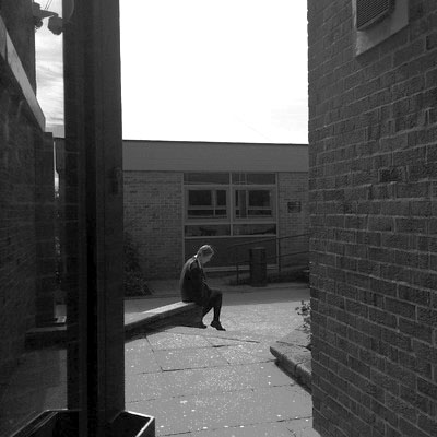
For the black and white photo, I did similar to the other edits, and the coloured one. first of all, I made it black and white, so it matches the style of my chosen photographer, and then adjusted the curves to make it bolder.
I think that the coloured one looks best, as the colours are very vibrant, which gives the photograph a summer look. I also like the black and white edit, and how the photo is bold but the colours of the building and sky would be better in colour.
I think that the coloured one looks best, as the colours are very vibrant, which gives the photograph a summer look. I also like the black and white edit, and how the photo is bold but the colours of the building and sky would be better in colour.
Refining my Ideas
Here are two step-by-steps of how I used Photoshop effectively to create the two different edits:
This is how I edited the coloured photo. First, I chose to adjust the brightness and contrast, because I needed certain areas lighter than others, to make the image stand out more. I then changed the levels, to ensure that the areas were as light and stood out as much as I needed it to. I then adjusted the curves, to enhance the features in the sky, meaning that the photograph would be darker than I wanted it to be, so I changed the brightness again, to make it lighter. Finally, I changed the vibrancy, to make the colours in the darker areas more vibrant and help them stand out more.
For this edit, I took the image I wanted, ad made it black and white. I did this by selecting the option in the 'Image' column in photo shop. I then changed the brightness and contrast if the photo, to make the areas with more definition stand out more. After that, I changed the levels on the photo, to make the darker areas slightly lighter and the lighter areas stand out more. Then, I adjusted the curves, to make the darker areas' definition stand out more. Finally, I changed the exposure, ensuring that that the different areas were as light or dark as hey should be, and making each different part stand out and contrast each other.
I like how the black and white edit came out, because its not too dark or too light, and most of the features are well defined as well. Using the different effects on photo shop helped me achieve a decent edit.
However, I prefer the coloured version of the photograph, because it makes the colours stand out more and appear more vibrant. this comes across as appealing, because the natural colours of the photo are opaque as they are, but I just enhanced them, making them stand out more.
However, I prefer the coloured version of the photograph, because it makes the colours stand out more and appear more vibrant. this comes across as appealing, because the natural colours of the photo are opaque as they are, but I just enhanced them, making them stand out more.
Final Piece
I have chosen these 12 images because they have a lot of meaning to them, and portray different images for the different genders. The photographs are taken and edited in a similar style as my chosen photographer, but give off a different message.


These are my favourite photographs, because I like the way I edited them. The black and white colours make it more in the style of my chosen photographer, Richard Sandler. I have chosen these because they create the effect of a different era, because of the way they are edited.
For this project, my intentions were to recreate Richard's work, but change certain things when editing. I think it went well, as I was able to do so and they look similar to Sandler's photographs.
I think I did explore a lot with this theme because I was able to recreate the images and make them my own, however, I could have researched more photographers and done more photo shoots in response to them.
If I had more time, I would have printed the edits out and mounted them with black card, to give the effect of an old fashioned, giant polaroid.
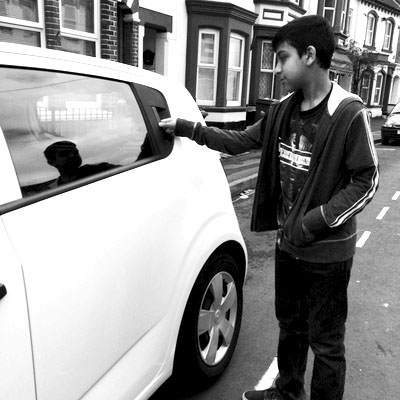
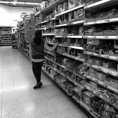
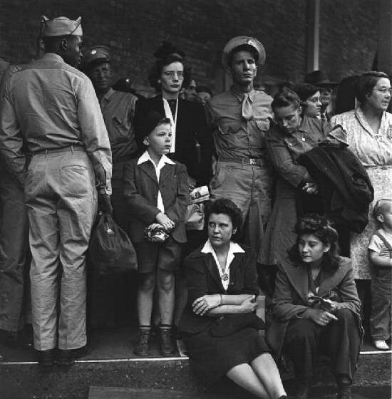
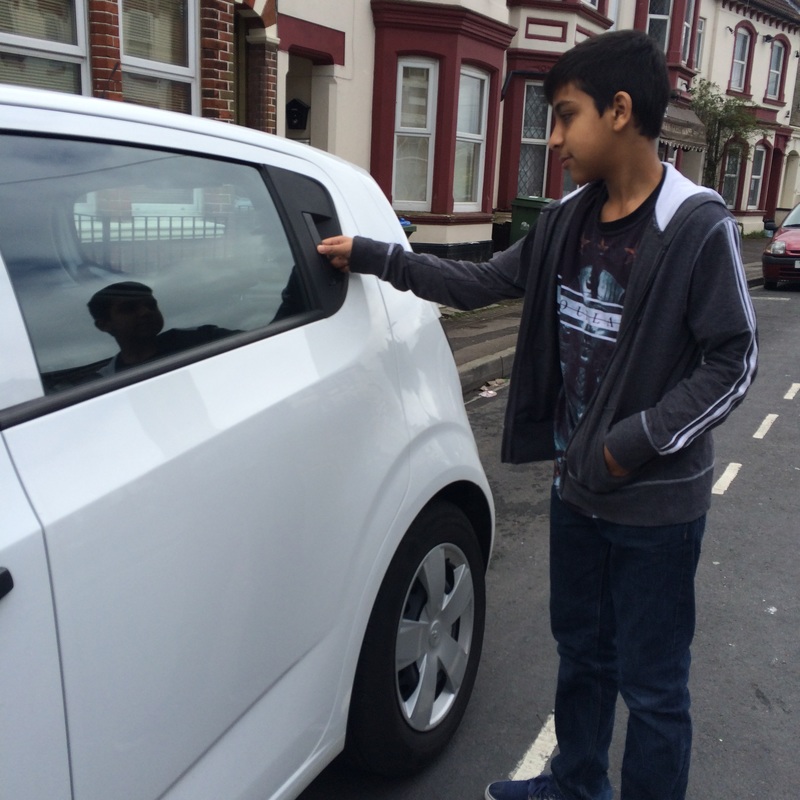
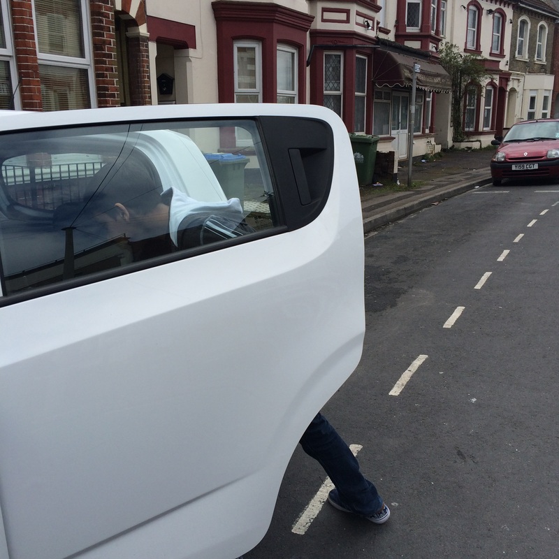
The personal part about these edits show the difference between our everyday life to life back in the 50's. These images represent the difference between men ad women in the old times. In a few of the photographs, there is a young girl look at items in a shop, this shows what women were taught at a young age to grow up and do the typical women job, which was to stay at home and look after the children, where as men were allowed to have jobs and go out and do what they wanted. This is portrayed in the images above, of a boy who is paying for items, meaning that they earn the money so they get to spend it, and there is another image of a boy coming out of the car, meaning that it was a mans jobs to be driving, as it is not safe enough for women.
This project will help show the viewers how different our society is today, compared to the past, and how we should be grateful that situations are different today.
For this project, my intentions were to recreate Richard's work, but change certain things when editing. I think it went well, as I was able to do so and they look similar to Sandler's photographs.
I think I did explore a lot with this theme because I was able to recreate the images and make them my own, however, I could have researched more photographers and done more photo shoots in response to them.
If I had more time, I would have printed the edits out and mounted them with black card, to give the effect of an old fashioned, giant polaroid.
The personal part about these edits show the difference between our everyday life to life back in the 50's. These images represent the difference between men ad women in the old times. In a few of the photographs, there is a young girl look at items in a shop, this shows what women were taught at a young age to grow up and do the typical women job, which was to stay at home and look after the children, where as men were allowed to have jobs and go out and do what they wanted. This is portrayed in the images above, of a boy who is paying for items, meaning that they earn the money so they get to spend it, and there is another image of a boy coming out of the car, meaning that it was a mans jobs to be driving, as it is not safe enough for women.
This project will help show the viewers how different our society is today, compared to the past, and how we should be grateful that situations are different today.